Year after year, we find them again and again: dozens or maybe hundreds of blog posts about web design trends. Everybody has a piece of mind, but they all seem to write one and the same thing over and over again.Why?Because nothing new happens, really.
There are no actual ’trends’ that designers follow or make up.
Is there something else that is going on? Do designers have no time to create something new, something that will change the web for good? Or are we looking for answers in a wrong place?
The odds are that the latter is up. Content writers today want to be hip and they google the latest design trends so they write about them. But, the sad truth is that writers do not dictate trends. Whatever they write will not magically be accepted as a trend. Instead, designers do it. Their creativity is, in fact, something we should all look forward to.
New styles, flat design, playful fonts, animation, illustrations, and use of bold colors – these are not passé but are just regular things in the world of web design. Something the users expect to see.
So, what is unorthodox? In this article, we will try to give our view of what we would like to see on the web in 2018.
Web design recommendations for 2018
1. Strong storytelling
Every website needs to have a story. Without a good visual storyteller, your web pages will be as good as blank. They will not attract users and you will not achieve your goals, whatever they might be. It is crucial that you have a good storyteller in your UX designer. Otherwise, the design will be generic and the same as any other on the web.
One of the first steps in good storytelling is to make a good structure and keep all the elements simple so that the users can understand easily (within five seconds) what the most prominent feature of your website is and what they should do next. And – most importantly – KISS, or keep it super simple.
2. Asymmetric layouts
In left-to-right writing systems, a regular website layout means that you are reading the text from top to bottom, which means that the layout expands till the bottom of the page, so you get a website in the shape of a standing rectangle. Everything must be aligned and symmetrical.
To avoid this, you can try asymmetric layouts and generally text and sections which you do not move to from top to bottom, but instead from left to right or in a circular form or even in some other direction. Do not be afraid to experiment, especially if your client is also willing to do something new.
3. Flat design 2.0
Flat design has been around for more than five years now (some would even say a century), but it never gets old. In fact, there is even a word of the so-called flat design 2.0 or semi-flat design which helps flat stay relevant. What 2.0 version implies are actually shadows. Now, some may think that this is practically material design all over again, but it is not. It is fascinating how a slight touch of shadow can add that extra depth to your perfectly designed flat design.
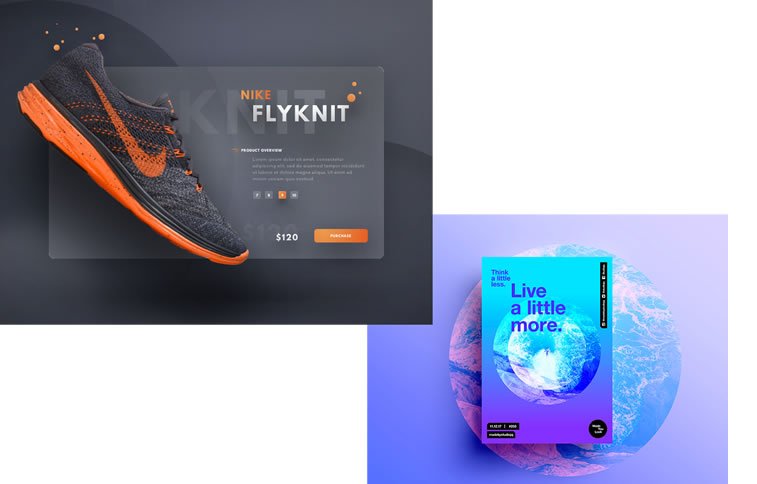
What we now see is that designers experiment with gradients, 2D, but this semi-flat style is supported with softening shadows in their work. We have seen many famous brands, such as Instagram and Dropbox, applying it in their branding, and we expect to see in on more in the 2018 web.
4. How minimal can we get?
This may be a philosophical question, but we will try to answer it. The thing with minimalism is that it tells a lot in just a small number of elements. Sometimes, artistic minimalism has no purpose otherwise that l’art pour l’art. In web design, however, minimalism has a function to grab the attention of the beholder and keep the focus on that one thing.
The minimalism of modern architecture, for example, can be an inspiration to modern designers. Geometric abstractions, straight angles, and simplicity in color can characterize your project as being minimalistic. And remember that you can never overdo it. That is the charm of it.
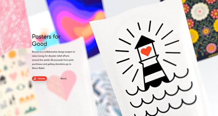
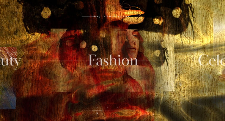
5. Illustration in photography
The illustration is a major trend for more than two years now, but what we might see in 2018 is the rise of custom illustration in photography. Plain photos, posters, and other page elements can be freshened up by adding hand-drawn illustrations which catch the eye and make it pop. Photos can now be made even more appealing by accentuating their graphic components, especially if the website is from a fashion, cosmetics or food industry.
6. Interactive pointers
The sole purpose of interaction design (IxD) is to engage. It originated from the physical world, from product interaction to be exact, and it quickly expanded into the digital world when designers started thinking about the purpose of a website and the way they can use a set of cognitive and physical signs to guide users towards a certain goal. And that goal is to ease access and stimulate interaction.
In the digital world, if you want to guide your visitors through a funnel and show them every action that would take them to the desired outcome, whatever that might be on your site (sign up form, contact form, buy button or basically any other CTA). And the more time users spend on your website, the lower the bounce rate will be – which means that you have fulfilled the purpose of having them interested in what you offer.
On the other hand, static websites have now grown into a new breed with many challenges, like usability and goal orientation, waiting to be fought off. If the attention of your users is quite small and you do not have much space to create wild animations or transitions, you can simply go with an interactive pointer which e.g. highlights the text it hovers on or leads the user to the form or next step they ought to take.
7. Captivating page transitions
With more and more websites looking the same as any other, there is a need to be different and offer something new. Since the scroll is dead and swiping mobile experience influences even web apps, the need for beguiling transitions arose.
Animated transitions, for example, give a classic page a touch of fresh air that smoothens the passage to another web page. Try it yourself if you want to improve your users’ browsing experience.
8. Mobile-first & progressive apps
Progressive apps and mobile-first approach, especially the AMP, brought us something wonderful. In the age when every day there are more and more users of mobile devices accessing the web, it is necessary for every website to have responsive design implemented, as well as a mobile-first development. This means that your website or web app was first developed for the mobile device, giving prominence to the mobile user experience, and adding features which will encourage the users to interact with the app more.
This is why we hope to see a greater number of progressive apps developed in 2018.
9. Floating menu
Website navigation is at the core of your website. If you do it wrong, everything can go wrong from there on.
In the past years, we have seen the hamburger menu on websites very frequently, but the problem is that it is not intuitive at all. At first, the users usually did not know how to use it and then it somehow went from mobile apps to the web, but there it created an even bigger enigma, which means that it was not such a good idea in the first place.
There is also the sticky menu, which is useful but on some websites, it can be too ordinary. So now we hope to see more websites with a floating menu, which remains at its position while scrolling down the page. Give it a try and tell us what you think.
10. Appealing aesthetics & page speed
Technology advances and every day we see screens as big as dream and resolutions on mobile devices getting sharper and sharper. With such conditions, you need to create appealing graphics with outstanding aesthetics. Handmade art enhanced by digitalized effect, 3D objects, or other multidimensional graphics that will make your viewers think – all of these should be on your website in the upcoming period.
However, the thing with multilayered, aesthetically pleasing graphics is that they can be heavy. With Google announcing that page speed will play a major ranking role, especially on mobile devices, one must think about optimizing those cool images and 3D animations. And the only way is to shrink and compress, allowing the file not to lose quality but in a smaller weight with the help of image optimization tools.
11. Monochromatic websites
In 2016 and 2017 we have seen the trend of building split screen websites with a lot of them being dichromatic. In 2018, however, we expect to see a rise of the monochromatic website. The challenge of this kind of visualization lies in the fact that it might look boring or unappealing, having everything colored the same.
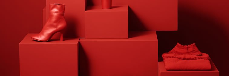
And the solution is, of course, using shadow as a means of creating focal points and highlighting the main features you want to stand out. Typography can also be of great assistance in such cases, as it can bring about the message to the front serving the color as the background support of the text.
12. UX writer?
This is probably one of the most controversial topics in the web design and content writing industries. Should designers, without writing expertise, write content for the websites so that they can fit everything perfectly, or should content writers do it, even though they sometimes do not have the design skills and ‘an eye’ for the visual? The answer may lie somewhere in between.
Of course, specialization is something completely normal, but the web design industry allows for a certain degree of flexibility. This means that when you have mastered all the design skills and you can create awesome websites, you can also become an English major or take a writing course and start writing content for your web pages. Or, completely the opposite, if you are already a writer (copywriter, content writer, transcreator), you can improve or develop your design skills and create awesome websites completely by yourself.
And who knows – maybe next year, you will read a web design trends blog article written by our designer. Let us wait and see!