Making an excellent user experience for your online store is all about keeping it simple and useful for your prospective buyers. But, how to know whether you are doing the right things and making the right choices? How to excel in your e-commerce design? Read on, as we are about to reveal the proven UX tips to level your online sales up in 2019 and beyond.
Now, let us cut to the chase.
Once the visitors hit your website or a dedicated landing a page that you set out to track conversions, make sure to keep them on site and walk them smoothly through your offer, product reviews and comparisons, shopping cart, shipping form, payment methods, and everything in between.
It is not an easy task, we know.
That is why we are here to help you delve into the process of creating a purposeful user experience for your online store.
Top 5 eCommerce UX tips for a Great User Experience
1. Know your customers
If you are just starting out and preparing to build your first e-shop, then the first stop should be defining your target audience (hint: it should not be „everyone”).
Think about an ideal buyer of your products or services. Who might that be?
For example, let us say that you are selling hand-made crafts online. Your ideal customers would be the ones who appreciate original, creative, and unique products they cannot find anywhere else, and they are willing to pay extra for the high quality and artisans’ manual work.
If you have owned the business for some time now, there is a big chance that you already have a cohort of returning, loyal customers. And your mission should be dedicated to expanding the circle of existing buyers and attracting new ones. Over and over again.
As defined by UK-based marketing specialist Lewis Basset, the usual 3 types of buyers are:
- Customers
- Prospects
- Suspects
Customers have already bought your products, used your services, and interacted with your business. They know you, they trust you, they love the quality of your products, and they will most probably buy from you again.
Prospects would be in the next, a much wider circle of people around your business. They might be thinking about buying hand-made crafts and searching for such items online. They might not know about your offers yet, but they are about to find out.
Suspects are concentrated in the widest circle around your business. They might not be linked to you right now, but they may be reach out to you soon. For instance, those might be the people who plan a home renovation and want to fill the house with original hand-made crafts. So, they might start searching for them online in the near future. And there you go. Bingo!
If you find yourself struggling to define the right audience, you should check out Michael Boylan’s book The Power to Get In. By using the system called Circle of Leverage, he creates a step-by-step guide that will help you identify the right people for your business.
So, now that you know your potential users, you need to step into their shoes and start thinking as a potential buyer of your products. Then, start creating a buyers journey for every step of their way and every step through the conversions funnel (if you have created a specific goal for your digital marketing campaigns).
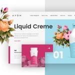
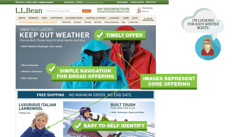
2. Create an amazing homepage
You do not have much time to make a first impression on someone who has entered your website for the first time. It is a matter of seconds, as a matter of fact.
So you need to design a killing hero area and make people fall in love with your homepage.
Make it unique, bring up the amazing hero image, custom-made illustration, or an eye-catching video that will speak to your target audience in a meaningful way and make an emotional connection with your website vistors.
Other important rules are:
- Use simple words
- Do not overcrowd the screen
- Do not overdecorate the UI elements
- Eliminate everything that does not make an impact
- Make sure that promotional banners are up to date
- Create a meaningful navigation bar
- Choose your categories and subcategories wisely
- Make functional search filters
- Put one CTA button above the fold
We recommend using a minimalistic design approach and trying to say more with less. The e-commerce homepage should be cleared of all unnecessary symbols, icons, pop-up windows, and other possible distractions. And you can always rely on the use of color and typography to make your page stand out.
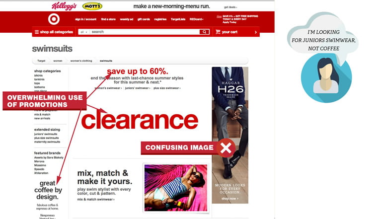
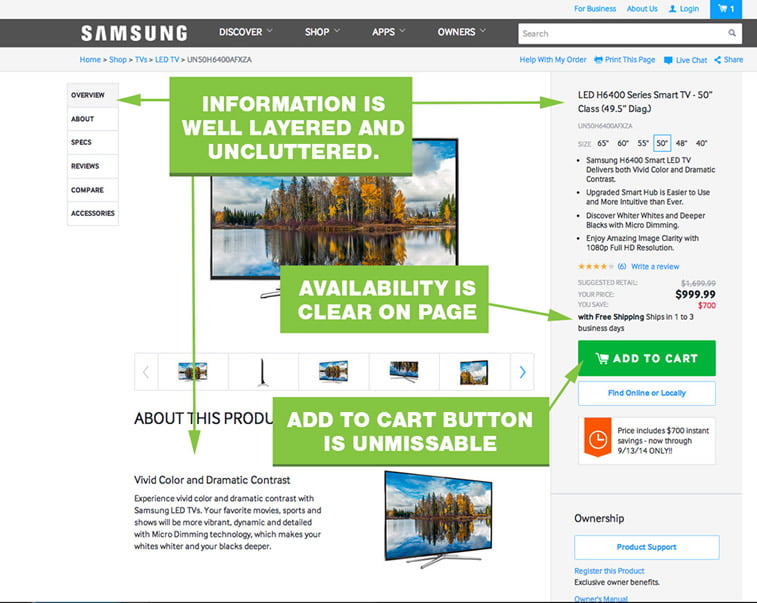
3. Make information-rich product pages
When it comes to an e-commerce website, product pages are usually going to be the landing page for your users. So, you need to pay special attention to designing well-structured pages that are going to fulfill all your customers’ expectations.
As described in the Nielsen-Norman Group’s e-commerce report summary that summarizes the most important findings, guidelines, and concepts about how people online shopping behavior, you should mind that there are several types of shopping behavior to design for:
- The browsers
- The detail-oriented researchers
- The price-conscious bargain hunters
- The product-focused shoppers, task-oriented
- One-time shoppers
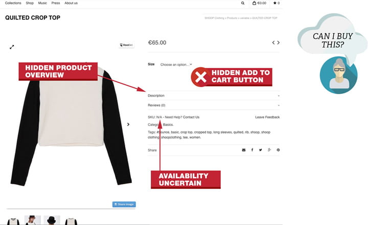
That said, you should build product pages that are going to be filled with all the necessary information about your products or services in full detail, followed by high-resolution images from different angels, promotional videos, product reviews, and customer ratings.
Also, do not forget to have breadcrumbs on product pages, as well as to include suggestions for related products, a possibility of product comparison, and details about product availability, and the estimated time of arrival.
Finally, create the functional call-to-action button, and make sure that it clearly says what you want your customers to do, which is probably going o be „Add to cart”. The button needs to be the right size, not too small, not too big, it should be instantly recognizable and placed in the so-called CTA area, usually next to the pictures.
4. Enable smooth shopping cart experience
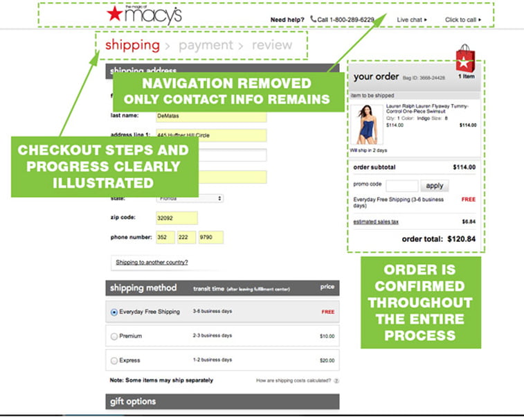
Once your prospective buyers click on that CTA button, their next stop should be - the shopping cart. It is one of the essential assets of your e-commerce website, and you should design it with flawless user experience in mind.
Providing a consistent feedback and creating a clear checkout path are of the utmost importance here.
There are two options to consider:
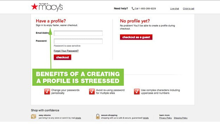
- You can insist on having users register on your website before being able to make a purchase
- You can give users an option to make a purchase as a guest visitor
It is up to you which one will you choose. Our advice, however, is to go for the option No. 2 for this simple reason – the more steps your users have to take before the purchase, the more chance there is that they might give up and walk away.
Another important advice about the shopping cart UX is that you should consider implementing the tracking option and then using a given email address to send gentle reminders about the started-and-abandoned checkout processes. Because, sometimes, people simply get distracted on the internet, and they just stray away from your website unintentionally. They would quite possibly want to come back and finish what they have started.
5. Try not to have too many payment options
When it comes to the payment, there are also two things you should have in mind:
- Be transparent about the total price
- Do not overwhelm the user with a ton of payment options
We know that there are different payment gateways available and we know that payment methods are ever-evolving with the rise of Electronic Money Institutions (EMI) and online wallets.
This is the most important issue for your customers, no matter if they are about to pay a few dollars or a few thousand dollars, you should always make a crystal clear total price at the checkout.
If there are additional shipping costs, include those right away or give the users an option to see the specific shipping cost for their country. Also, do not forget to inform them about the various shipping options if available.
And when it comes to the checkout form, please follow the personal data privacy regulations and make sure to collect only the necessary information. Besides that, pay additional attention to the microcopy in the form to make every step of the way perfectly clear for users.
For the payment methods, inform users about the credit and debit cards that you accept, and include some of the online payment options as well. Try to be selective, though, and make sure that your choice is a recognizable and trustworthy payment gateway. Customers will appreciate it.
Conclusion
Your online appearance is no longer just one of the ways for keeping in line with your returning customers and reaching all the prospects and suspects out there. It has become the most significant way of presenting your business to the world. And your website is the most important part of your online presence.
If you run an online store, then your website is also a sales tool, so you need to keep it neat and functional. People should be able to navigate through your site smoothly, find out everything they want to know about your products or services and be able to finalize the purchase without obstacles.
But, as we said, before you attract the visitors to your website, you need to define the right target audience for your business. So roll up your sleeves and get some serious research done. Many possible prospects will then start emerging. And when you find the ones with a strong need/interest/problem that your product can help them solve, well, then you point out and shoot. You show the offer they can’t refuse.
If you are at the very beginning of your e-commerce path, you would want to earn the trust of your potential customers first. And here is a simple advice – keep the user-centric approach to the e-commerce design and you will be on a good way of creating an excellent user experience.
Still, if you are not sure you would do the good work by yourself, you can always ask professional web designers for help. We have been recognized as one of the top e-commerce agencies of 2019 by DesignRush, so do not hesitate to contact us to tell us more about your project. We will be glad to help you design and develop your online store.