Great web design has the potential of making or breaking your business. Whether you're looking to establish your authority, drive conversions, or improve click-through rates, an aesthetically pleasing website can help you achieve your goals. However, there's much more to it than layouts and graphics. For top performance, you need a website that's put together well in all of its aspects. And that means dedicating some thought to the use of colors.
Nowadays, there are two general directions designers use when choosing color schemes for their clients. The first is the more traditional one ? they follow established color psychology rules and hope to appeal to consumers by playing on what they’re already familiar with. The second method is slightly more progressive. Here, the point isn’t to send a message by choosing a specific hue. Rather, it is to create a cohesive whole that is aesthetically appealing, offers a great UX, and supports branding.
If you’re looking to boost click-through and conversion rates on your website, it might be a good idea to look at how you use colors. Here are a few tips to ensure you get great results, no matter your stylistic preferences.
Identify & Highlight High-Value Elements
The most beneficial way to use colors on your website is by having them contribute to the overall UX. As a rule, consumers want intuitive websites. They want to find information quickly, navigate without any hiccups, and have the same experience quality on all their devices. Colors can play a significant role in ensuring all this.
One thing to note is that the color palette you pick for your website will immensely impact readability. Choosing the right hues will allow the right page elements to stand out. Moreover, contrast and opacity will ensure that users clearly see all the presented information, making it easier for them to take the next step in their buying journey. An optimized webpage will automatically ensure higher click-through and conversion rates than one that’s difficult to view or shows off your brand and products in a bad light.
The best tool to pick your color palette will be Adobe’s free Color wheel. However, you can make solid choices by using common sense as well. Ideally, your website background will be pleasant to the eye, it will provide sufficient contrast with the copy and visuals, and you’ll choose complementary and highly visible hues for your high-value elements like CTA buttons. When a user lands on your page, they should immediately have a clear idea of what to do next, whether it’s to look at a product, sign up for a newsletter, or contact your sales team.
If you take a look at the Figma homepage, you’ll see that it’s entirely minimalistic, with color being used to direct the user’s eye to the elements they need to see first. These include the black CTA buttons placed on the white background and the purple notification banner that acts as a vessel for messages from the brand founders. In this case, it’s used to announce the company’s 5th anniversary, but it could also hold a discount code or a link to a special sale.
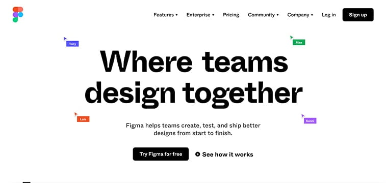
The effect achieved on this website is one of clear focus. It works because the only elements to use colors are the ones that provide the brand with a high return. Yes, other information is available as well. But, it’s presented in a muted way so that it doesn’t distract from the CTAs.
Establish Rules
Another great benefit of using the right colors on your website is that they can help you achieve the right harmony. A uniformly designed website isn’t just aesthetically pleasing. But, it can also help your customers have a better experience and inspire them to take action.
Look at it this way: colors have long been used to send universally accepted signals. The best example of this is, of course, the standard traffic light. Using the two colors, red and green, consistently across the globe, absolutely everyone in the world knows that the first one stands for “stop” and the second for “go.”
Now, you don’t have to go red and green on your website to help your customers know what to do next. You can very well achieve the same beneficial effect by applying your own color palette. Just make sure that you do so consistently and logically.
For example, the website Eachnight uses color to categorize the different types of articles they post. Mattress reviews are labeled with turquoise, sleep health research with purple, and bedding reviews with orange. Then, the strategy is taken a step further. The design team added custom-made graphics in the same colors, helping users know what to expect from each post.
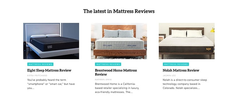
So, once a customer lands on the homepage and sees a large number of posts, they can quickly scan for the appropriate colors and get to the section they intend to visit, quickly and efficiently.
Don’t Go Overboard
If you’re planning a website redesign and looking for ways to boost conversions with color, your first instinct may be to go a bit overboard. However, you must keep in mind that the best way to elicit a reaction from web visitors isn’t to bombard them with page elements. Instead, it’s to prioritize the highest-value actions on your website. Then, present those in an eye-catching manner.
One direction that could help you achieve the desired effect is minimalistic design. Resting on the principle of surrounding impactful elements with negative space, it’s the perfect choice for websites that want to deliver a punch and ensure a conversion.
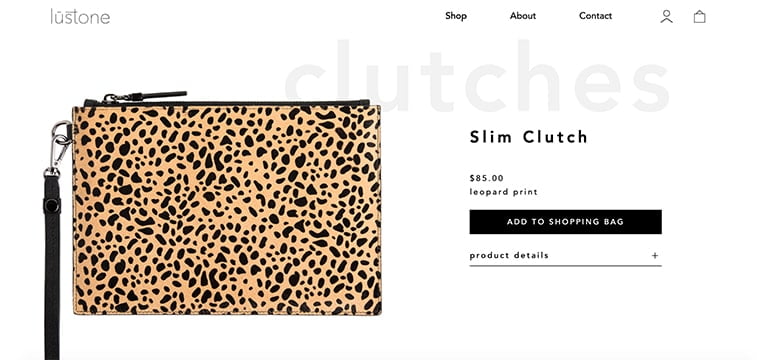
For example, the Lustone ecommerce store has the perfect formula to make users convert. The left side of the screen is dedicated to high-resolution product images. The right holds the product name, price, two-word description, and CTA button. Users who need more information can click on the product details expansion menu, while those who like the product don’t have to waste time and can get to their shopping right away.
There is one thing you need to keep in mind about minimalistic design and color. Although negative space is traditionally white, it doesn’t have to be. This means that you can use any hue you like for your background, as long as you uphold the rules of surrounding elements with sufficient blank room and using well-coordinated palettes.
Final Thoughts
As you can see, using colors to improve click-through and conversion rates doesn’t have to be complicated. However, it’s a strategy that relies on several design best practices to yield the desired results.
With this in mind, remember to choose your color palette with intention. You should have a limited number of visual highlights, and you must allow them to stand out if they are to be effective. Moreover, keep in mind that the best way to drive conversions is to base your decisions on data. You’ll want to test your visual elements and make any necessary changes.
Finally, account for the fact that many web visitors use dark mode on their devices. This can significantly impact the way your website appears to them. So, when making your color choices, ensure that they work with all browsers so as not to lose precious business due to poor planning.