Progress is a normal thing in life. People get older (and wiser), and so do brands learn and introduce new things over the years. Logo design is not an exception to this rule of thumb.
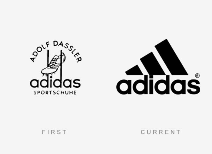
Think of a big brand logo, such as Adidas, for example. What image first crosses your mind? That cool three-striped sign with a name under it? We thought so. Well, this might surprise you, but their logo did not look like that back when the company was founded. Actually, it was derived from the name of its founder, Adolf Dassler, short Adi Das(sler), and it contained an image of a shoe, a brand name, and his name as well. Talk about today’s simplicity in branding.
This story is not lonely. Many brands developed over the course of time, and change is perfectly normal. The same thing happened to us here at PopArt Studio (see featured image which shows what our first logo was like).
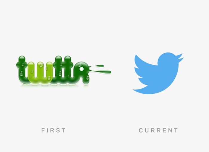
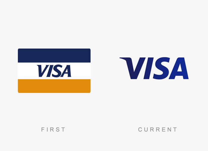
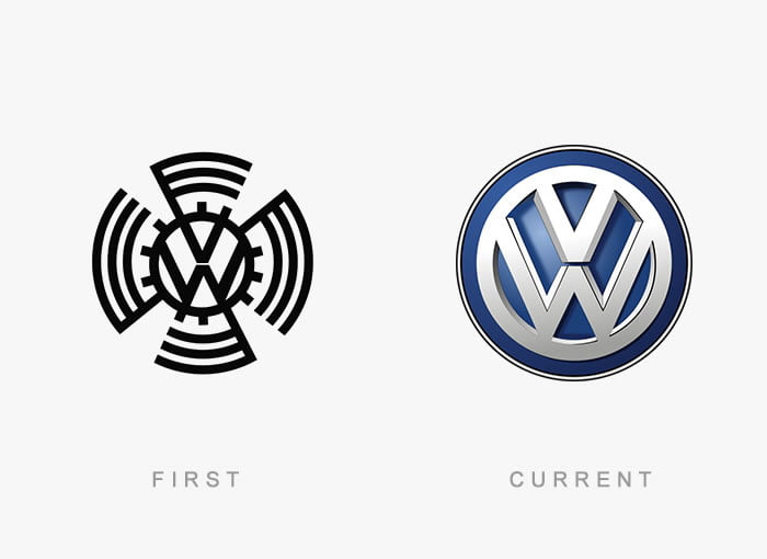
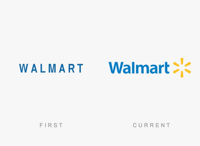
Bored Panda made a compilation of 50 brand logos at the beginning of their careers and now, creating a unique time machine.
Do you recognize some of the old logos? Which ones?
Adidas
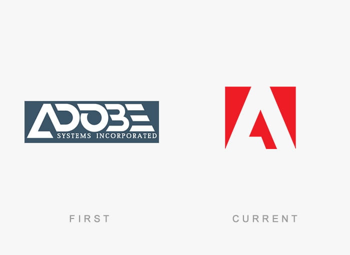
Adobe
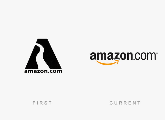
Amazon
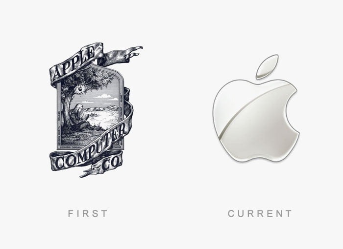
Apple
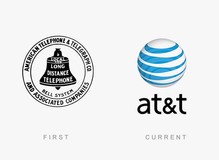
AT&T
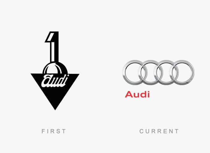
Audi
Bored Panda
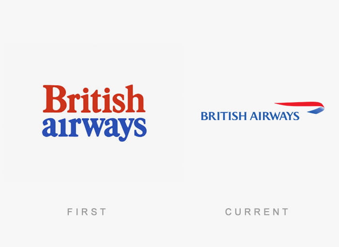
British Airways
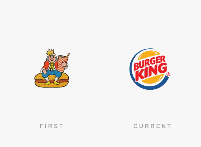
Burger King
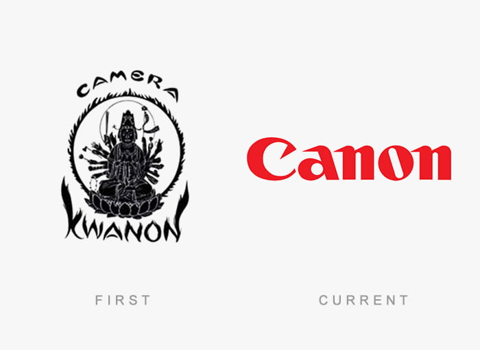
Canon
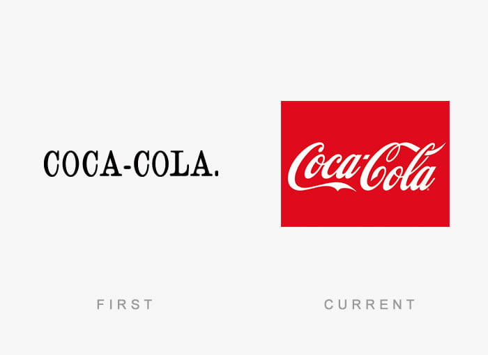
Coca Cola
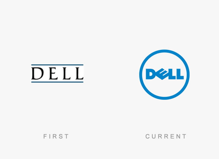
Dell
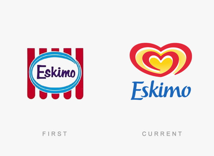
Eskimo
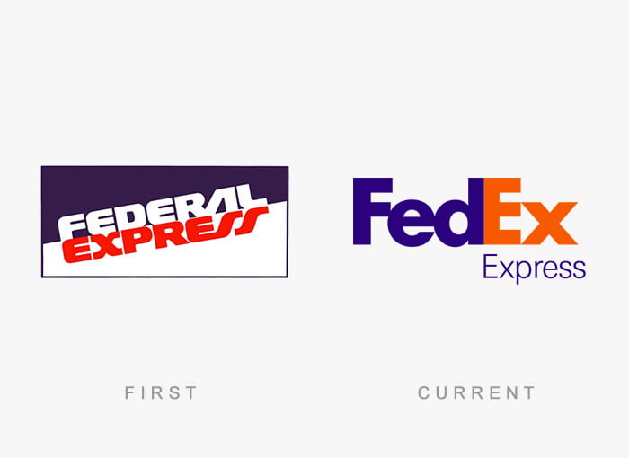
FedEx
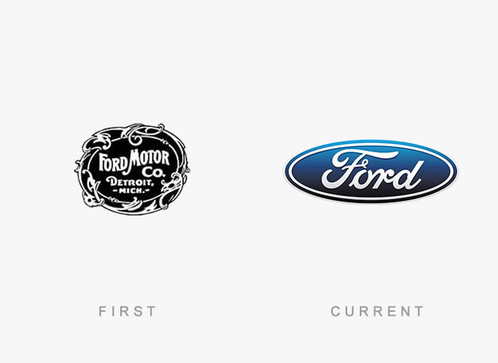
Ford
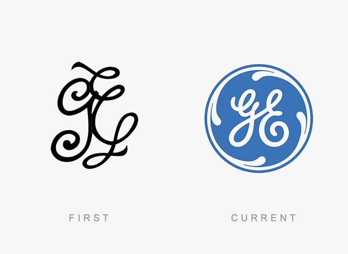
GE healthcare
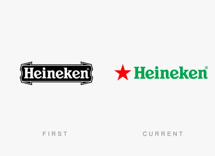
Heineken
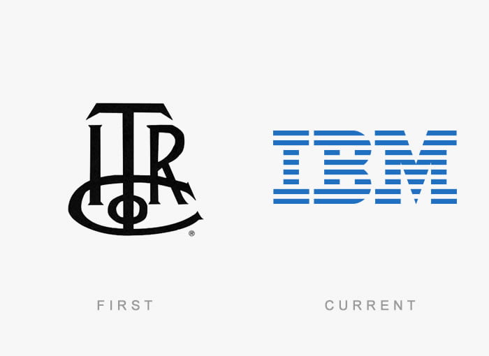
IBM
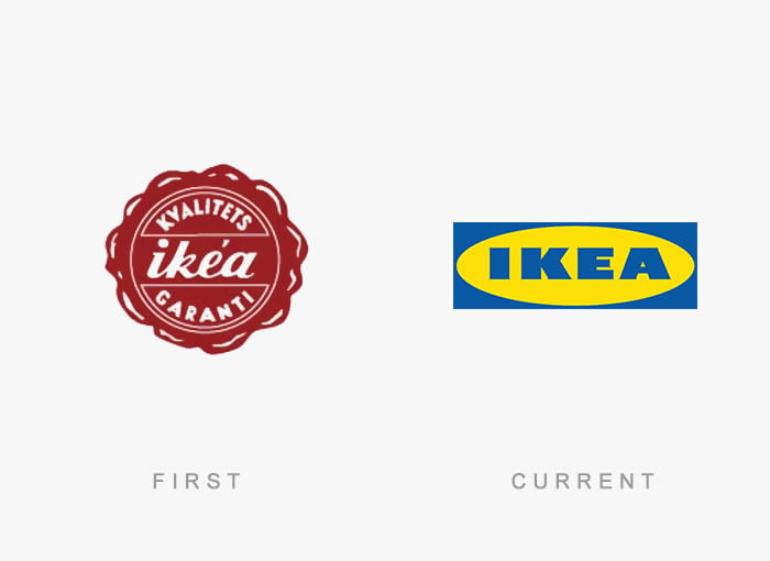
Ikea
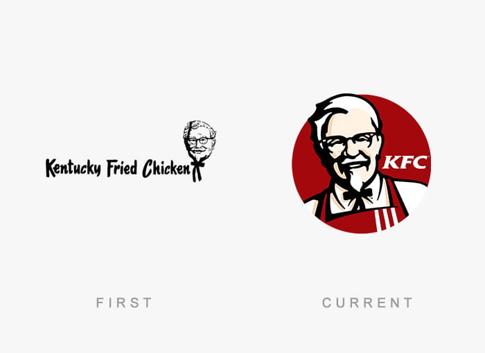
Kentucky Fried Chicken
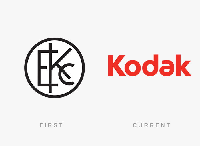
Kodak
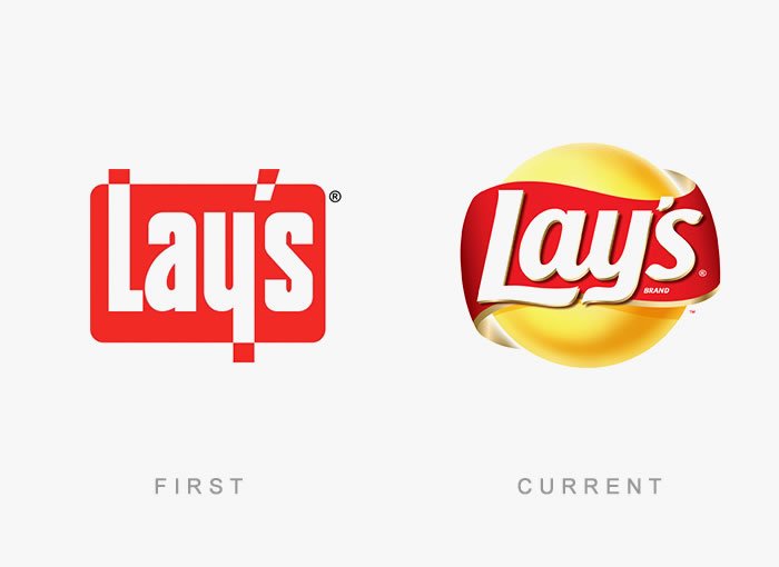
Lay’s
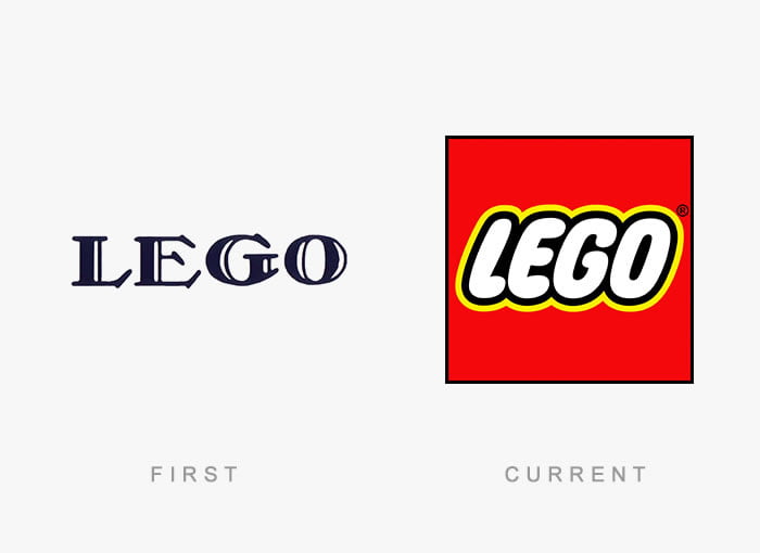
Lego
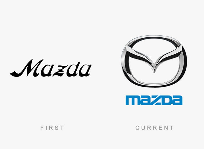
Mazda
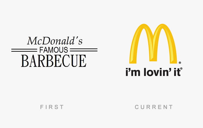
McDonald’s
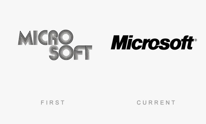
Microsoft
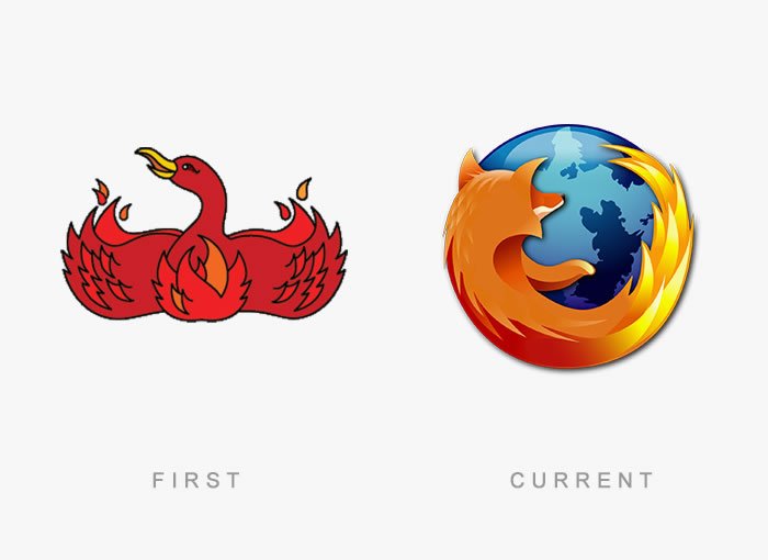
Mozilla Firefox
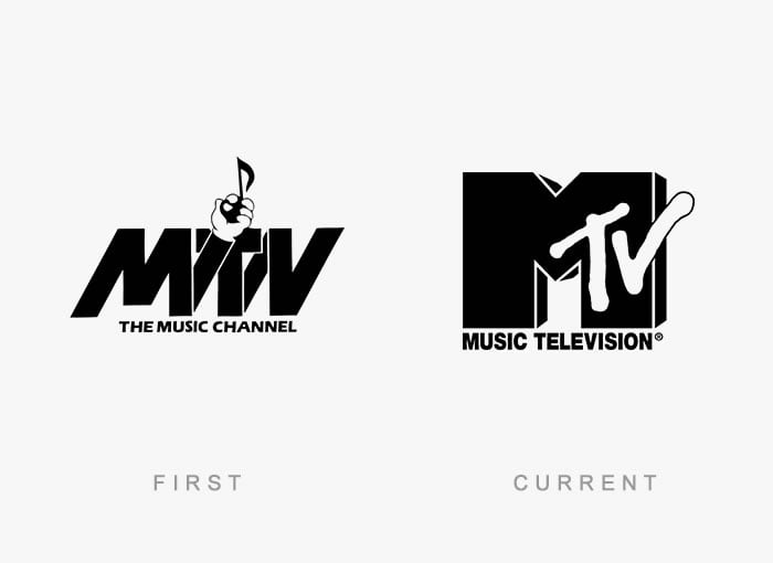
MTV
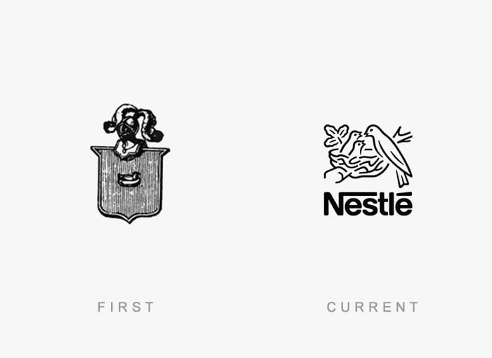
Nestle
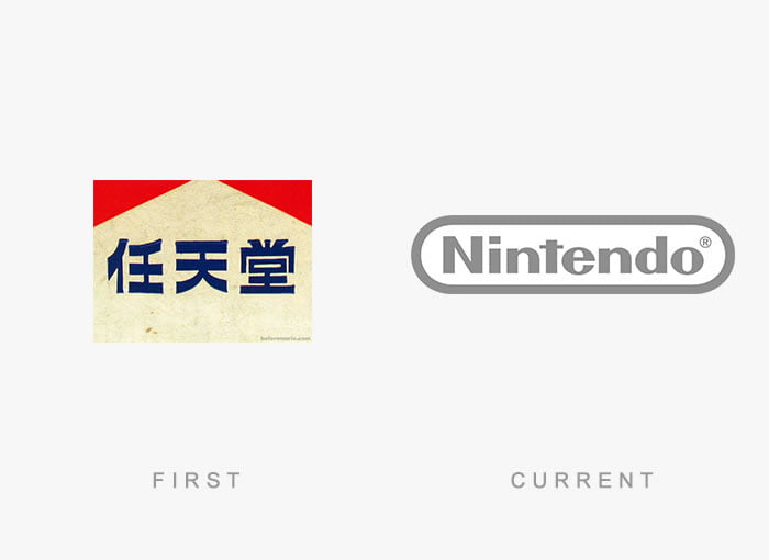
Nintendo
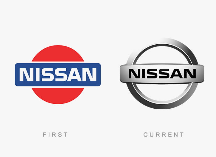
Nissan
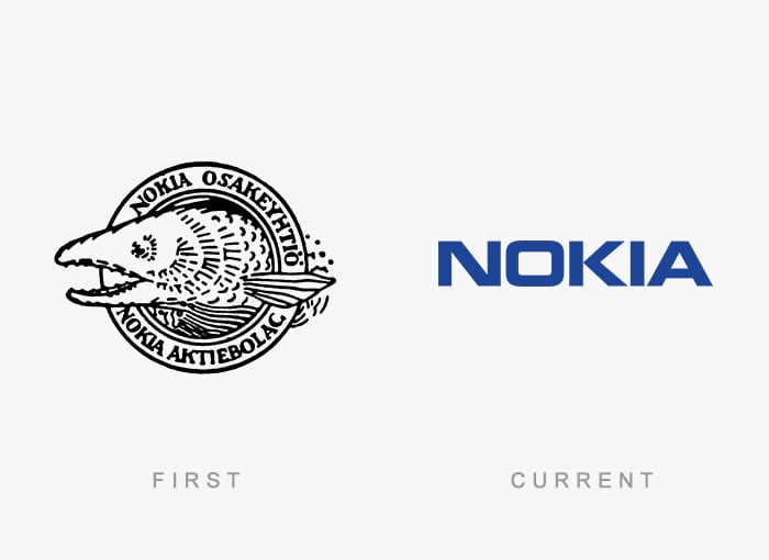
Nokia
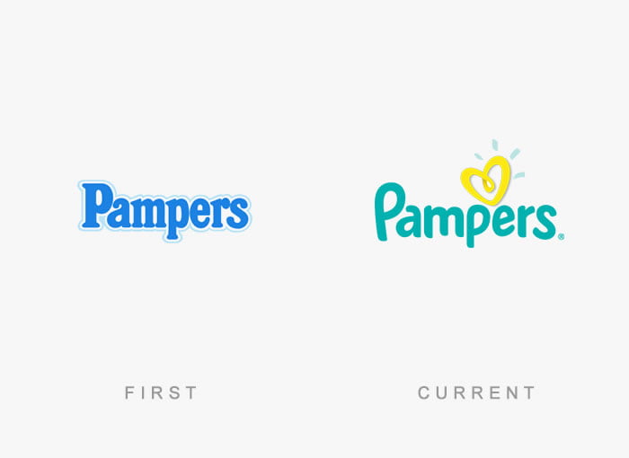
Pampers
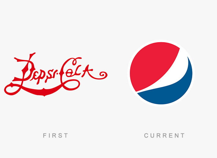
Pepsi Cola
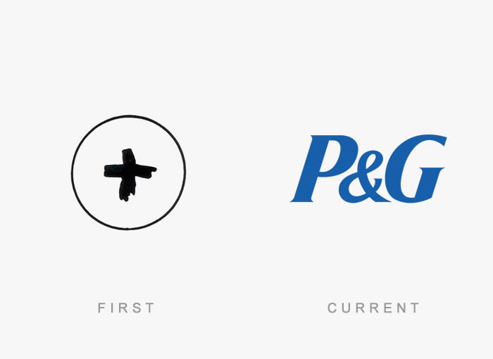
Procter and Gamble
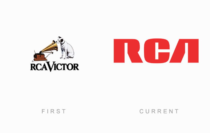
RCA
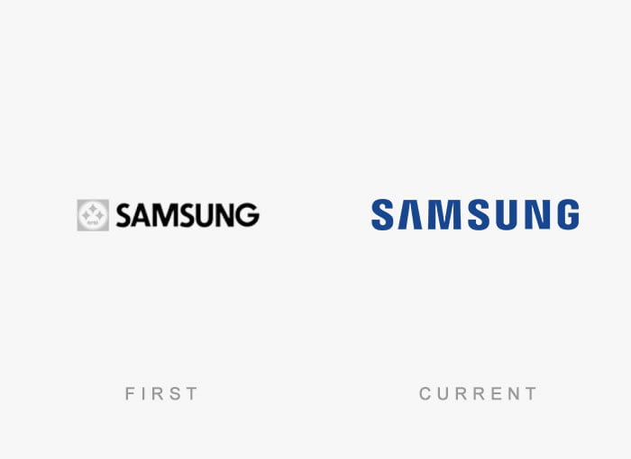
Samsung
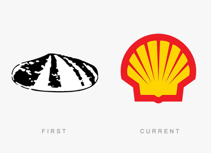
Shell
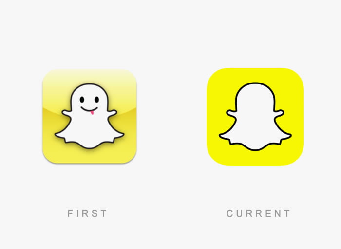
Snapchat
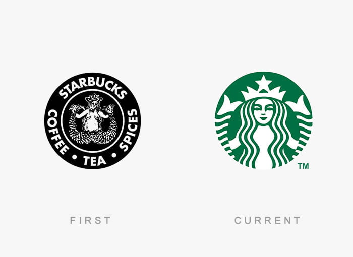
Starbucks
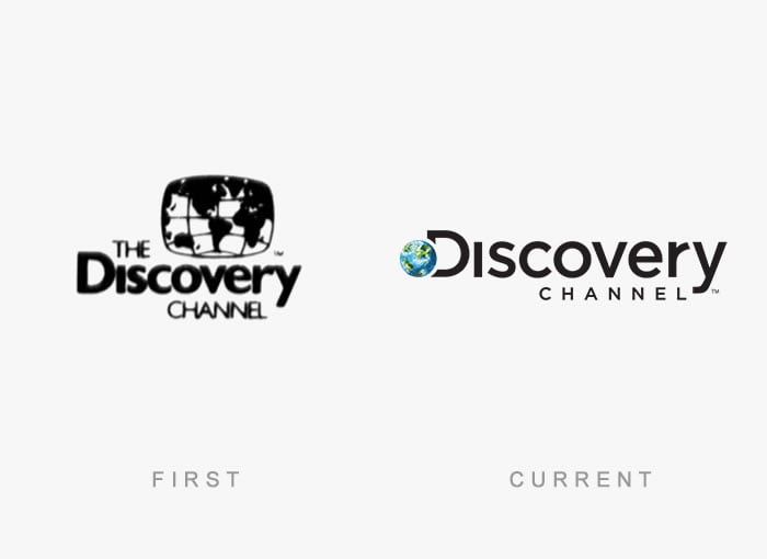
The Discovery Channel
Visa
Volkswagen
Walmart
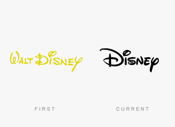
Walt Disney
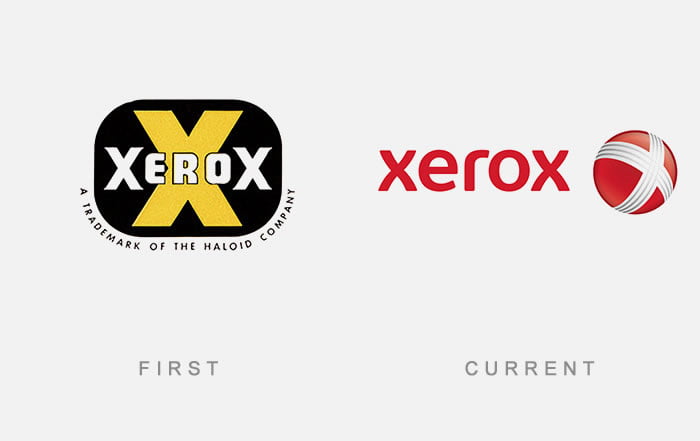
Xerox