Even though 88% of all websites load custom fonts, in 2026, the most reliable and fastest rendering still comes from web-safe fonts that are already available on your visitors’ devices. We are living in a world in which heavy assets and customizability take center stage, but pre-installed typefaces can still work (and should) as a part of a high-performance strategy for modern interfaces.The problem here is choosing aesthetics over functionality and performance. Most designers use the best fonts for websites based solely on how they look in a Figma mockup, rarely testing actual rendering across different systems. This leads to broken layouts, branding inconsistency, and more.
And while the global font market is projected to reach $4 billion, the most effective choices for Core Web Vitals often cost designers nothing, not even downloads. In this guide, we’ll be ranking the 20 most professional fonts for websites specifically for UI/UX work.
What Are Web-Safe Fonts (and Why Do They Still Matter in 2026)?
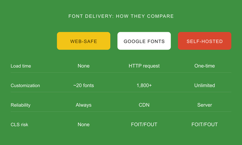
Web-safe fonts are pre-installed typefaces on most operating systems like Android, iOS, Windows, macOS, and Linux. Because they are already available on the users’ devices, they render without external downloads, eliminating additional HTTP requests along with “flash of unstyled text” (FOUT) or “flash of invisible text” (FOIT).
In today’s design trends, it’s important to differentiate between three key terms:
- Web-Safe Fonts: Think of Georgia or Arial. Universal classics that are available on almost all platforms.
- Web Fonts: Custom fonts (like Google Fonts) that the browser must fetch from a server.
- System Fonts: These are chosen by the OS developers to define the look and feel of the interface (like San Francisco for Apple).
Today, most websites load custom web fonts, yet still, web-safe typefaces are crucial for website speed optimization, either as reliable fallback stacks, assets for offline-first application or HTML email compatibility.
As a matter of fact, websites that avoid external fonts often see improved Core Web Vitals due to fewer requests and faster rendering. Not having to use external requests for them can reduce Largest Contentful Paint (LCP) by hundreds of milliseconds (often ~100–500ms depending on conditions).
While this does not seem much, even small delays (e.g., ~100ms) have been shown in studies to negatively impact conversion rates. Modern CSS generic families like system-ui, ui-sans-serif, and ui-serif have taken advantage of this approach, offering “web-safe-like” performance while maintaining an OS-native aesthetic with custom fonts.
Web-Safe Fonts vs. Google Fonts — When to Use Each
Google Fonts populate roughly 54% of desktop websites and 47% of mobile sites per 2025 HTTP Archive data. These are the most popular external font sources. Still, popular doesn’t necessarily mean optimal.
Whether you use pre-installed typefaces or external libraries depends on your branding requirements, fallback strategy, and performance budget. And while Google Fonts offers a huge library of 1,826 families, you only have 20 universally recognized system fonts that are web-safe.
Despite this variety, Google’s market share is declining every year, reflecting the growing trend of self-hosting and mobile-first design to prioritize performance.
Comparative Overview: Font Delivery Methods
Choosing the Right Tool for the Job
So, what should you use? Web-safe fonts should be your go-to for email templates, government, and/or high-accessibility projects, along with performance-dependent landing pages. They are also the mandatory foundation for any professional fallback stack.
Google Fonts, on the other hand, are great for projects that require a strong brand identity. Still, we recommend self-hosting the files for these projects and using font-display: swap to mitigate loading delays. Currently, most top pages have moved toward self-hosting to reclaim control over their Largest Contentful Paint (LCP).
The 20 Best Web-Safe Fonts for UI/UX Design
Opting for the right professional fonts means finding the right balance between aesthetics and reliability. This web-safe fonts list has been curated based on four strict criteria:
- universal cross-platform availability
- high readability at body-text sizes
- UI/UX versatility for elements like navigation and forms
- variable weight support.
All in all, the best website fonts need to make sure that your interface remains consistent across every OS.
To help you choose the best UI fonts for your project, we organized this guide into three categories: sans-serif (the UI workhorses), serif (for editorial/premium UI), and monospace (for code and data).
Best Sans-Serif Web-Safe Fonts (for Clean, Modern UI)
Sans-serif fonts are by far the most popular on digital interfaces, running on 85% (while Serif only 10%, monospace 3%, and 2% goes to other fonts) of the top 1000 websites currently. The clean geometry and open letterforms optimize screen readability, especially on small screens. They are ideal for everything: from simple landing pages to complex dashboards.
1. Arial
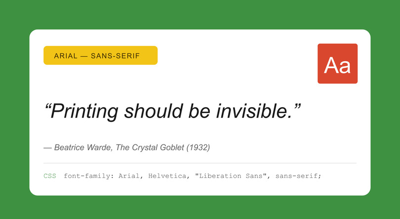
The Universal Baseline
- Category: Sans-serif | Designer: Robin Nicholas & Patricia Saunders, Monotype (1982)
- OS Coverage: Windows ✓ | macOS ✓ | iOS ✓ | Android ✓ | Linux ✓
- Best For: Body text, forms, and UI labels.
- Summary: These “simply work.” Not flashy, but it’s close to Helvetica, making it an essential for any fallback strategy.
- CSS Stack: font-family: Arial, Helvetica, “Liberation Sans”, sans-serif;
- Pro Tip: Use Arial as your baseline when A/B testing custom fonts; if metrics regress, your custom font is likely hurting performance or readability.
2. Helvetica
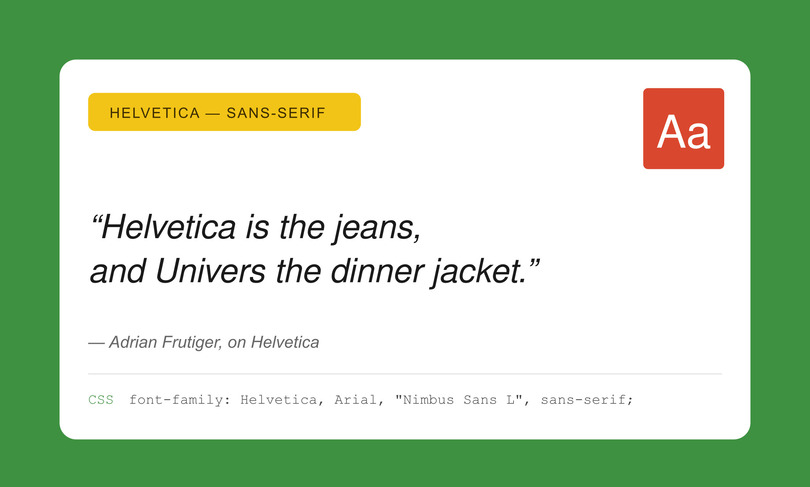
The Designer’s Default
- Category: Sans-serif | Designer: Max Miedinger, Haas Type Foundry (1957)
- OS Coverage: Windows ✗ | macOS ✓ | iOS ✓ | Android ✗ | Linux ✗
- Best For: Headings, navigation, and brand-forward UI.
- Summary: Authoritative, neutral, and clean. It’s usually missing from Android and Windows natively, so pair it with Arial for fallbacks.
- CSS Stack: font-family: Helvetica, Arial, “Nimbus Sans L”, sans-serif;
- Pro Tip: On Apple devices, Helvetica Neue offers more weights. Use it first in your stack for macOS/iOS users.
3. Verdana
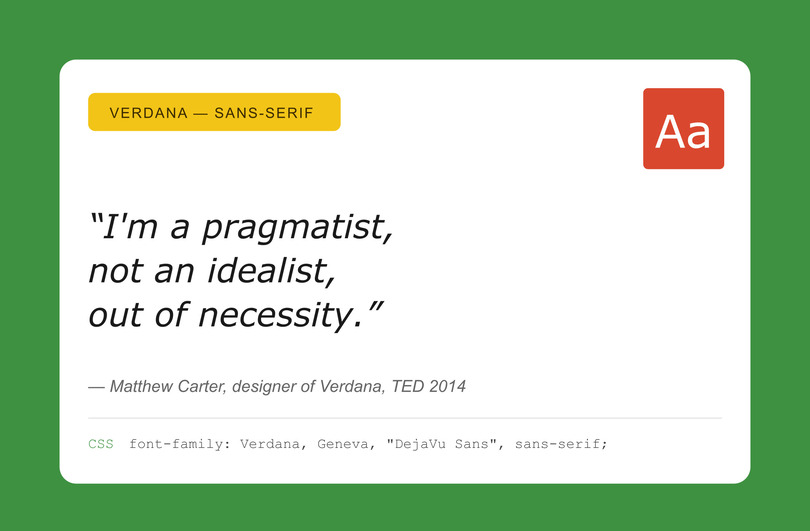
The Screen Readability King
- Category: Sans-serif | Designer: Matthew Carter, Microsoft (1996)
- OS Coverage: Windows ✓ | macOS ✓ | iOS ✓ | Android ✗ (Partial) | Linux ✓
- Best For: Small text, data-dense dashboards, and form labels.
- Summary: Specifically screen-engineered fonts. The wide letterforms and the great x-height make the fonts readable at even 12px and below.
- CSS Stack: font-family: Verdana, Geneva, “DejaVu Sans”, sans-serif;
- Pro Tip: If you need a Google Font with similar metrics, try Noto Sans.
4. Tahoma
The Compact Professional
- Category: Sans-serif | Designer: Matthew Carter, Microsoft (1994)
- OS Coverage: Windows ✓ | macOS ✓ | iOS ✗ | Android ✗ | Linux ✓
- Best For: Navigation bars, buttons, and compact UI elements.
- Summary: Verdana’s tighter version, better for putting characters into narrow horizontal spaces while keeping readability intact.
- CSS Stack: font-family: Tahoma, Verdana, “Segoe UI”, sans-serif;
5. Trebuchet MS
The Approachable
- Category: Humanist Sans-serif | Designer: Vincent Connare, Microsoft (1996)
- OS Coverage: Windows ✓ | macOS ✓ | iOS ✗ | Android ✗ | Linux ✓
- Best For: Blog headings, marketing pages, and friendly interfaces.
- Verdict: Has more personality than Arial but less formal than Verdana. A more approachable and warm font overall.
- CSS Stack: font-family: “Trebuchet MS”, “Lucida Grande”, “Lucida Sans Unicode”, sans-serif;
6. Segoe UI
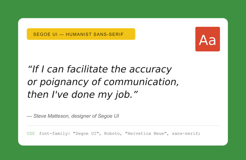
The Windows Standard
- Category: Humanist Sans-serif | Designer: Steve Matteson (2004)
- OS Coverage: Windows ✓ | macOS ✗ | iOS ✗ | Android ✗ | Linux ✗
- Best For: Windows-first apps and enterprise dashboards.
- Summary: A native Windows system font. Modern and clean, excellent hinting. Great for responsive design due to its variable weight support.
- CSS Stack: font-family: “Segoe UI”, Roboto, “Helvetica Neue”, Arial, sans-serif;
- Pro Tip: This is the stack used by GitHub. Pair it with Roboto for Android users.
7. system-ui
The Modern Performance Choice
- Category: Meta-font (Generic Family) | Year: CSS Fonts Level 4
- OS Coverage: Native per OS (San Francisco on Mac, Segoe on Windows, Roboto on Android).
- Best For: Any UI requiring a native platform feel.
- Summary: The most popular option for 2026, as it requires no downloads, while making sure that users see the font they are already most comfortable with.
- CSS Stack: font-family: system-ui, -apple-system, “Segoe UI”, Roboto, “Helvetica Neue”, Arial, sans-serif;
- Pro Tip: This is the recommended starting point for new projects; it’s the default for Tailwind CSS and Bootstrap 5.
8. Lucida Grande
The Refined Humanist
- Category: Humanist Sans-serif | Designer: Bigelow & Holmes (1985)
- OS Coverage: Windows ✓ (Lucida Sans) | macOS ✓ | iOS ✗ | Android ✗ | Linux ✓
- Best For: Sidebars, secondary navigation, and footnotes.
- Summary: A more refined font than Verdana with an added literary quality. Popular with long-time Mac users.
- CSS Stack: font-family: “Lucida Grande”, “Lucida Sans Unicode”, “Lucida Sans”, Geneva, sans-serif;
9. Calibri
The Corporate Documenter
- Category: Humanist Sans-serif | Designer: Luc(as) de Groot (2004)
- OS Coverage: Windows ✓ | macOS ✓ (via Office) | iOS ✗ | Android ✗ | Linux ✗
- Best For: Email templates and document-heavy interfaces.
- Summary: This is the default MS Office font. While not that prominent in modern design, it is essential if you target Outlook users.
- CSS Stack: font-family: Calibri, “Gill Sans”, “Gill Sans MT”, sans-serif;
10. Century Gothic
The Geometric Hero
- Category: Geometric Sans-serif | Monotype Imaging (1991)
- OS Coverage: Windows ✓ | macOS ✓ | iOS ✗ | Android ✗ | Linux ✗
- Best For: Headings, hero sections, and lifestyle branding.
- Summary: This font is modern, airy, with circular, large letterforms. Great for headings as it adds a premium feel, but should be avoided for small-body text, as it uses up a considerable amount of horizontal space.
- CSS Stack: font-family: “Century Gothic”, CenturyGothic, AppleGothic, sans-serif;
Best Serif Web-Safe Fonts (for Editorial & Premium UI)
Serif fonts are great for adding elegance and authority, paring it with excellent readability to long-form content. And even though 85% of top websites use sans-serif, serif remains a stellar choice for editorial layouts, financial interfaces, legal sites, and premium brand identities.
Modern, high-resolution screens have debunked the myth that serifs do not work on screens, and these four fonts can attest to that.
11. Georgia
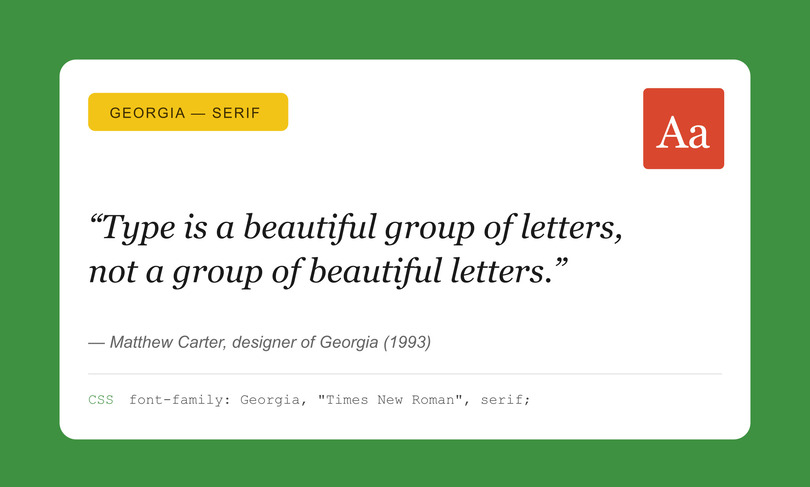
The Gold Standard for Screen Serifs
- Category: Transitional Serif | Designer: Matthew Carter, Microsoft (1993)
- OS Coverage: Windows ✓ | macOS ✓ | iOS ✓ | Android ✓ | Linux ✓
- Best For: Blog body text, article pages, and editorial layouts.
- Summary: Simply the best web-safe serif available. Specifically designed for screen clarity with a large x-height and open counters, it provides warmth and authority without the need for a custom font.
- CSS Stack: font-family: Georgia, “Times New Roman”, “Bitstream Charter”, serif;
- Pro Tip: Pair Georgia headings with a system-ui body for a powerful, high-performance editorial look.
12. Times New Roman
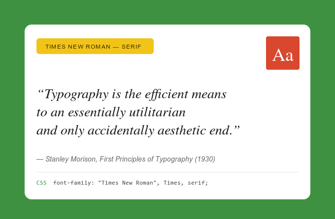
The Universal Authority
- Category: Transitional Serif | Designer: Stanley Morison & Victor Lardent (1931)
- OS Coverage: Windows ✓ | macOS ✓ | iOS ✓ | Android ✓ | Linux ✓
- Best For: Legal, academic, and financial interfaces; PDF generation.
- Summary: The most “omnipresent” serif font. A blend of tradition and formality, great for compliance interfaces and financial reports. Avoid it for modern consumer UI unless that specific formality is intended.
- CSS Stack: font-family: “Times New Roman”, Times, “Nimbus Roman No9 L”, serif;
13. Palatino / Book Antiqua
The Elegant Humanist
- Category: Old-style Serif | Designer: Hermann Zapf (1948)
- OS Coverage: Windows ✓ | macOS ✓ | iOS ✓ | Android ✗ | Linux ✓
- Best For: Long-form content, luxury brand UI, and portfolio sites.
- Summary: More calligraphic and warmer than Georgia, making it an excellent option for creative agencies and luxury brands that want to appear elegant without the performance drawbacks associated with custom downloads.
- CSS Stack: font-family: Palatino, “Palatino Linotype”, “Book Antiqua”, “URW Palladio L”, serif;
14. Garamond
The Literary Classic
- Category: Old-style Serif | Designer: Claude Garamond (16th Century)
- OS Coverage: Windows ✓ | macOS ✓ | iOS ✗ | Android ✗ | Linux ✗
- Best For: Book-like reading experiences and storytelling interfaces.
- Summary: The most literary web-safe font. The slender letterforms enable engaged reading; however, because of its delicate strokes, it reads best at 16px or larger.
- CSS Stack: font-family: Garamond, “EB Garamond”, “Times New Roman”, serif;
Best Monospace Web-Safe Fonts (for Code & Data UI)
Monospace fonts give every character equal width, making them essential for things like data tables, code blocks, and terminal UIs where vertical alignment is critical. We highlighted four web-safe monospace fonts that provide the necessary structure for everything from technical documentation to financial dashboards.
15. Courier New
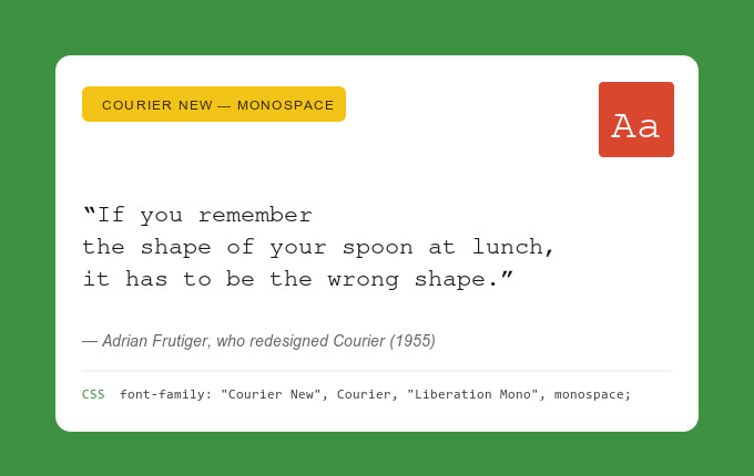
The Universal Monospace Standard
- Category: Slab Serif Monospace | Designer: Howard Kettler & Adrian Frutiger (1955)
- OS Coverage: Windows ✓ | macOS ✓ | iOS ✓ | Android ✓ | Linux ✓
- Best For: Code snippets, legal documents, and retro/typewriter aesthetics.
- Summary: Available on every device, more or less. It may lack the modern feel of newer coding fonts, but it is the most reliable for fallback strategies.
- CSS Stack: font-family: “Courier New”, Courier, “Liberation Mono”, monospace;
16. Consolas
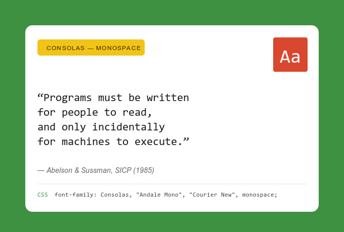
The Developer’s Windows Favorite
- Category: Sans-serif Monospace | Designer: Luc(as) de Groot (2004)
- OS Coverage: Windows ✓ | macOS ✗ | iOS ✗ | Android ✗ | Linux ✗
- Best For: Code editors, developer tools, and technical documentation.
- Summary: Most consider this the best-looking monospace font on Windows because of its ClearType optimization. If you target audiences who develop using Windows, this font should be your go-to choice for code blocks.
- CSS Stack: font-family: Consolas, “Andale Mono”, “Courier New”, monospace;
17. Lucida Console
The Choice for System Logs
- Category: Sans-serif Monospace | Designer: Bigelow & Holmes (1993)
- OS Coverage: Windows ✓ | macOS ✗ | iOS ✗ | Android ✗ | Linux ✗
- Best For: Terminal-style UIs, status displays, and system logs.
- Summary: The letterforms are wider than Courier New, making it more readable at small sizes. This makes it an ideal choice for system monitoring dashboards and terminal-style interfaces.
- CSS Stack: font-family: “Lucida Console”, Monaco, “Courier New”, monospace;
18. Monaco
The Mac Classic
- Category: Sans-serif Monospace | Designer: Susan Kare, Apple (1984)
- OS Coverage: Windows ✗ | macOS ✓ | iOS ✗ | Android ✗ | Linux ✗
- Best For: macOS-native terminal UIs and developer documentation for Apple users.
- Summary: This is the classic macOS monospace font, known to be compact, clean, and highly legible. While Menlo has largely superseded it as the default, Monaco remains a staple in stacks designed for the Apple ecosystem.
- CSS Stack: font-family: Monaco, Menlo, Consolas, “Courier New”, monospace;
Modern System Font Stacks (The “New Web-Safe”)
Nowadays, some may use the terms “system font” and “web-safe” almost interchangeably, as CSS generic families like system-ui and ui-monospace offer designers almost native-quality typography while not having to download any fonts.
The entries below represent options for a cutting-edge web-safe approach, if you want speed and platform-native aesthetics.
19. ui-sans-serif / ui-serif / ui-monospace
The Future of Web-Safe Typography
- Category: CSS Fonts Level 4 Generic Families
- OS Coverage: Automatically maps to each OS’s preferred UI font (e.g., San Francisco on iOS, Segoe UI on Windows).
- Best For: Design systems, component libraries, and any project where a native feel is paramount.
- Summary: These CSS generics tell the browser to use the intended UI font of the operating system. Radix UI and Tallwind CSS, along with other frameworks, tend to use these because they come at zero performance cost and total consistency on the platform.
- CSS Stack: font-family: ui-sans-serif, system-ui, sans-serif;
20. -apple-system / BlinkMacSystemFont
The Legacy System Shorthands
- Category: System Font Shorthand (Pre-system-ui Era)
- OS Coverage: macOS/iOS (-apple-system), Chrome/Blink (BlinkMacSystemFont).
- Best For: Backward-compatible system font stacks and legacy browser support.
- Summary: Before system-ui gained universal support, these vendor-specific keywords served the same purpose. They are still included in most professional production font stacks to ensure compatibility with older versions of Safari and Chrome.
- CSS Stack: font-family: -apple-system, BlinkMacSystemFont, “Segoe UI”, Roboto, Helvetica, Arial, sans-serif;
How to Build a Bulletproof CSS Font Stack
What makes a great font stack? It’s essentially a list of typefaces on your font family declaration that makes sure that the text on your pages renders accurately and instantly, regardless of device.
In order to maximize your page speed optimization efforts, you need to create a stack that follows a three-layer structure:
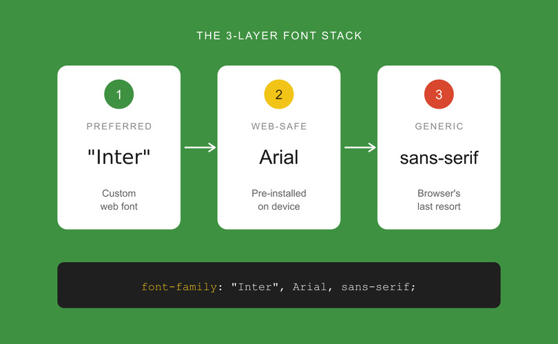
- Preferred font (custom web font)
- Web-safe visual match (pre-installed fallback)
- CSS generic family (the browser’s last resort).
In essence, you are making sure that the factors that influence UX are always intact, preventing layout shifts. Here are three copy-paste-ready examples for 2026:
Modern Sans-Serif Stack:
- font-family: system-ui, -apple-system, “Segoe UI”, Roboto, “Helvetica Neue”, Arial, “Noto Sans”, “Liberation Sans”, sans-serif;
Editorial Serif Stack:
- font-family: Georgia, “Times New Roman”, “Bitstream Charter”, “URW Bookman”, serif;
Code/Data Monospace Stack:
- font-family: ui-monospace, SFMono-Regular, Menlo, Monaco, Consolas, “Liberation Mono”, “Courier New”, monospace;
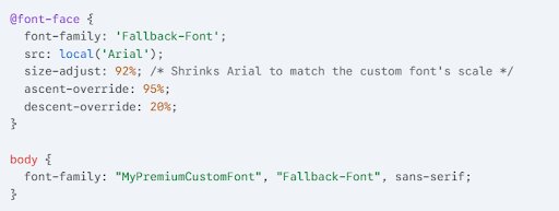
Advanced: Eliminating CLS with Font Metric Overrides
Even if you have a good fallback, the layout might seem to “jump” a bit when your custom web font finally loads, because of different font widths and heights. If you use font face descriptors like size-adjust, ascent-override, and descent-override, you can force a system font to match the exact footprint of a premium typeface.
Example: Matching Arial to a Custom Web Font
Testing Your Stack
To test out your configuration, open Chrome DevTools, find the Elements tab, where you can select a text node. To see which font is actually being displayed on the screen at the moment, find the “Rendered Fonts” section, where you can check.
Having a solid CSS font stack strategy offers layered feedback so browsers will always render the text instantly, starting with the prioritized font and degrading to web-safe alternatives if needed.
Web-Safe Fonts and Accessibility — WCAG Typography Checklist
Accessible websites enhance user reach and engagement. As of now, the WCAG 2.2 does not talk about mandatory typefaces; choosing the right font is a critical factor if you are optimizing user experience and inclusivity. This means using typography that offers resizable text, readable line lengths, and sufficient contrast.
WCAG 2.2 Typography Requirements
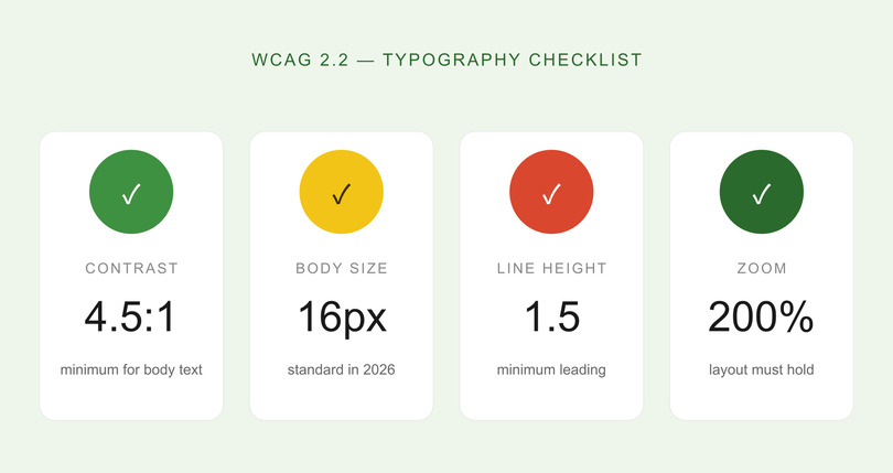
To nail compliance and user-friendliness, your web-safe font implementation should be guided by these technical benchmarks:
- Contrast Ratios: Minimum 4.5:1 for body text and 3:1 for large text (18pt+ or 14pt bold).
- Text Resizing: The layouts should remain functional even if you zoom the text to 200%.
- Spacing: The leading (or line height) should be at least 1.5, and the paragraph spacing should be at least 2x the font size.
- Size: 16px has become the standard for body text in 2026, and 14px is the minimum for secondary metadata.
The Most Accessible Web-Safe Choices
Regarding readability, Verdana is often cited as the best for web-safe accessibility, because of the large x-height and solid letter spacing. Georgia has high-contrast strokes that remain readable for users with vision problems. Arial is a clean and universal baseline.
On the other hand, you should avoid Impact for text body because of the cramped spacing, or using Courier at small sizes, as it can “wash out.”
Among common UX myths, the notion that accessibility limits creativity stands out. We would argue that instead of limiting it, it refocuses it, pushing designers to create cleaner, more intuitive, more functional, and often bolder designs.
Web-safe fonts improve accessibility by evening out rendering across all assistive tech. Verdana and Arial are safe bets, meeting WCAG 2.2 readability guidelines without additional CSS overrides.
How to Choose the Right Web-Safe Font for Your Project
Your project’s primary function should dictate what font you will use, besides pure aesthetics. To maintain the psychology of visual branding, it’s best to match the typeface with the context of the UI: dashboards with lots of data can benefit from Verdana’s wide letterforms, while editorial blogs do fine with Georgia.
Strategic Decision Framework
Here’s an example of how you can select your baseline based on your interface’s primary objective:
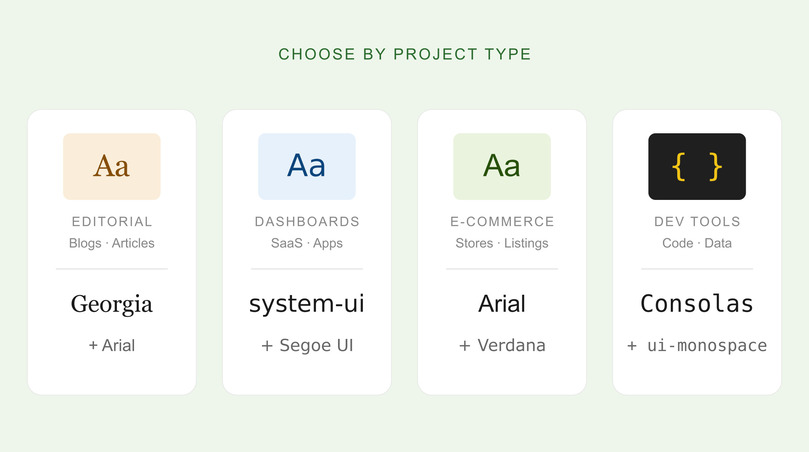
- Blogs and Editorial: Georgia and Arial (for headings and body). System-ui may also suffice with Georgia. The combination creates a perfect balance of readability and authority.
- eCommerce: Arial and Verdana are both optimal for quick scanning in product lists, and are compatible on every device.
- Dashboards and Saas: system-ui or Segoe UI + Roboto stacks are great because they feel native and load fast.
- Enterprise and Corporate: Calibri and Segoe UI both offer a professional aesthetic that’s already present in most business tools that people use daily.
- Developer Tools: Choose Consolas or ui-monospace for high-precision, code-optimized layouts.
Lastly, when pairing fonts with color schemes, don’t forget to use Serifs for Authority, Monospace for a Technical Edge, and Sans Serifs for Neutrality.
FAQ: Web-Safe Fonts for UI/UX Design
What Are Web-Safe Fonts and Why Do They Matter in 2026?
These are pre-installed typefaces on most OS systems, and they are important because they render without the need for external downloads. This eliminates shifts in your page layout and improves loading speeds. Even today, when most sites use custom web fonts, web-safe options are critical for fallbacks and still are the fastest text-rendering options.
What is The Difference Between Web-Safe Fonts and Google Fonts?
Web-safe fonts are pre-installed on devices, while Google Fonts are externally hosted, and the browser must fetch them (this means additional HTTP requests and potential render delays). There are over 1,826 Google Font families, adding a lot of options, but web-safe fonts are still considered better as they are more reliable and offer better performance. Experts usually offer combining them by using Google Fonts as a primary and a similar web-safe alternative as a fallback.
Which web-safe fonts are best for UI/UX design?
The optimal choice depends on your content type and target platform. Still, for modern UI, system-ui can be great, along with Arial and Segoe UI. For code and data-heavy interfaces, ui-monospace and Consolas can work. For editorial purposes, Georgia remains one of the best options.
Are web-safe fonts still relevant when Google Fonts exists?
Yes, these are the most important fallbacks if Google’s CDN is slow or blocked. Web-safe fonts provide immediate text rendering, and they are the only viable option for HTML email compatibility across Outlook, Apple Mail, and Gmail.
How do web-safe fonts affect website performance and speed?
There are zero additional requests, making these the fastest-rendering typography option. External font files add around 10–100+ KB per weight/style, plus DNS lookup time. This means that sites that only use system fonts have faster LCP (Largest Contentful Paint) and zero font-related Cumulative Layout Shift (CSL). Both of these are Core Web Vitals metrics for SEO.
Putting it All Together
Web-safe fonts are still a cornerstone of high-performance UI/UX design. While custom fonts offer more freedom regarding creativity and branding, the reliability and speed that come from pre-installed typefaces are superior if you want to optimize for Core Web Vitals. If your strategy puts performance first, web-safe fonts eliminate layout shifts, improve accessibility, and loading speeds.
Key Takeaways
- Performance Foundation: Instead of thinking about them as outdated, look at them as the most reliable way to improve CLS and LCP.
- Modern Evolution: CSS generic families like system-ui offer zero load time and native-platform aesthetics.
- 3-Layer Stacks: Always structure your CSS as: Preferred Font → Web-Safe Match → Generic Family.
- Metric Overrides: Use size-adjust and ascent-override to perfectly match fallbacks to custom fonts.
- Cross-Platform Testing: Always verify rendering across every OS.
If you need help with choosing the right typography for your next project, remember that the team at PopArt Studio offers expert UI/UX design services and has the tools to help you build a high-performance interface that looks great and loads fast.