Blue can fill you with inner peace and relief, yellow can cheer you up, and white can quickly remind you of your childhood. Each color can evoke specific feelings, making it ideal for reinforcing branding strategies.
Some can even be the main push behind a purchasing decision. That’s why marketers and graphic designers pay special attention to colors in branding psychology.
The right palette helps send the intended message and appeal to the target audience. For example, orange conveys the zest and refreshment that stimulates consumers to grab Fanta during a hot day. Meanwhile, people associate green with health and vitality, a part of why Whole Foods is among the most revered organic product brands.
You can use color psychology in marketing and branding to your advantage. Below, you’ll learn everything you should know about how to use different palettes to shape and communicate your brand’s values, goals, and characteristics.
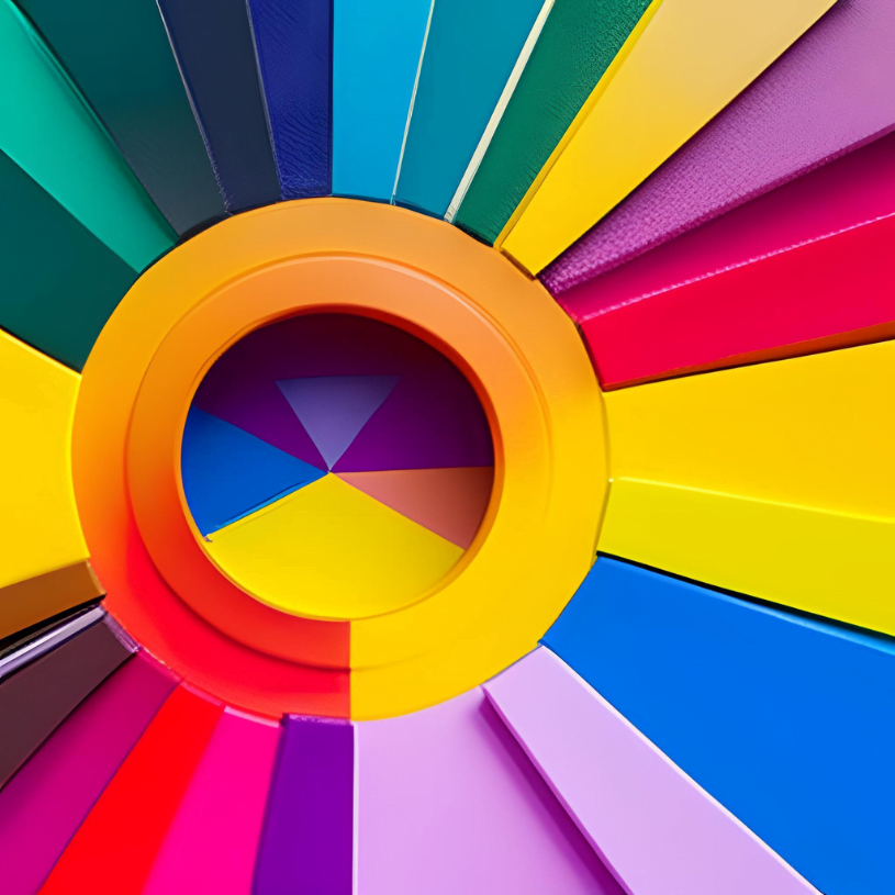
What is Color Psychology in Branding?
Color psychology itself focuses on how colors impact human emotions, behaviors, and decisions. Since different tones, hues, and palettes bring up unique mental connections, they can influence mood and choices.
The same applies to the psychology of colors in branding and marketing – colors can determine how consumers perceive a brand or product, affecting their decision-making. Web and graphic designers and marketers use them to shape their perception of a company’s visual image, aiming to increase sales and loyalty.
That’s a highly effective practice concerning that shoppers base around 85 percent of their purchasing choices on colors. Even more will buy a product if they only like its visual appearance.
Colors also play a central role in consumers’ first impressions of a brand. If they misalign with your purpose, ethos, and services, you might fail to convert leads.
Culture, gender, and age may skew these perceptions. For instance, although blue is the universally beloved color, young adults prefer intense tones, while older ones gravitate toward softer palettes. Moreover, red alludes to purity in India, but those in Western countries associate it with passion and danger.
The Impact of Color Psychology in Branding
Understanding colors in branding psychology can be crucial in influencing consumers’ behaviors. These insights not only allow you to identify the precise reactions that particular hues might evoke but also to evaluate the alignment between your brand’s color palette and its intended message. This aspect is essential when selecting the signature color, as it serves as the catalyst for eliciting recognition among potential customers.
But it will also determine the logo palette and overall aesthetic, both of which contribute to the formation of a brand identity. Here’s how colors may convey different messages.
Red
Around 29 percent of the most recognizable brands globally use red as their main color. After all, most people associate it with fearlessness, intense energy, zest, and excitement, making it ideal for stimulating consumers to take action.
Web and graphic designers often use red for CTA buttons, nudging lead conversions and giving off a sense of urgency. Human bodies also naturally respond to this color, as it increases blood pressure and heart rate. No wonder red can induce hunger and excitement, but also a need for greater force and speed.
On the flip side, it may also trigger negative feelings, including hostility, anger, danger, and pain. That’s why marketers and graphic designers must be careful when using red; too much can leave an overly aggressive impression.
Brands typically use the red color to appeal to consumers’ emotions, hoping to convey ideas of desire, passion, and intensity. Coca-Cola, CNN, Bugatti, Netflix, and Red Bull are among the best-known and most successful examples of using it to grab the attention of a diverse audience and position themselves as the dominant choice in their respective industries.
Blue
Blue takes the trophy for the world’s most popular color. People associate it with safety, stability, trustworthiness, neutrality, and peace.
Although it has a calming and soothing effect, it also appeals to emotions. This color evokes loyalty, responsibility, and commitment. It rarely has negative connotations, explaining why many brands choose blueish tones.
However, some may also associate this color with predictability, depression, sadness, and conservativism. Using too much blue for a company’s logo or brand visuals can come off as uncaring, aloof, and cold, requiring web and graphic designers to choose the tone carefully.
It’s also not the best choice for food products due to being the only appetite suppressant in the color spectrum. Instead, brands should use it to convey credibility, integrity, and knowledgeability. Visa, IBM, Dell, Ford, and LinkedIn have all leveraged blue to highlight their reliability and instill trust among consumers.
Yellow
While often heralding traits of youthfulness, exuberance, and joy, the color yellow has found itself amid a curious juxtaposition – adored for its energetic connotations yet ranking as one of the less preferred hues globally, accompanied by brown and grey. Interestingly, its web presence has been met with a touch of ambivalence, with some finding its radiance a tad intense for comfort, occasionally feeling somewhat assertive.
However, amidst this kaleidoscope of opinions, lies a golden opportunity – the chance to harness the sheer warmth, cheer, and boundless creativity that yellow can infuse into a design landscape. It’s intriguing how this color, often associated with extroversion, holds a particular resonance within the realm of web design, particularly within the culinary domain, where it possesses a knack for whetting the appetite.
Take a glimpse at the luminous arches of McDonald’s, the zesty charm of Subway, or the invigorating aura of Shell – these global brands have adeptly harnessed the vivacious spectrum of yellow to captivate their audience. Not to mention the likes of Pringles, Schweppes, National Geographic, and IKEA, each weaving their narratives through this vibrant thread. It’s a reminder that the judicious use of yellow can kindle a sense of connection with the viewer, evoking feelings of contentment and curiosity.
Nonetheless, as with any artistic palette, finesse and nuance are key. While yellow radiates warmth, it can also be perceived as cautionary, reminding us to tread thoughtfully. Striking the right balance between vivacity and restraint becomes pivotal, as the color’s journey through emotions is as dynamic as the web itself.
Orange
Orange is also among the less favored colors in web and graphic design. It may generate feelings of self-indulgence, triviality, sluggishness, and frustration.
However, orange has positive connotations, including confidence, flamboyance, extroversion, sociability, and optimism. According to HuffPost, it increases oxygen supply to the brain, creates an energizing effect, and stimulates cerebral activity.
Brands use it to convey intense energy, creativity, friendliness, anticipation, and cheerfulness. MasterCard, Fanta, Hooters, Harley-Davidson, and Nickelodeon are the best-known examples of including this color in their logo and brand identity.
Green
Nearly 40 percent of people link this color with contentment. As it brings upon feelings of hope, new beginnings, freshness, health, and prosperity, it’s often associated with life.
Moreover, it’s restful for the eyes, generating the least eyestrain. Green is the most popular choice of organic brands aiming to highlight the quality of their products. The best-known examples are Mint, Starbucks, Tropicana, and Green Giant.
However, green also conveys nature, prosperity, growth, and luxury. That’s why it’s not only the symbol of companies producing high-quality food and drinks. Other popular brands using green in logos and visuals are Spotify, Land Rover, BP, and Xbox.
Purple
People associate purple with superiority, fantasy, femininity, sophistication, melancholy, and wisdom. In the past, many ancient rulers and royal families wore this color to make a distinction between them and the lower class.
To this day, many brands use purple to signal first-rate service, experience, and quality. However, it may also represent excess, conceit, immaturity, and decadence.
The best-known examples of using this unorthodox color in brand identity are FedEx, Yahoo, Claire’s, SyFy, Cadbury, and Los Angeles Lakers.
Pink
Feminine and intense, pink is known as the girly color representing youthfulness, quirkiness, innovation, and imagination. Many brands, such as T-Mobile, lean into this color to differentiate themselves from competitors.
Other revered examples of companies with pink logos and visuals are Barbie, Avon, Victoria’s Secret, Cosmopolitan, Lyft, and Donut King. However, this color may also be overly intense for the eyes or have negative connotations, such as rebelliousness and childishness.
White
White represents cleanliness, purity, innocence, and simplicity. Businesses aiming to achieve a sleek, modern, and minimalist look typically go after this color in combination with silver tones.
But it can also come off as sterile, plain, and cheap. Some also consider it inexpressive.
Yet, whitespace is an essential component of a successful web design, as it helps engage users, create balance, and give a quick break when browsing. White is rarely present as the principal color in a brand’s logo, but MAC Cosmetics, Estee Lauder, and Sephora are the best-known examples.
Black
Elegance, sophistication, power, substance, authority, and security are the usual connotations people imagine when seeing black color. Brands typically use it to come off as sleek, modern, and classic.
However, some also perceive it as aggressive, heavy, sad, or evil. It’s a popular choice for logo design in the fashion and car industry, with Nike, Adidas, Puma, Chanel, Honda, Mini Cooper, and Nissan being the most popular examples.
How to Use Color Psychology in Branding?
The crucial part of using colors in branding psychology is understanding what each color represents and how these perceptions align with your brand. Learn about the color theory in design to effectively play with different tones to convey the intended messages.
Consider what emotions you want to evoke among consumers to reinforce your storytelling and highlight your products and services. Check how other brands do it for inspiration and a better understanding of the trends in your industry. But always keep in mind the cultural code and your target audience’s gender, age, and preferences.
Color Preferences by Age and Gender
For instance, people between 18 and 24 prefer purple and are more in touch with their emotions, meaning they don’t mind unusual palettes. Blue is a safe choice, as it’s the favorite color of 57 percent of men and 35 percent of women.
Avoid yellow, orange, brown, grey, and green in large amounts unless they’re essential for your branding messaging, values, and niche. Be wary of using too much white, as many perceive it cheap and inexpressive.
Men prefer bright tones and tolerate achromatic colors more than their female counterparts. They favor colors with a black shade, while women love soft palettes and colors with a white highlight.
Final Thoughts
Ultimately, consistency and alignment with your branding and niche are crucial. Choose tones that match your company’s values, goals, and mission.
These colors will serve as the principal recognition point among consumers, meaning they should appeal to your target audience. That can be challenging as you must consider multiple factors, especially if you’re only starting.
You may consider professional help to select the most effective colors for your custom web design services. A well-thought-out and careful approach is essential for developing a striking brand identity that grabs attention.