Are you a budding entrepreneur launching your company's digital presence or perhaps an established business contemplating a website overhaul? Regardless of your position in the web development journey, one concept you can't afford to overlook is "mobile-first design."
In this digital era, the notion of mobile-first design is more vital than ever. While you’ve probably encountered terms like “mobile-friendly” and “responsive design” in your web development exploration, it’s time to dig deeper and comprehend the nuances of mobile-first design. Think of it as distinguishing between a burrito and an enchilada: similar but inherently different.
Understand The Importance of Mobile-First Web Design: Distinguishing Between Mobile Friendly vs. Responsive Design vs. Mobile-First
Before we tackle the benefits of having a mobile-first and responsive design, it’s vital that we fully understand the different terms often used interchangeably to cover the relationship between smartphones and web design. As you’ll see, sometimes, the differences are pretty minuscule, but in other cases, the distinctions can make drastic differences.
Mobile-Friendly Design
The mobile-friendly design ensures that users can perform nearly all functions on a mobile device as they would on a desktop. It seeks to meet the majority of mobile users’ needs while ensuring minimal impact on loading times and functionality.
For instance, on a mobile-friendly site, large hero images on the homepage are resized or removed to enhance mobile usability. Although it might sacrifice certain desktop functionalities, these are often elements that aren’t frequently used on mobile.
In the past, when mobile-friendly design gained popularity, businesses scrambled to retrofit their existing websites for mobile functionality. Back then, this seemed like a good temporary solution; it needed to be remedied. Why? Well, because neglecting mobile users has led to fewer visits, shorter engagement, and diminished site performance.
Responsive Web Design
Responsive design takes the mobile-friendly approach further, aiming for optimal user experiences on all devices. It entails crafting flexible layouts that adjust to various screen sizes and orientations, ensuring your site looks its best regardless of the device.
The crucial distinction is that responsive design is typically used from the start of web development or during a website redesign. In contrast, mobile-friendly design is often seen as an afterthought. Though these terms appear similar, understanding their differences is vital for comprehending the evolution of web design.
Mobile-First Design Methodology
Traditional web design often began with creating the optimal user experience for large screens, like desktops, and then adapting to smaller screens. Mobile-first design flips this approach, prioritizing the smallest screens first.
Recent research from comScore reveals that desktop usage has steadily declined since 2014 while mobile usage continues to rise.
Optimizing for the devices your audience uses, not those they don’t, has become imperative.
Some elements simply can’t be translated from desktop to mobile. So why not design the UX and UI aspects specifically for mobile, where the mobile version can also be viewed on a desktop? Starting with mobile embraces the limitations of smaller screens from the outset.
The Advantages of Embracing Mobile-First Design
So, what are the benefits of the mobile-first approach in responsive web design? Below, we’re going over the main benefits of creating a mobile-first responsive web design to help you better understand why the technology is beneficial in today’s digital marketing landscape.
- Enhanced User Experience: Designing for mobile-first guarantees users an excellent experience on both mobile and desktop devices. This approach eradicates mobile feature constraints and sluggish loading times on mobile devices, a factor that even Google acknowledges. A faster-loading site across all devices also ranks better on search engines.
- Streamlined Content: Mobile-first design compels you to focus on essential content and features, ensuring your site is populated with critical elements for optimal functionality. The removal of fluff and redundancy creates a more efficient and engaging user experience.
Why Mobile-First Design Matters
Traditional web design often began with creating the optimal user experience for large screens, like desktops, and then adapting to smaller screens. Mobile-first design flips this approach, prioritizing the smallest screens first.
User-Friendliness
Today, a smartphone is an indispensable tool, and your website must adapt to the modern pace of life. Users prefer seamless mobile experiences. A well-optimized mobile site minimizes problems like small fonts, low-quality images, and clunky navigation, ensuring a positive product experience across all devices. User experience can break or make any website, so ensuring that your visitors can navigate through your platform easily and effectively is of pivotal importance.
Mobile-Friendliness
This is not just a matter of user preference; it directly impacts your website’s performance. Google, the world’s leading search engine, prioritizes mobile-friendly websites in its rankings, making mobile optimization essential for visibility and search engine traffic. Furthermore, in the competitive digital landscape, user-friendliness on mobile devices often makes the crucial difference between a satisfied, loyal customer and one who quickly moves to a competitor’s site.
Fast Loading Times
Sites optimized for mobile-first design load faster than responsive sites, offering an advantage for user experience. This speed improvement is achieved by posting only essential content, using smaller yet high-quality images, eliminating bulky code, and sidestepping common adaptation issues.
Again, a fast-loading website isn’t just something that your visitors want to experience, but it’s also something Google wants you to embrace. Faster loading times mean better overall optimization, which can also translate into better SERP rankings.
Search Engine Ranking Priority
Google introduced mobile-first indexing as the default in 2016. This means that the search engine primarily considers the mobile-friendly content of your site for indexing, structured data, and snippets. As mentioned above, by adopting a mobile-first design, you align with Google’s recommendations and benefit from faster-loading pages, earning a notable advantage in SEO.
Conversion Boost
While desktop conversion rates still surpass mobile, the gap is shrinking. With a mobile-first approach and careful call-to-action placement, you can optimize the mobile experience to increase conversion probabilities. As mobile usage continues to surge, mobile conversions are expected to grow as well.
Just think about it: we’re pretty much always on the run already, wanting to spend less and less time performing even simple tasks like online shopping. By designing a mobile-centered site that makes shopping on the go easier, chances are, buyers and visitors in general will welcome the idea.
Easy Scalability
Scaling from mobile to desktop is notably easier than the reverse. Mobile-first design allows for the addition of new features without compromising existing functionalities, ensuring that your digital product maintains its quality.
Adaptability to Future Devices
Designing for mobile first ensures your site is ready for future devices with varying screen sizes. As new technologies emerge, your site can quickly adapt to different screen dimensions and orientations.
Cost Efficiency
Starting with mobile design often results in a cleaner, more efficient website. This can lead to cost savings in terms of development and maintenance.
Mobile-first web design can reduce development costs by promoting focused and efficient design processes. It simplifies content creation and optimization, ensures compatibility with various devices, and streamlines testing. Mobile-first design can lead to improved website performance, better search engine rankings, and a more user-centric approach, all of which contribute to cost savings in web development.
Competitive Advantage
Mobile usage is on the rise, and customers increasingly expect a mobile-optimized experience. A mobile-first approach gives you a competitive edge in meeting these expectations.
Better Accessibility
Mobile-first design often includes accessibility features to accommodate users with disabilities. This is not only ethically important but may also be legally required in some regions.
Incorporating accessibility features into your mobile-first design showcases a commitment to inclusivity, welcoming your digital presence to a broader range of users. This proactive approach not only aligns with ethical standards but can also help your business comply with legal requirements, ensuring a more inclusive and user-friendly experience for all.
Increased Mobile Traffic
As more people use smartphones to access the internet, a mobile-first design helps capture a larger share of mobile traffic, potentially expanding your audience.
In an age where mobile devices are ubiquitous, a mobile-first design is not only strategic but essential to stay relevant and competitive. By prioritizing mobile traffic, your website can tap into a vast and growing user base, increasing your online visibility and potential customer reach.
A Mobile-First Future
As of 2023, there are over 6.92 billion smartphone users, meaning 85.82% of the global population. Mobile-first design isn’t just an option; it’s necessary to stay relevant in the ever-changing digital landscape.
The numbers are compelling:
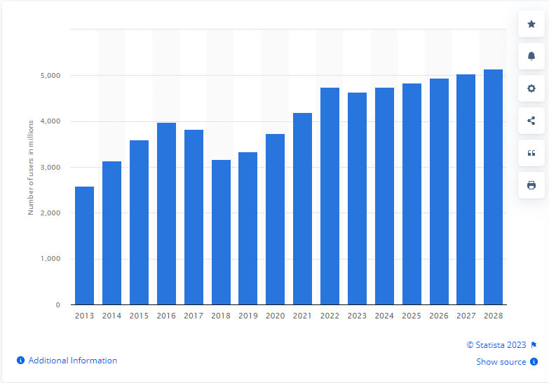
- 4.18 Billion Active Mobile Internet Users: Statista reports an active mobile Internet user population of five billion.
- 70% of Online Traffic from Mobile Devices: Mobile devices account for 70% of all online traffic, as reported by Quartz.
- 15% More Unique Clicks: Websites optimized for mobile devices receive approximately 15% more unique clicks.
- 57% Don’t Recommend Poor Mobile Websites: Poorly designed mobile sites lead to customer dissatisfaction and a reluctance to recommend businesses, according to a study.
- 118.57 Exabytes per Month of Mobile Traffic by 2023: The trend in mobile data traffic is on a steady incline, reaching an estimated 118.57 exabytes per month by 2023, as projected by Statista.
- 84% of Customers Make In-Store Decisions Using Mobiles: Users employ their smartphones to make purchase decisions, even in physical stores, according to Google.
- 40% of Users Switch to Competitors After a Bad Mobile Experience: 61% of individuals, after experiencing a subpar mobile browsing experience, won’t return to a site, and 40% will shift to competitors.
- $62 Billion Expected Global Mobile Ad Spend by 2023: Global mobile advertising spending is projected to reach a staggering $362 billion.
- 48% of Users Use Mobile as the First Point of Contact: For 48% of buyers, the first point of contact in a purchasing journey is on their mobile devices.
- 64% Increase in Average Mobile Conversions: Mobile conversion rates are increasing, inching closer to desktop conversions.
Embrace the Future
A mobile-first approach isn’t limited to just your website; it should extend to all your digital endeavors. This methodology ensures you cater to the needs of the expanding mobile-first population and stay connected with your customers wherever they go.
In a world of ever-increasing mobile usage, you must prepare for a mobile-first future.
A mobile-first approach guarantees a seamless mobile user experience, helps you rank on search engine result pages, and boosts your conversion rates. It also provides an edge over competitors and facilitates easy scalability. So, join the mobile-first revolution and offer an impeccable user experience on mobile and desktop devices.