Figma's plugin library is astoundingly extensive. You have thousands of options at your disposal. Many you'll use once and leave unopened for good. A small set may rotate in daily use, cutting all the repetitive steps and making design-to-dev handoff less painful.
This list comes straight from our production workflow at PopArt Studio. Every plugin here has earned its place in real client work. So, keep in mind, these were not merely side tests.
We’ve ranked them by how often they appear in actual projects, from early concepts to final delivery. You’ll also see where AI fits in, and where a human eye is still a must.
If you’re searching for the best Figma plugins, this is a focused shortlist that we’ve determined based on what we use in real work.
TL;DR: 10 plugins we rely on daily, grouped by workflow stage, with one AI pick we actually keep installed.
How We Picked These 10
The backbone of this list is how our team works day to day. We’ve used each plugin here on at least three client projects in the past six months.
If it showed up once and then disappeared, it didn’t make the cut. We also checked how well each tool is maintained.
Anything that introduces difficulties during updates or creates extra steps for the team is out of the equation.
Cost was important, too. Most of the plugins below are free or come with a simple paid tier that makes sense for regular use.
More importantly, each one solves a recurring issue that appears throughout projects, including the work we do through our UI/UX web design services.
We also grouped them based on how often they come up in our work. Some are open in nearly every file. However, others we only use as support at a specific stage of the process. That difference says more than a long feature list.
The Daily Drivers — Plugins We Open Every Project
These are the plugins that show up in almost every file we touch. They solve small but constant problems that slacken a project when left unchecked.
Those tiny delays can exacerbate over time. But the workflow stays unfaltering from the first frame to the final handoff with the right tools in place.
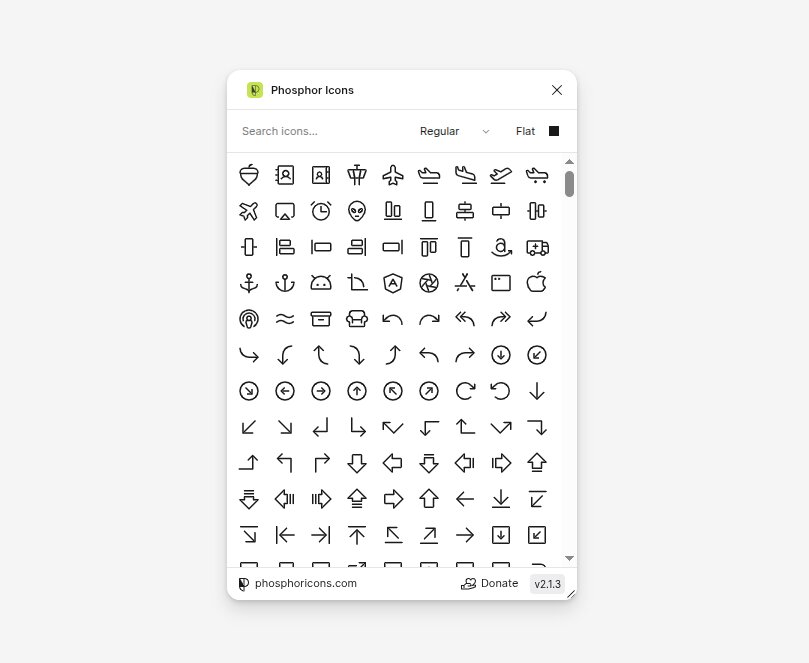
Phosphor Icons — for consistent, modern iconography
Icon sets can create more work than you expect. For example, styles don’t match, or stroke widths feel off. That can easily lead to visual inconsistency on all screens.
Phosphor Icons removes that strain. The library stays cohesive regardless of weights, so switching between outline and filled styles doesn’t break the design.
This is vital for iteration. It takes seconds to swap icons when a layout changes, without searching through multiple sources.
Phosphor offers 7,000+ free icons across 6 weights, which encompass most product needs without external libraries. In practice, that means fewer imports and adjustments, as well as less second-guessing during reviews.
Unsplash — for instant high-quality imagery
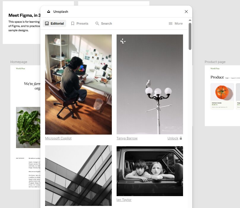
Placeholder images are notorious for halting progress. Low-quality visuals distort spacing and give a false sense of how a design will look in production.
Unsplash handles that by pulling in high-resolution images directly into Figma. The selection is broad enough to match different industries, which is practical when you work on varied client projects.
Thanks to that, designers can build layouts with visuals that resemble real content without ever leaving empty blocks or generic placeholders.
Teams can also use images in commercial work under the Unsplash License, which eliminates uncertainty during project delivery.
Screens look more complete during client reviews, resulting in more precise feedback. Teams can better predict how images will behave once they add real assets.
Lorem Ipsum — for realistic placeholder text
Text placeholders seem simple, but they often trigger problems later on. Short dummy lines don’t reflect real content, and layouts break once you add the actual copy.
Lorem Ipsum allows quick insertion of longer text blocks that better match real scenarios. Paragraph length, line breaks, and spacing are then easier to evaluate early in the process, hence fewer layout fixes later.
This is also beneficial when you build components. You can test buttons and content sections with text that mimics real use, so no need to depend on short labels that conceal spacing issues.
Chroma Colors — for turning ad-hoc colors into a real style system
Early-stage files accumulate colors fast. A green here, a slightly different green there, three near-identical greys across six components — by the time you want to clean it up, you’re hunting through layers manually.
Chroma Colors handles that in one step. Select the layers (or the whole frame), run the plugin, and every fill becomes a proper Figma color style in your file, named after the layer it came from. No more hex-by-hex copying or guessing which shade belongs in the system.
We reach for it once a draft layout is settled and it’s time to convert one-off colors into a reusable palette before component work begins. Keeps the design system tight from the start, without the manual cleanup.
The Accessibility Stack — Building Inclusive Designs from the Start
Accessibility shouldn’t wait until you’re concluding reviews. Fixes at that stage often lead to rework.
Spacing changes and focus adjustments can ripple through the entire file. A better approach is to check these details as you start working on the layout.
Our team treats accessibility as part of the core workflow, not a separate task. The plugins below help us catch issues early and align our designs with the World Wide Web Consortium’s WCAG 2.2, which became a recommendation in October 2023.
The final handoff requires fewer corrections when these checks happen throughout the process. Each accessibility Figma plugin we use supports that process by pointing to red flags while the design is still easy to adjust.
Contrast — WCAG ratio checks
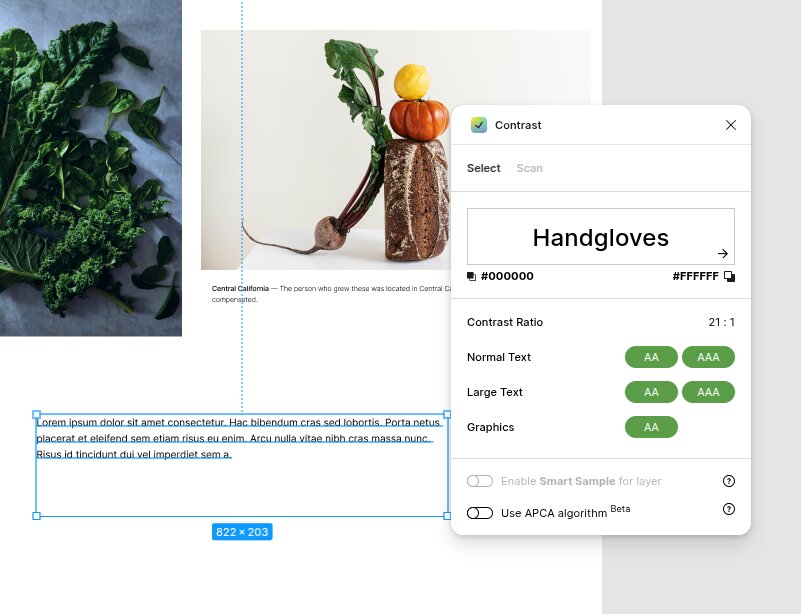
Color contrast issues are easy to miss during design. A palette can look clean and still fail accessibility standards once applied to real components.
Text blocks and background layers all need to meet specific contrast ratios to remain readable. Contrast gives instant feedback on whether a color combination meets WCAG requirements.
You don’t have to engage in guessing games or switch tools. Simply test combinations directly inside Figma. This makes it easier to fine-tune colors before they spread throughout screens.
Use this as a shortcut for coherence. Once you find a compliant pair, you can confidently reuse it across components.
Stark — color blindness simulation, focus order, alt text auditing
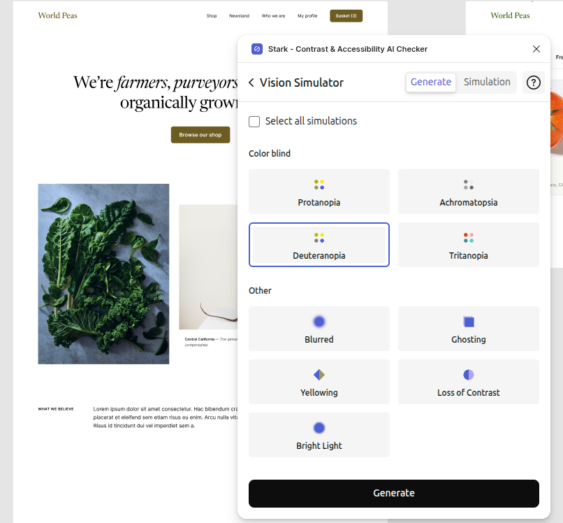
Contrast isn’t where accessibility stops. Visual impairments, keyboard navigation, and content precision all factor in how users experience a product. Stark covers these areas in one place.
The color blindness simulation emphasizes how designs appear to users with different types of vision. This tends to uncover initially invisible issues.
Focus order tools help ensure that navigation follows a logical path, which is key for keyboard users. Alt text checks add another step by prompting designers to describe visual content more carefully.
These checks aren’t theoretical. According to the WebAIM Million Report, a large majority of homepages still contain detectable accessibility issues, with low contrast text among the most common.
That gap shows how often accessibility ends up being one of the last consideration points.
Teams that work with Figma plugins 2026 know that tools like Contrast and Stark are part of a stable setup that keeps projects in check with accessibility standards from the start. If you want a broader look at how accessibility fits into design decisions, see our UX Myths article for a closer breakdown.
The Visual Polish Crew
Some details only emerge once the structure is in place. Typography and subtle visual accents can alter how a design feels without changing its layout.
These plugins help polish those elements inside Figma, and you’ll need no extra tools or exports.
ARC — typography on a curve
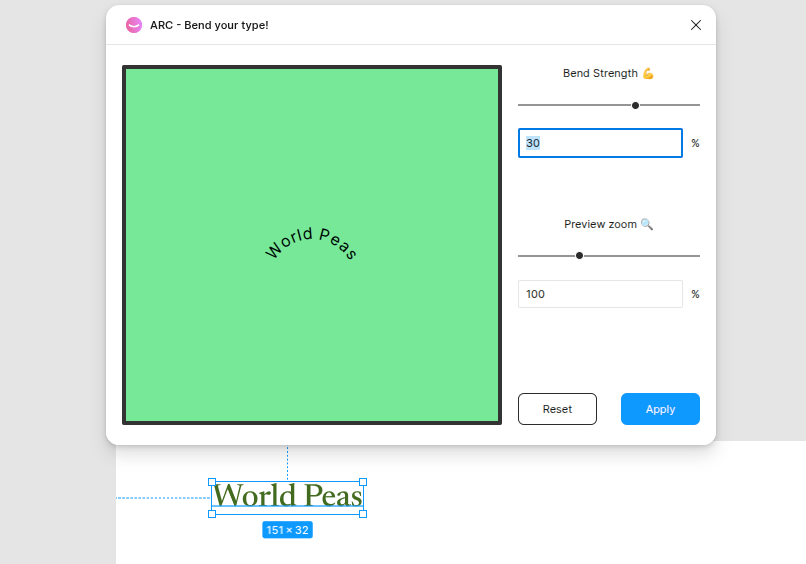
Straight text works for most layouts, but certain sections benefit from a different approach. Hero banners, logos, and decorative elements may need text that follows a curve.
Without a plugin, that usually means moving to another tool or creating it manually with multiple adjustments.
The ARC keeps this process within Figma. It allows text to follow a circular path with control over radius and spacing. This makes it easier to test variations without exiting the file.
And it’s extremely helpful during early concept work. Designers can try curved text treatments, then pivot if necessary.
Noise — texture without rasterizing
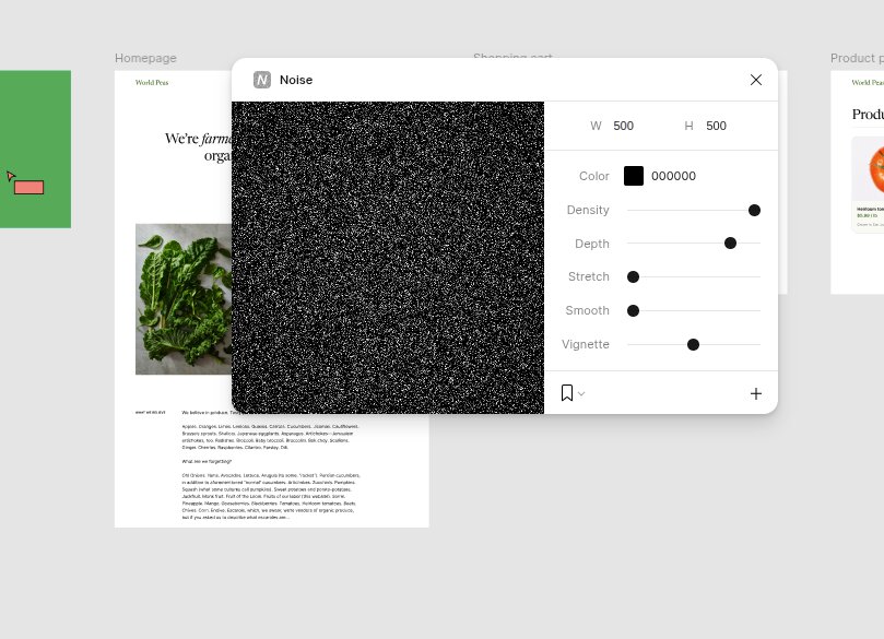
Flat color surfaces can feel too sterile, especially in large sections. A small amount of texture can create depth, but importing raster images imposes additional steps and limits flexibility.
The Noise allows you to bypass this and apply grain directly to shapes and backgrounds. The effect remains editable, meaning you can modify it at any stage of the design process.
This is valuable for delicate refinements. Backgrounds start looking more sophisticated, and sections become easier to distinguish without relying on heavy contrast. Since everything stays vector-based, the design is still easy to update.
If you’re working with Figma plugins for UI/UX design, tools like ARC and Noise are superb for final touches that often have a major impact.
Concept-to-Code: Plugins That Bridge Design and Development
Design and development are at risk of drifting apart near the end of a project. Layouts can look complete, but still require key details to translate into code.
Spacing, structure, and real data are essential in this phase. The plugins below help keep that transition smoother and reduce back-and-forth.
html.to.design — convert URLs into editable Figma frames
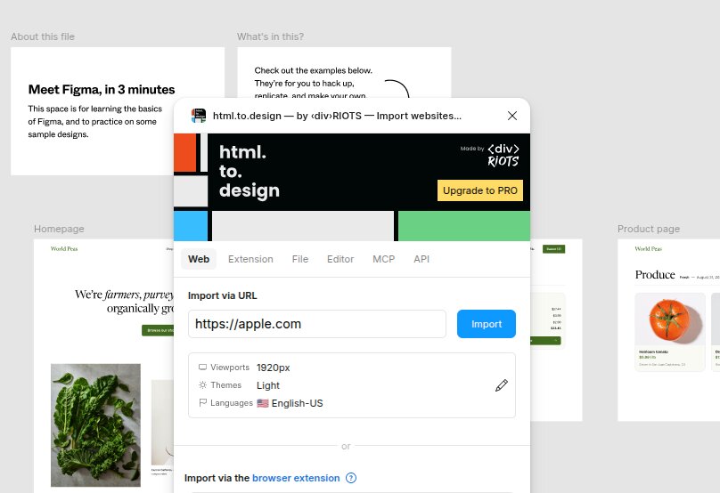
You may find that recreating existing pages inside Figma can be time-consuming. Even basic layouts require meticulous spacing and firm structure.
The html.to.design imports live URLs and converts them into editable frames. Designers get a ready-made structure, so they don’t have to rebuild everything.
On a recent redesign, html.to.design saved us about half a day that would have gone into recreating existing pages. That time went into layout refinement and, instead, testing improved versions.
This also supports closer alignment with development teams. The Nielsen Norman Group notes that teams introduce rework and delays when they bring developers in too late.
Designs that stay close to real output make discussions more precise. They also reduce mismatches between design decisions and code implementation.
User Profile — realistic user data and avatars for handoff-ready prototypes
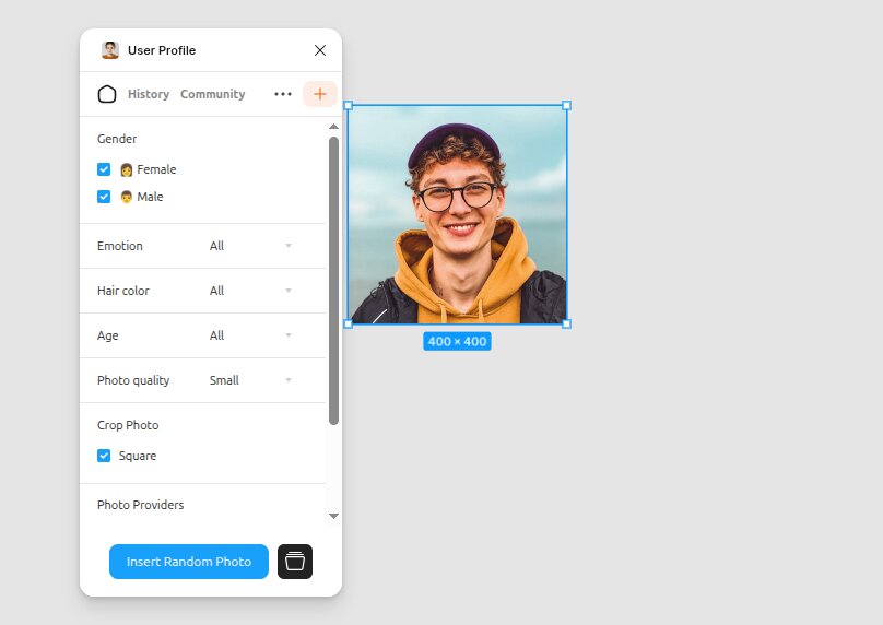
Empty states and generic placeholders may become a point of disorder during handoff. Devs need to see how real data fits into each component, and short labels rarely provide enough context.
The User Profile fills designs with realistic names, emails, avatars, and other user details. Screens feel more in line with a live product, which helps surface layout issues earlier.
This also betters communication. When devs can evaluate content that looks real, edge cases become easier to spot.
Long names and image ratios are just some of the elements that affect how components respond.
Teams that already rely on tools like Chrome extensions for SEO, designers, and developers may find that plugins like these round out the workflow. While some of the best Figma AI plugins center around copy or visuals, these tools address structure and data, which directly determine how designs move into code.
The AI Pick We’re Actually Using: Magician AI
AI plugins come and go, and many of them look better in demos than in real work. We kept one that’s great for daily use but doesn’t fracture the flow.
The Magician AI runs inside Figma and supports early-stage tasks. You can use it to generate short UX copy, suggest icons based on prompts, and return image ideas in harmony with the layout.
This comes in handy when a screen needs content fast, more so during wireframe or concept phases.
We use it for first-draft microcopy and quick icon ideation, but not for final design output. The suggestions often need edits, but they provide a good starting point that saves time during early exploration.
So, the team can refine later, not having to pause to contemplate every label or placeholder.
It also keeps momentum in large files. Magician AI fills gaps neatly when multiple screens require content at once, so the team can assess layouts as a whole.
That makes feedback more useful, since stakeholders respond to something that presents the product more realistically.
There are other tools in this space. UX Pilot focuses on wireframe generation and layout concepts, while Lummi leans toward visual assets and image-based prompts.
Both have their place, but they often fall outside the main workflow or demand more manual effort to get usable results.
Magician AI stays in our list because it works within the file and supports tasks that come up in most projects. For teams looking through the best Figma plugins, this is one of the few AI options that earns a permanent spot without getting in the way.
Honorable Mentions (Plugins We’re Watching)
Some plugins don’t appear in every project, but they still deserve attention. They either handle more specific needs or continue to enhance with each update.
Here are a few we keep an eye on:
- UX Pilot: Focused on AI-assisted wireframes that can move toward full screens. Useful during early concept work, especially when paired with idea sources like Midjourney logo prompts for visual direction.
- Iconify: A solid alternative to Phosphor when a project calls for niche icon sets or brand-specific styles that aren’t covered in standard libraries.
- Tokens Studio: Built for design systems and token management. It fits teams that need tighter control over spacing, color, and typography across large-scale projects.
- Mockuuups Studio: Helps place designs into device mockups without leaving Figma. Useful for presentation and client previews when context matters.
How to Install a Figma Plugin (Quick Recap)
Open Figma and go to the Community tab. Search for the plugin you need, then open its page. Click “Install” to add it to your account.
Once you install it, open any file, right-click on the canvas, and find the plugin under the “Plugins” section.
You can also access installed plugins from the top menu. Select “Plugins,” then choose the one you want to run. Most tools launch in a small panel inside Figma, so you can use them without leaving your file.
FAQ
What are the most useful Figma plugins?
Figma’s plugin ecosystem keeps growing. Recent data shows there are over 12,000 plugins available in the Figma Community, which makes selection harder than it should be.
In practice, the most useful ones are not the most feature-rich, but the ones used repeatedly.
Our team ranks usefulness by frequency of use across projects. Tools like Phosphor, Unsplash, and Stark stay in rotation because they solve recurring tasks that appear in almost every file.
Are Figma plugins free to use?
Most Figma plugins are free, at least at a basic level. The Figma Community allows creators to publish both free and paid plugins, including one-time purchases or subscriptions.
In this list, tools like Phosphor Icons, Unsplash, Lorem Ipsum, Chroma Colors, and html.to.design are free. Others offer paid tiers.
Magician AI, for example, includes a free trial but moves to a paid plan for extended use. Tokens Studio also offers paid plans for advanced system work.
Which Figma plugin replaces icon libraries like FontAwesome?
Phosphor Icons works as a strong replacement for FontAwesome inside Figma. It gives you access to a large icon set you can use directly in your files without relying on external libraries or manual imports.
Iconify gives access to multiple icon libraries in one place, including FontAwesome, beneficial for projects requiring broader coverage.
What’s the best Figma plugin for accessibility?
There’s no single plugin that covers every accessibility need. We use a combination of Contrast and Stark because they address different dimensions of the same problem.
Contrast focuses on color ratios and compliance checks. Stark goes further with color blindness simulation and alt text review.
Together, they blend design decisions with WCAG guidelines and reduce the risk of issues later in the process.
Are AI Figma plugins worth using in 2026?
They are useful for specific tasks. AI plugins can speed up early stages such as writing microcopy, suggesting icons, or filling layouts with content. That makes them helpful during concept work.
That said, they still require review and adjustment. Design decisions, hierarchy, and user experience still depend on human input.
How do I install a Figma plugin?
Open Figma and go to the Community tab. Search for the plugin you need and open its page. Click “Install” to add it to your account.
After that, open any file, right-click on the canvas, and find the plugin under “Plugins.” You can also access it from the top menu. Most plugins run inside a small panel within your file.
Final Thoughts
The right plugins can save time, but they only work when you pair them with a neat process. Without that, even the best Figma plugins become just another layer inside the file.
What makes the difference is how and when you use each tool. Consistent choices and handoff habits tend to have a bigger impact than any single plugin.
This list is a sum of what holds up across real projects. It covers the points where teams usually lose time, from early setup to final delivery.
If you would rather have a senior team handle the full process from concept to handoff, take a look at our UI/UX design services. Or, if you just want to talk through your project, send a free inquiry.