If you've seen your fair share of website designs, then you know that fonts (more precisely, typefaces) can actually play a crucial role in how well a design is perceived. In the digital world, this is true not just about sites, and apps, but landing pages, visuals, and every other piece of marketing material where there's a style, a message, and a brand involved.
To make our point clearer, let us take an example from everyday life. Let’s say, take shoes. The pair of shoes you wear surely leave a specific impression. For example, you can wear old and beaten shirts and pants, and you can even have unkempt hair. However, if your shoes are nice and clean, people around you will surely notice. On the other hand, if you are wearing nice clothes (like a new sports jacket) but you fancy a good old pair of your favorite beaten sneakers, people will look at you like you’ve just fallen from Mars.
So, you get the whole deal about the shoes, but you’re still wondering how can they be connected to fonts and typefaces? Think about it this way: your typefaces and fonts can be the shoes of your overall design in any project.
You’ve read that right. Even if it’s just around 10% of the overall design, it can still have a profound effect on how people will think about the final, overall product.
So, in this article, we aim to dig a bit deeper regarding the ins and outs, dos and dont’s of choosing the best font, or better yet, typeface.
Getting Started With Choosing The Right Font/Typeface
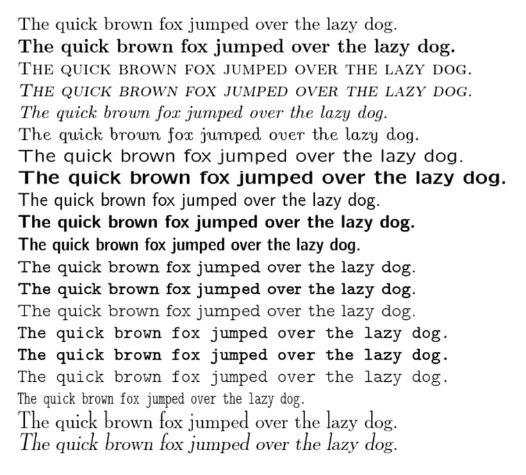
First of all, you need to know that a font is a specific style and size of a typeface, which has several variations of a similar font style.
That being said, that the first step in choosing the right font actually starts with opting for the right typeface.
So, to get started, here are a couple of ways to go about choosing the perfect typeface for your project.
Playing it safe
While you will always come across a couple of extravagant designs every now and then, you will also notice that most of the time, designers will stick to typefaces that are tried and tested. These can be referred to as ?safe? options, typefaces that you will see most of the time.
Why use them? Simple. You should give them a shot simply because they work. They are clear, legible, easily readable, and won’t compromise the overall goal of the design, which is to communicate a specific message. Experts say that people don’t like to spend extra time figuring out what is written down in a design. If it takes them more than 4 seconds, chances are, they will disregard the entire message.
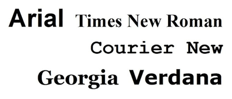
So, to get started, you can opt for some safe sans-serif typefaces, like Impact, Arial, Lucida Grande, Verdana, Helvetica, and Tahoma. Serif typefaces like Palatino, Times New Roman, and Georgia may also work.
Get to know the type families
Spend some time learning about the five different classifications of typefaces that usually make up around 80% of the content that you see on the internet or in the world of design.
Please note, this isn’t the entire list of all classifications that you can choose from. It’s only a starting point that can help you pick the right typeface for your project.
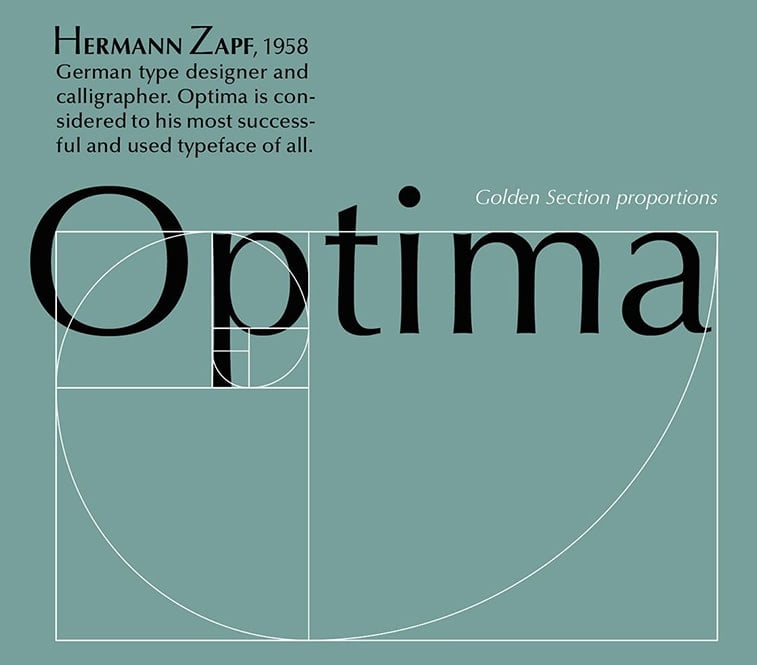
Humanist Sans-Serif: These mostly hand-derived typeface variations are rather clean and modern. They are designed with simplicity in mind, sporting thinner stroke weights to enhance their similarities to human handwriting. They can be best described as empathetic and clear, modern yet human at the same time.
Examples of them include Frutiger, Myriad, Gill Sand, Optima, Verdana.
Geometric Sans-Serif: They are a combination of three different typeface groups which are all similar enough to ultimately fall under the same group. They are Realist, Geometric, and Grotesk. Simply put, these are based on strict geometric form-letters often have a ?less is more? aesthetic approach, which means that they usually also share uniform width. They are rather modern, universal, clear. Because of that, some may even dare to call them impersonal, boring, and cold.
Good examples of Geometric Sans-Serif include Univers, Helvetica, Avant Garde, Futura, Akzidenz, Franklin Gothic, Gotham, Grotesk.
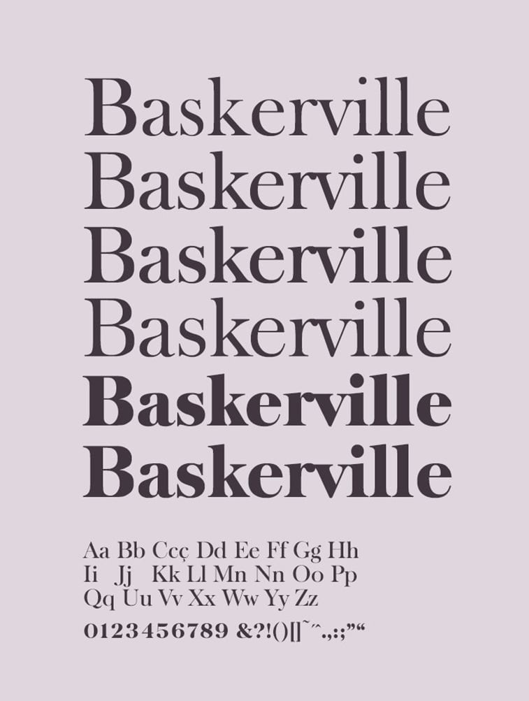
Modern and Transitional Serifs: These were created in the mid and late 18th century, and are more or less a result of an experiment of trying to make letterforms more sharp and geometric. These are often described as dynamic, strong, and stylish.
Examples of them include Baskerville, Times New Roman, Didot, Bodoni.
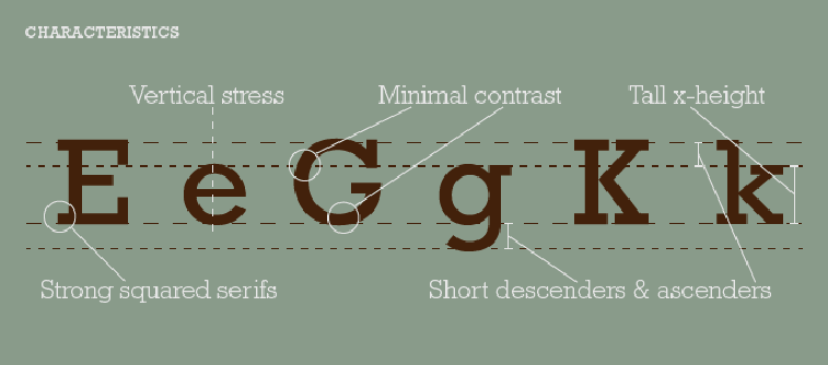
Old Style Serif: These are usually referred to as the ?oldest typefaces?. They are distinguishable by the fact that they boast a little contrast between thin and thick lines, and their curved letterforms usually tilt to the left. Generally, these typefaces are described best as readable, traditional, and classic.
Examples: Bembo, Jenson, Garamond.
Slab Serifs: Recently, these types have become more popular. They sport a similar stroke-like sans typefaces have but have solid rectangular shoes on the end. They have been used rather sparingly in the world of typography as they can convey a rather specific and contradictory message at the same time. To put it stylishly, they generally stick out like a sore thumb in the wrong settings but fit in perfectly in the perfect places.
Examples of slab serif typefaces include Rockwell, Lubalin Graph, Archer, Courier, Clarendon.
Decisive contrast is your friend
More often than not, a single font (or typeface) is more than enough for your entire design but there are certain instances when you will want (or have to) use more than one to accent specific areas of your design.
When you have to work with multiple typefaces to achieve that ?in-your-face? effect, make sure that the ones you use have obvious contrasting differences.
Now, don’t think that you can’t necessarily use any two typefaces, but there are some time-tested combinations that seem to get the work done quite nicely.
Choosing two random typefaces may seem too easy yet too overwhelming. One solid rule of thumb in these cases is to look at combinations that have at least one commonality and are otherwise vastly different.
That being said, they might look great together if:
- The two are from the same time period
- Come from the same designer
- Have a similar stroke weight or height.
Another thing you need to take into consideration is the fact that you are looking for contrast and not conflict. Contrast can create a clear impact and allows you to guide your reader easily through the page. It lets your reader scan the page for the parts that they are most interested in, and can increase the overall value of the ?look? of the entire text.
Lastly, avoid too similar fonts. They can compromise the reader’s attention and can render the entire project ?off-looking?.
Take it easy with the wild stuff
You remember our examples with the shoes and clothes, right? Well, keep the train of thought going. Sometimes, a nice or wide belt can do a lot more than an entire outfit of flamingo pink or seafoam green.
Heck, even a sports jacket over a t-shirt with a unique print can be eye-catching and even sharp if done right.
The point of this tip is to use wilder fonts sparingly. You need them to create an effect, not to oversaturate the entire design with them. Balance and taste are the keys.
Determine the language of your design
As you will see, different brands will choose different styles and fonts to evoke specific emotional responses or attributes. When you want to choose a font for your brand (or if you are doing a design job for one), always take a thorough look at the company, its message and its niche industry. Tech brands nowadays will usually fancy minimalistic, simple, and clean fonts.
Opt for font families with a sans-serif and serif typeface
When designers need to come up with something fast to face a tight deadline, they often use the ?super-family? fonts. These are font families that have both sans serif and serif typefaces, and a variety of styles, widths, and weights to choose from. They are also more or less considered a safe option if you want to use two different fonts for the same project and will work nicely in the end.
These families include Spirited, Thesis, Goral, Storyteller, and Typnic or ?Typographic Picnic?.
On the other hand, you can always simply just opt to combine sans serif and serif fonts. Strong sans serif can work great for main titles while serif fonts can always make for great body text.
Bonus tip: Rule number one ? there are no rules
The principles above are merely guidelines to help you come up with the right typeface and fonts for your project. While these can help you with getting started on your design-journey, they are by no means set-in-stone rules that you have to adhere to every time. As time passes, you will hone your own skills and come up with your own set of rules when choosing typefaces.
Generally speaking, there are no right or wrong combinations, styles, and fonts. It’s true that some work better together than others and that some will be more popular while others will usually be less. Stick to what works in the beginning but never stay away from experimenting.
Never Underestimate The End Goal of Your Design
Truth be told, there are literally thousands of different paid and free fonts you can choose from online but not all of them will fit into your spectrum, and knowing the basics about typefaces isn’t the only thing you should have in your pocket when designing a new project or when launching a new brand.
Simply put, the best font choices will align with the purpose of your design. The right font will help you convey the message of your next project. As mentioned above, it should speak the language of the brand and should communicate eloquently with the target audience evoking the desired emotions. To choose the best font, you must also consider its function within the context in which you will use it.
Brand
Let’s say, if you are creating a project for a brand, you need to choose a font that communicates specific messages and attributes, and has a personality that matches the persona of the brand. That being said, serif fonts can help portray tradition, safety, reliability, history, sans serif fonts speak of a modern, clean, and contemporary company. If you choose script fonts, it adds a shade of grace, femininity, and even romance to your design. Whichever you choose, make sure to align with the characteristics of your brand.
Here are a few good examples of different fonts and industry pairings:
- Finance: Bembo, Andrew Samuels, Clarendon, Gotham Narrow, FF Kievit
- Wineries: Burgues Script, Adios Script Pro, Darleston
- Wedding Photography: Anisha Script, Beautify, Hunter River
- Design Agency: Helvetica Bold, Gotham Black, Montserrat Bold
- IT Company: Moon, Big John/Slim Joe, Simplifica, BW Quinta, Pier
Readability/Function
As mentioned above, this is a crucial part of every design when it comes to typography. If your chosen typeface is easy to read, than you already have half of the work done. Don’t forget, the body text of your design needs to be readable.
As such, we would recommend the following body text fonts:
- PT SANS
- Vision
- Bifocals Grotesk
- Roman Serif
- Alte Haas Grotesk
If you’re looking for solid display text options, these might make your cut:
- Eva
- Konstant Grotesk
- Ridgeline 201
- Geizer
- Terrain
Look at industry trends
if you want to be a good designer or an entrepreneur with a keen eye for design, you will pretty much have to know what’s trending in major industries and how others use them, not to mention, how well it resonates with the public.
Keeping current with the latest trends can save you a lot of time if you need to come up with something standard, can give you more insight if you want to do something new and exciting. Lastly, it can also be a great way to observe a few bad examples and things you need to stay away from at all costs.
Good Pairing Examples
To make your job easier, here are a few pairings that to together and work well in most designs.
- Vision, a modern and clean sans serif font works well if you are looking for bold and large headlines, and it pairs great with Libre Baskerville if you choose the latter for the body copy.
- Anisha is a romantic and modern calligraphy that can be ideal for photography studio, wedding planner and florist headlines. If you’re looking for the right text body font to pair it with, consider Lora to create a stunning visual experience.
- Sometimes, you can come up with a great combo when you’re using the same typeface. For instance, Roboto Condensed in bold can be used in the headline and its regular type for the body copy.
- Lastly, Hunter River is a signature brush script typeface that’s really popular on prints, for branding, labels, quotes, apparel, and a handful of other creative projects. For the perfect combination, try pairing it with Playfair Display, a serif font that manages to enhance the overall beauty of the design.
Make Good Use Of Pairing Tools
These tools should serve as your go-to source for pairing options if you feel overwhelmed or simply don’t want (or have the time) to mess around with paring options.
To Sum It Up
To do a quick recap, you should know that there are several different font and typeface classifications. However, the largest difference that you will come across between all of them is whether they are sans serif or serif fonts. The latter are more traditional options while sans serif fonts boast a more modern look and thus, a more modern feel. One of the first things you must think about whenever you’re at the very beginning of a project is whether you want to use a serif or a sans serif font to establish a certain vibe.
Next, always make sure that your fonts/typefaces are readable and that every letter can be read and distinguished against the others.
Third, always look for contrast, not conflict. Fine contrast should create a smooth and elegant visual presentation, not to mention practical that will let your reader navigate through the text with ease. The best way to go about this is to choose a sans serif font for your headline and a serif option for your body text.
Lastly, never forget about the end goal of your design. What’s the message? Who’s your audience? What brand do you need to deliver the project to? Is it your brand we’re talking about? What’s your mission? What are you looking to represent?
All these questions will provide the ground work for your entire project. As you would go with color schemes and other design elements, the rule is that there are no rules at all. As said before, some things work more efficiently than others, however, if you see that you can get away with more traditional approaches and parings, by all means, try them out. See how the audience (or clients) react, and go from there. Nothing’s set in stone, so dare to innovate.