"Creating the visual identity for EXIT really is a unique and unrepeatable experience, incomparable to working in any design studio. The client is the same but is constantly evolving and with it, the creative expression that accompanies it. And unlimited creative freedom reveals both sides of the same coin. ” recalls Predrag Kovačev, our dear colleague, who designed the visual identity of the EXIT festival a few years ago. Pandemic has postponed the celebration of the 20th birthday of the greatest music festival in the region, but it doesn't prevent us from recalling how EXIT looked in the eyes of a graphic designer.
In the past 20 years, EXIT has become one of the main symbols of not only Novi Sad and Serbia but also the whole of Southeast Europe. Good vibrations, the most famous world artists, and unforgettable fun until dawn on the Petrovaradin Fortress made the EXIT’s voice heard to the remotest corners of the world. Only in 2019, EXIT has recorded 200,000 visitors, and for this year, the plan was organizing festivals in neighboring countries, such as the Sea Dance Festival in Budva, and Sea Star in Umag.

However, the health situation in the world prevented Petrovaradin Fortress from hosting the biggest international music stars and fans of quality music and good fun. EXIT 2020 is officially canceled, but while we wait for the new dates and line up for EXIT 2021 let’s recall what the graphic design for EXIT festival looked like in 2016 and 2018, as well as the story of inspiration, path, and motives for its emergence.
How is the visual identity of the EXIT festival born?
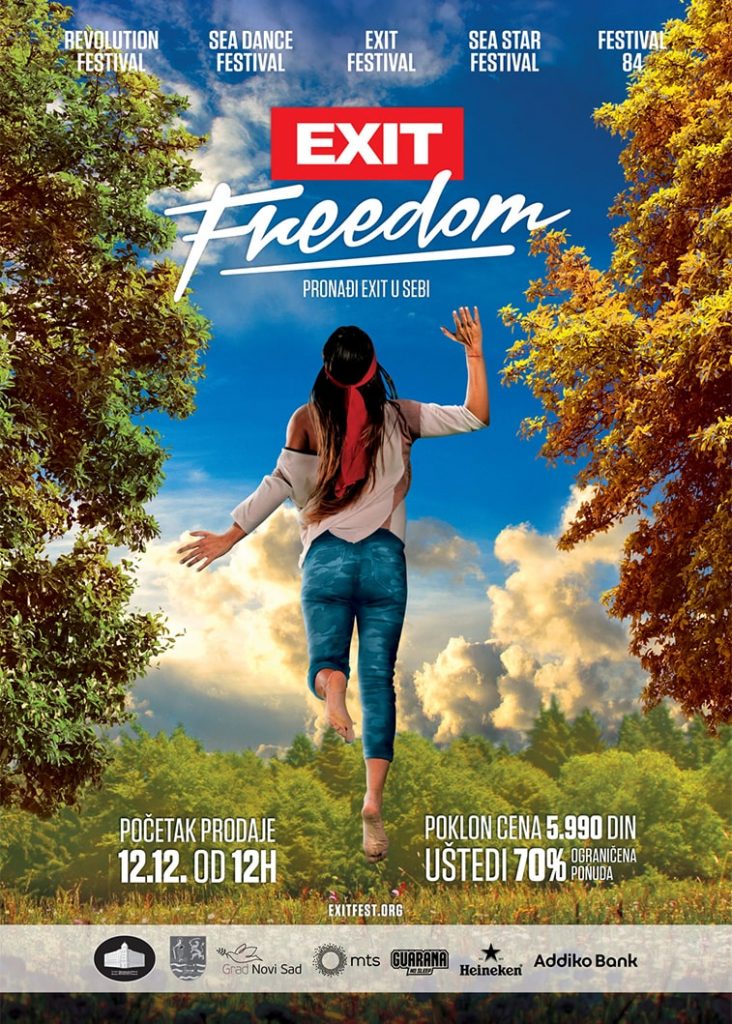
The first step toward creating visuals for EXIT is coming up with the campaign name, such as Magic (2016), Summer of Love (2017), Freedom (2018), Tribe (2019), etc. ” But it’s not just a name that will sound interesting in an advertisement but has a much deeper meaning. Around it is built an entire story and essence of the festival and graphic design is there to present the message of the campaign through visuals, colors, symbols in the right way ” says Predrag.
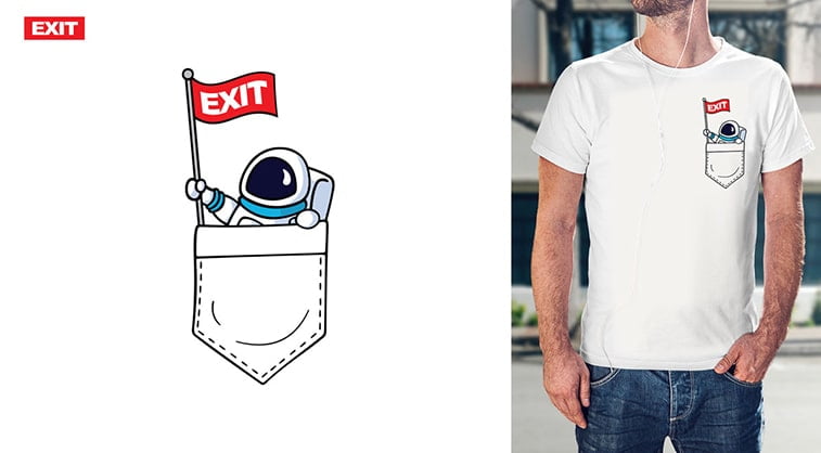
EXIT is always the same, but is constantly changing, says Predrag. The approach to the job is completely different than usual because you work for one client every year, but the campaigns are completely different. “In 2017, EXIT marked 50th anniversary of the Summer of Love, and the design had to go along. Symbols of peace, flowers, colorful – are just some of the elements we used to awaken hippie feeling.”
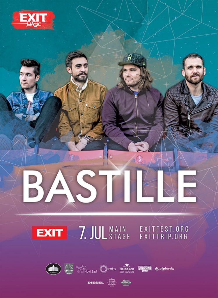
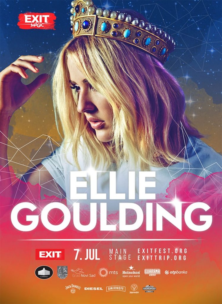
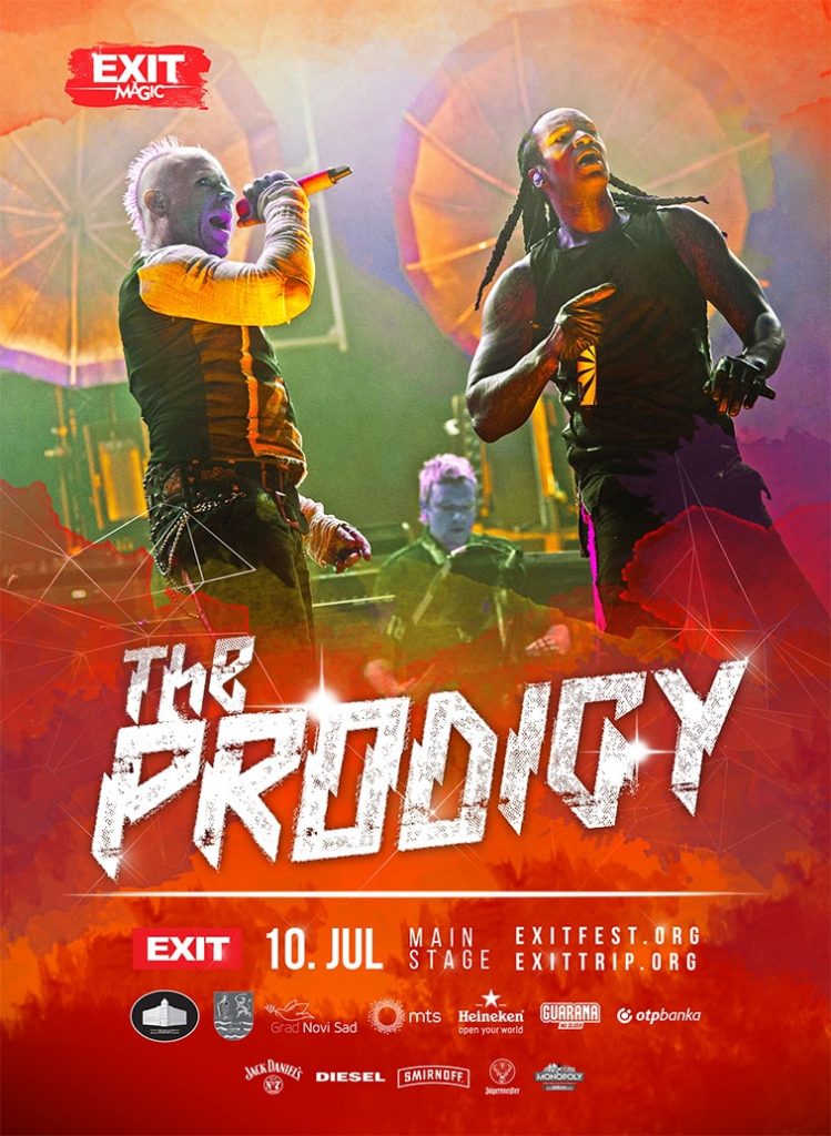
“A year earlier, the name of the campaign was Magic, so everything revolved around the universe, sky, watercolor. Designs are dominated by colors that would allude to this, such as blue, pink, purple, and we also included symbols such as stars, constellations, and astronauts”.
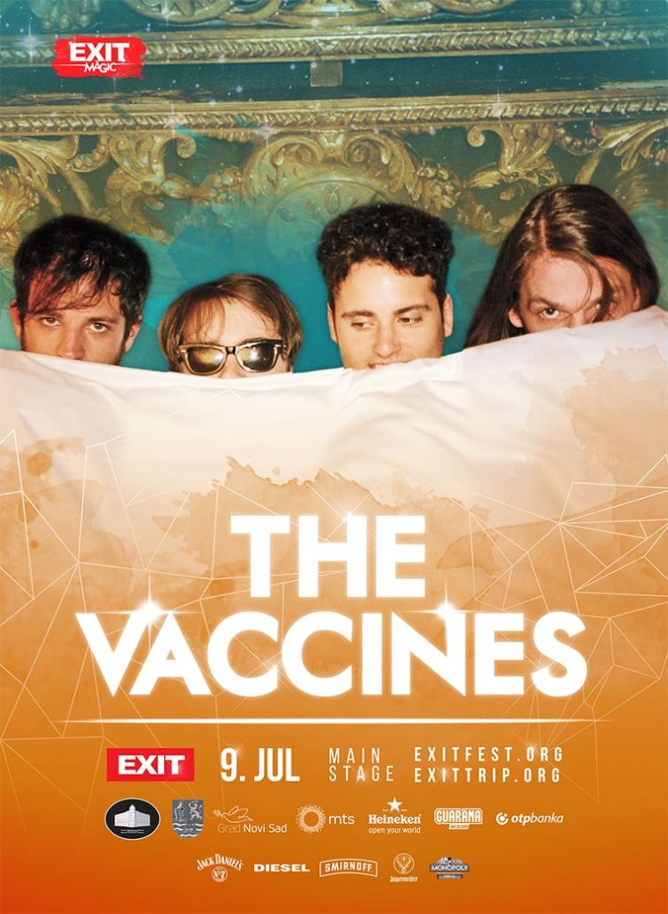
Of course, there are also different artists – how to combine gentle synth-pop of Ellie Goulding and the techno rave of The Prodigy in the same poster design? “It is important to maintain the visual identity of the EXIT campaign and at the same time, design graphics that will be in line with the performer themselves. So, the final appearance of the graphics is actually just the beginning, because for each musician individually we later created design tailored to their music.”
Great success and popularity of EXIT expanded in the neighborhood, and as of recently, the festival spirit spreads across the beaches of Budva and Umag, where the Sea Dance and Sea Star festivals are held. Of course, the design is created for the entire festival, including these two events.
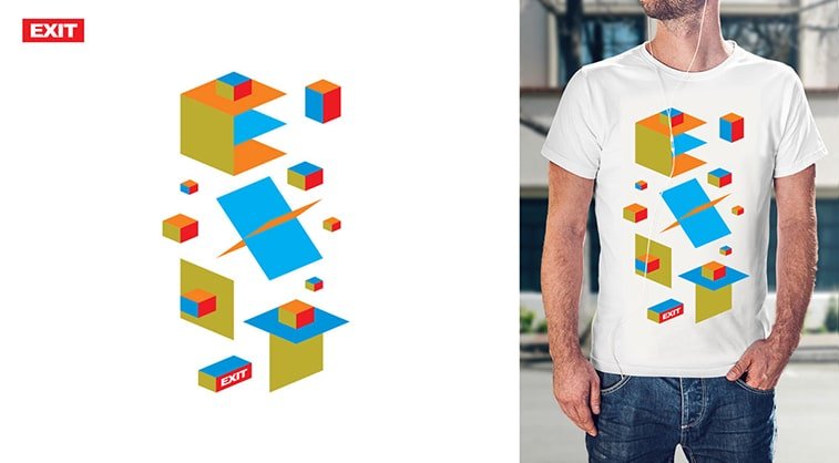
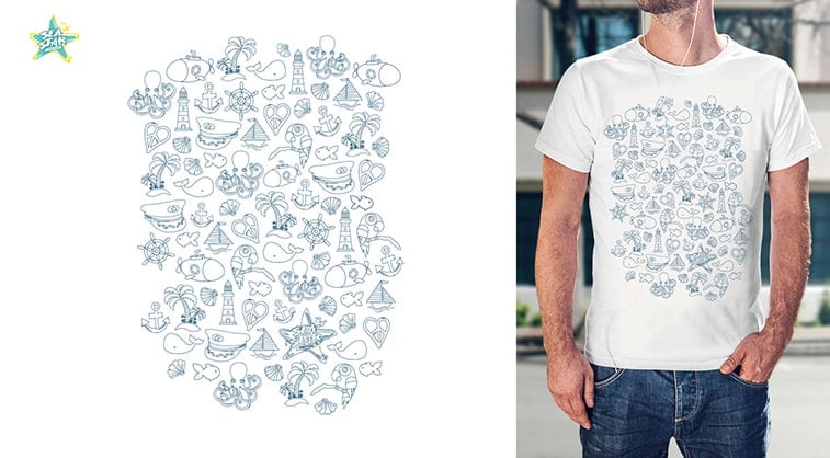
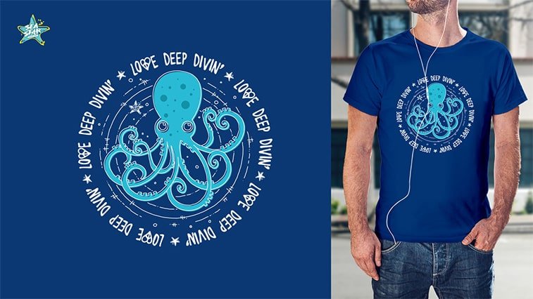
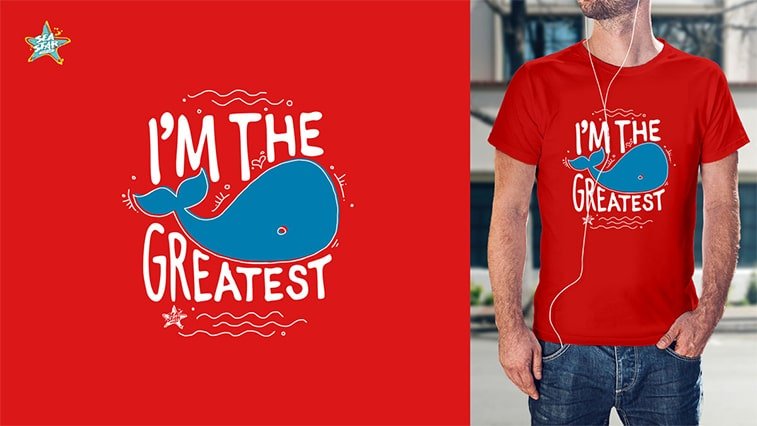
“The design made for the Sea Star and Sea Dance needs to remain true to the EXIT brand, but again to have some personal touch, especially as both festivals are held in cities on the Adriatic”. The T-shirt design for the Sea Star 2017 perfectly illustrates everything that a seaside offers – shells, fish, dolphins, beach, palm trees, maritime motifs, sailing boats, octopus, and submarines.
Social engagement of EXIT and how it portrays in its graphic design
EXIT is not only a music festival, but also a symbol of togetherness, multiculturalism, and social engagement. As the festival is being prepared for months and includes not only music stars but also influential individuals from around the world, EXIT is constantly changing, evolving, moving forward. The fight for the preservation of the environment, equal rights, inclusiveness, are just some of the topics that EXIT put the spotlight on during its campaign.
“Social engagement is an essential aspect of EXIT, and by it, the accompanying graphic design. All these topics are already well- known and touched upon countless times, which is why it is even a greater challenge to present such an important and serious problem innovatively” adds Predrag.
Besides, have a not that easy task of finding the balance between presenting these key matters within the festival’s playful spirit. “EXIT is music, but it is much more than that. It was not easy to find an adequate way to fit social issues into the “relaxed” brand of EXIT, while still maintaining the seriousness and pointing out the importance of these topics. ”
Creative freedom in design – an inspiration or a block
The visual identity of the campaign, called the artwork, changed day-to-day. “You can see significant changes in the design at the beginning of the work, and compared to the festival itself. But that’s not unusual.” The festival is multifaceted, and therefore the team and the accompanying graphic design must be multi-layered, multi-dimensional. The poster is not only the presentation of artists, and T-shirts are not just a clothing item. They are the message, the argument for the multi-layeredness of the EXIT festival.
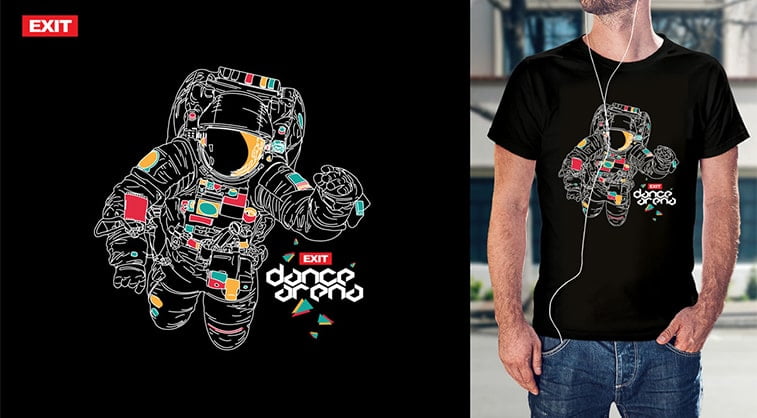
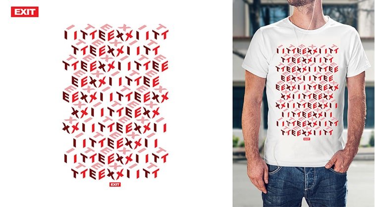
The artwork consists of a set of elements, colors, fonts, effects, and when the ideal combination is found, the making of compositions begins. Predrag states that all promotional materials that will be part of the festival must contain these elements or at least part of them. “The entire branding EXIT festival is done internally, as well as the design of all promotional materials.”
“Working for such a large, versatile and complex festival is really challenging,” Predrag concludes. “On the one hand, there is exceptional creative freedom, on the other, sometimes this limitlessness limits. It is very easy to slip into the abyss of endless possibilities and variations, even to the point of creative block.”
EXIT is the largest music festival in the region, and one of the largest in the world. It is the holder of numerous awards, among which that of the best European festival. Until now it brought together well over two million visitors and tens of thousands of artists around the globe. It is a symbol not only of great music and unforgettable fun but also of actions and movements for social change. ” EXIT is an amazing event and it was a huge honor to create a graphic design for one such an important part of the culture of Serbia and around the world and to know that if your idea to see millions of people around the world, and it will, just in there, find your creative inspiration. ”
