Back in the seventies, a WHO report revealed that around 10% of the population lived with a certain type of disability and researchers now believe that that same number has risen to 15%.According to the rough numbers, there are around 466 million people who are living with hearing loss or deafness, 1.3 billion are visually impaired or blind, and 2-3% of the population live with cognitive disabilities.
By taking these gloomy facts into account it’s only natural for site owners to make their web apps more accessible. It’s not just a matter of catering for the disabled but about making the internet available for each and every individual.
As a first step on the quest for accessibility, most site owners and designers will opt for optimizing their web apps for different screens and devices, however, there’s a lot more room for improvement.
What Is Web Accessibility and Why You Should Care About It
Simplest terms, accessibility in the digital realm means making your web app easily usable for everyone, including people with physical disabilities, cognitive problems, and hearing impairment. A lot of people from this huge audience use certain types of assistive technologies, such as speech recognition devices, web screen readers, alternative keyboards, or Braille terminals to use the world wide web.
The problem is, according to some estimates, a staggering 70% of all websites do not meet the basic WCAG (Web Content Accessibility Guidelines) principles, set back in 2017.
Those guidelines have moved on considerably since then — the current benchmark is WCAG 2.2, and our guide to meeting WCAG 2.2 AA compliance breaks down every requirement as a practical checklist.
Morally and ethically speaking, there should be no arguments against the optimization of websites for accessibility, so everyone can enjoy the content online. That alone should be enough of a driving force for most site owners, however, if you look at it from a monetary angle, there’s also a broader audience one can cater to.
From a business standpoint, maximum online availability and accessibility takes little effort and brings a lot more to the table than people might think.
Accessibility benefits include:
- enhanced brand reputation
- better customer experience
- larger market share
- less legal risks
- using innovative technologies
Without further ado, here are ten great tips for making your site more accessible. With them, not only are you making a potentially good business move, but also leading a positive change.
1. Choose a CMS that will help you in building an accessible website.
When it comes to content management systems and frameworks, you literally have an abundance of different options.
As open-source systems evolve rapidly, designers and developers around the world have ensured that they meet availability guidelines with a large number of themes and projects that support accessibility out of the box. From this aspect, WordPress is a well-prepared CMS but other platforms like Drupal or Joomla have some great accessibility features too.
As such, let’s see how these three different platforms stack up against each other in terms of accessibility.
WordPress – Putting accessibility at the forefront is a growing concern for WP developers and as such, you can find a large number of new themes and plugins that all support making online content reachable and enjoyable for everyone. WordPress also has an “Accessibility Team” who help out developers during core updates to make sure that the new features will be in tune with the current accessibility guidelines.
Joomla – The undisputed king of content management systems before WP, this platform is also well-versed when we’re speaking about accessibility. It’s easy to implement accessible code for theme optimization and for tweaking essential elements. The only thing you have to do is to make sure that the template core that you’re using is compatible with such changes.
Drupal – While Drupal developers usually cater to the more tech-savvy, they also take the topic of accessibility seriously. Their building app is fully compliant to the WCAG 2.0 guidelines and offers great documentation that will help designers with implementing those standards. To top that off, the latest core update to Drupal 8 has also added significant improvements to the ARIA and HTML5 markups.
Whichever CMS you choose, make sure to check the documentation for accessibility notes and for further tips for improving user experience and for adding accessible content, layout, modules, plugins, and widgets.
To put it simply, all three of these platforms can help you out to create a more accessible website. And for all those who don’t really wish to start over with their website but want to see how it holds up to current accessibility principles, there are quite a few great tools out there that help with just that:
- WAVE, or Website Accessibility Evaluation Tool from WebAIM, that even has an online checker and extensions for Chrome and Mozilla.
- SortSite also evaluates your site’s state according to the WCAG 2.0 guidelines and highlights possible issues.
- A11Y Compliance is an app from the Bureau for Internet Accessibility and it covers all the latest standards supporting the most common site markups such as XHTML, SVG, PDF, CSS, and more.
2. Use semantic markups to increase accessibility
Readability should always be a major concern, especially when you are writing/pushing content for a larger audience. You should ensure that the text flow is optimal and easy to understand. The same rule of thumb applies to markups as well, so marking the essential content elements and making it understandable for users who cannot fully rely on visual cues is a key factor.
HTML 5, for example, gives developers every feature they need to optimize object labels.
Here are a few examples of how the key semantic markup elements can make your content more readable
- <section>: helps define new sections in the content. In most cases, it starts with a new heading.
- <article>: signifies a new, independent piece of content that you can consume separately from the rest of the web app.
- <header>: shows a new header.
- <h1, h2…h6>: these are used to outline headings. Usually, your main title should be the single H1 tag, while your subheadings should have H2-H6 tags, depending on the structure of your content.
- <table>: indicates a table in the content.
- <form>: shows a form within the content.
- <nav>: used for defining navigational links.
- <footer>: indicates the footer of your page.

Image source: medium.com
Using the HTML semantic markup can be a great way to boost accessibility however, make sure to include more definitive classes to elements that don’t carry a clear meaning to define their content.
3. Use ARIA roles and landmarks if necessary.
You can also use Accessible Rich Internet Applications (ARIA), a set of powerful tech specifications that add accessibility info to those elements that aren’t accessible by default. Use them only when necessary, otherwise, stick to native HTML elements when you can. Luckily, most elements that required ARIA attributes are now standard in HTML5.
You can add these attributes to your HTML as you would add classes to load CSS attributes. You should also remember that
ARIA attributes can definitely help with boosting accessibility, however, in some cases, simply just adding them won’t make most complex widgets more accessible out of the box. ARIA does little for keyboard-only users, it only helps those who use assistive tech. That being said, interactions and behaviors should still be set up with JavaScript.
ARIA notifies those who use screen readers about dynamic page changes, like search filters and stock tickers. They also make interactive widgets like date pickers accessible to screen reader users.
4. Be careful when it comes to colors.
When creating an accessible layout is your main goal, you shouldn’t choose color layouts by assessing the overall “feel” of your website or brand. You should see the set accessibility guidelines and choose color layouts accordingly instead of relying solely on personal preference.
Choosing colors can be a risky business, since nearly 8% of the population has red-green color deficiency and relying only on these colors will prevent these users from visiting your site. On the other hand, certain people with learning disabilities benefit highly from different color schemes if you use it to organize, structure, and organize your content.
To cater to both group’s needs, make sure to use colors that aren’t too disturbing but also use other indicators like question marks and asterisks. Also, don’t forget to use whitespace to distinguish different content blocks.
Here are a few things you should keep in mind:
- Bright colors, for instance, may be too intense for those with higher photosensitivity.
- Keeping clear contrast lines is also highly advised because this way, people with color blindness will have an easier time making sense of the content on your website.
- Make sure that the essential elements on your site aren’t heavily color reliant. The toggle button, for instance, should have a clear role and functionality without any color linked to it along with the other key components of your site.
- Fortunately, most CMS platforms let you fine-tune your color schemes, so resolving this issue shouldn’t be so problematic if you are using them.
5. Design your forms for accessibility.
Nowadays, most webmasters don’t really consider forms as a priority when it comes to accessibility.
Without optimization, navigation through forms is hard if you’re using a screen-reader and find only empty fields.
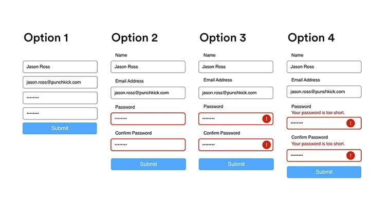
Image Source: punchkick.com
Make sure that each form field is labeled in a position adjacent to its respective box. Also, add extra instructions outside the fields if you have to. Do the same thing with error messages. Give clear instructions when the box is filled out incorrectly or left empty. On the other hand, make sure that the required fields will send screen reader users notifications regarding their nature. Most often, only asterisks are used for this, but some screen readers simply don’t recognize them.
Similar or related fields can be organized into groups with fieldsets. For instance, the “Date of Birth” and “Full Name” fields could be organized into a “Personal Information”. This can help users who use screen readers to keep track of their progress.
6. Optimize your navigation and content for full accessibility.
Most of us are used to explore to the Internet with the help of our keyboards and mouses, however, this is not the case for everyone.
Millions of people who live with motor skill difficulties are unable to fully take advantage of this computer hardware and often use the following tech:
- speech recognition software
- screen readers
- head wands
- adaptive keyboards
- trackball mouses
- mouth sticks
For many people, this tech makes it possible to use a computer and to surf on the Internet. These solutions are advanced, however, futile if your website isn’t configured to support them.
That being said, a few simple steps can go a long way. For starters, ensure that your website is keyboard-friendly across the board. If it is, visitors can access every essential part or object on your site.
Make sure that you have visual indicators when tabbing on the page so users will know where exactly they are on your website.
Also, if you have lots of content on your pages, don’t forget to break them up with jump lists, making keyboard-only users easier to navigate and to get to relevant info faster.
Sub-menus or sub-items in menus should also be keyboard-accessible and detectable to screen readers.
Lastly, dynamically updating content may go unnoticed for users who use screen readers. Screen overlays, lightboxes, popups, modal dialogs, in-page updates, and such might not be recognized and keyboard-only users might get trapped in page overlays. Those who use magnification software might get stuck zoomed in the wrong page section.
To optimize dynamic content, you can turn either to ARIA roles, alerts, and you can also use specific front-end dev. frameworks that support accessibility.
Other smaller things include making sure that videos won’t play automatically on your site, and that they can be keyboard-accessible.
7. Optimizing audio, video, images, and text.
Since we’ve mentioned videos above, there are few things we need to discuss regarding your content on your website.
To make your audiovisual content more accessible, consider captioning as an option. Captions aren’t only beneficial for those with hearing disabilities. There’s a large number of people out there who simply focus on the content better this way, and makes it easier for them to understand. Consider adding written transcripts too.

Image source: wave.video
As mentioned before, make sure that automatically playing features can be stopped and muted easily.
Alternative text should also be used on images to ensure proper website optimization in general. Search engines rely on alt text to “see” what the images contain.
You’ve probably noticed that you also have an image search on Google, and without a solid alternative text, crawlers simply won’t see your images which in turn, can ruin your rankings.
Alt-text is especially important for informative visuals, like infographics. The alt text should reflect the message you are trying to send with your imagery, so create the alt text accordingly. Also, when you use an image as the only content of a link, provide alt text for them since screen readers will read only the file name if you don’t provide alt text.
Also, there’s another benefit to alt texts and that has to do with accessibility.
Screen readers also appreciate correctly-labeled visual content. So, don’t forget to fill out the alt text field next time you load up an image.
Generally, when talking about text, you should optimize it so it can be magnified without affecting the content on the page, or the page’s function. Make sure that the text on your website can be enlarged and still make sense for the end-user. People with impaired sight will thank you for that.
8. Be careful with tables and layout complexity.
Tables can be very effective when you want to push data comprehensively and straightforwardly.
However, don’t overuse them. You don’t want to use them to display lists and step-by-step instructions. Why?
Your visitors who use keyboards only to navigate through your grids will have a hard time and those who use screen readers will even have it harder. Readers usually interpret one data cell at a time and complicated, descriptive tables would just only confuse the user.
Tables are indeed necessary elements when it comes to structuring your content, however, it’s important to use them only when it’s necessary and even then, try to calibrate them in a way that supports the accessibility standards.
This means, use headers for columns and rows to help explain the relationship between cells. If you are using a more complex table with more cells in the table that can be connected in multiple ways, use the “scope” HTML attribute. In HTML5, table captions can also give additional info to your users to help them read your tables.
The same goes for layouts. If it’s too complex, people with visual impairment or blindness will have a hard time navigating through it. On the other hand, complex, overwhelming, and hard-to-figure-out layouts will turn off most users, even those who don’t have accessibility concerns. Nobody likes complex navigation.

Image source: thefairchildgrove.com/
9. Optimize your links.
When you have a website with an abundance of navigational links, it can be a real nightmare to navigate on it with a screen reader or with a single keyboard. To spare people from suffering, it may be best to introduce link skipping.
It’s a rather simple concept – you just place the main link on the top of the page which redirects your users to important anchor links below it. This lets your visitors skip the unnecessary info and jump to things they’re actually interested in.
Links in your content should properly describe the link-destination so adding descriptive names should help your accessibility optimization process.
Visually-impaired users use their screen readers to scan for your links and if the links aren’t optimized, the screen readers will often fail to read it. Descriptive names can help give a better understanding of the context of the links to users. For example, instead of “click here to get to know the company” put “Read about us to learn more”.
10. Structure your content with correctly used headings.
A good heading structure should help people who use screen readers navigating your content more efficiently. Using appropriate H1, H2, etc. headings can help them in doing so, making your website well-organized.
Just make sure that you use the correct heading order and not adding them just for the sake of style or because it looks good. When you skip heading levels or use them incorrectly, screen reader users will wonder if they’ve missed any content.
Finishing thoughts
One of the main driving forces of the world wide web is freedom, and accessibility should be considered as one of the most powerful tools to support said freedom.
In most cases, it takes only a few tweaks and generally, it just simply helps everyone to have a better user experience on your website.
Organized and structured content never hurt anybody, did it?
For those who wish to improve their online business:
- Latest Web Design Statistics to Improve Your Business in 2020
- How To Make Your Website Profitable?
- Social Media Advertising 101 – True Costs & Expert Tips