Color is the basic ingredient of every design. Be it graphic (print) or web, it practically cannot do without color.
Even though some will argue that there would not be color without light (and likewise darkness), this view is irrelevant to our story.
What people often talk about in terms of color are color models or standards, such as CMYK, RGB, and Pantone colors. Have you ever wondered what these actually are? If your answer is yes, keep reading to find out.
What is CMYK?
CMYK is a subtractive color model used in color printing.
This color processing uses four colors: Cyan, Magenta, Yellow, and Key (black), which are keyed or aligned, usually in that order, with the key of the black key plate.
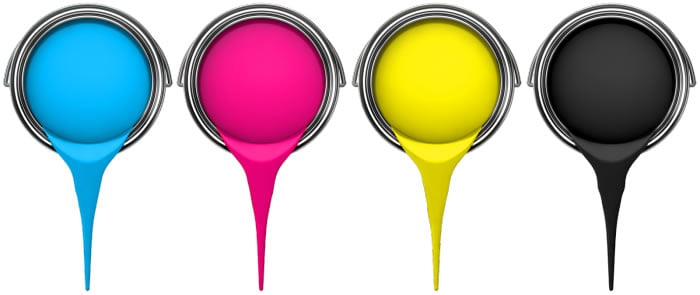
The ink used reduces the light on paper (background) which is why this model is called subtractive since it subtracts (removes) brightness from white.
What is RGB?
RGB is an additive color model which uses three colors: Red, Green, and Blue to reproduce an array of other colors in the color wheel.
As opposed to CMYK, which is mainly used in printing, RGB color model is generally used for digital representation and display of electronic images (i.e. on computers, TVs, camera displays, projectors, etc.).
RGB model is based on forming color by adding these three components (colors red, green, and blue) light beams against a black screen (background), which is why it is called the additive model.
What is PMS?
PMS stands for Pantone Matching System. This color reproduction system was standardized by Pantone, a color supplier corporation, in order to ensure the colors do not get into direct contact with one another.
The standard has become an absolute authority on color, so popular that celebrities even ask to have a color developed just for them.
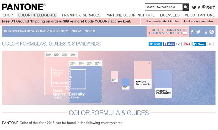
Since 2000, Pantone declares a Color of the Year, thus influencing consumer-oriented companies which use this color in their designs and in product planning. This year’s colors are Serenity (15-3913) and Rose Quartz (13-1520).
This color matching system is unique in its kind due to the fact that it almost perfectly matches print and digital appearance of colors.
Are There Any Other Color Spaces?
Of course, there are, it is just that they are not so popular. One color space, though, is rarely said to have been used – even though it covers all potential colors a human eye can see (2.3M, to be exact).
The named space is LAB color space, largely used by Photoshop as its native color space. Its name refers to lightness and color-opponent dimensions, a and b, are its channels. It is the filter this program uses when converting from RGB to CMYK et vice versa, resulting in color enhancement. When converted to LAB, an image looks exactly the same as in RGB, for example, because it does not deteriorate its quality.
How to know when to use this color space? When you want to match paint colors with print media, fabric colors in catalogs or websites, or when you want to communicate Pantone colors to other media.
Key Takeaways
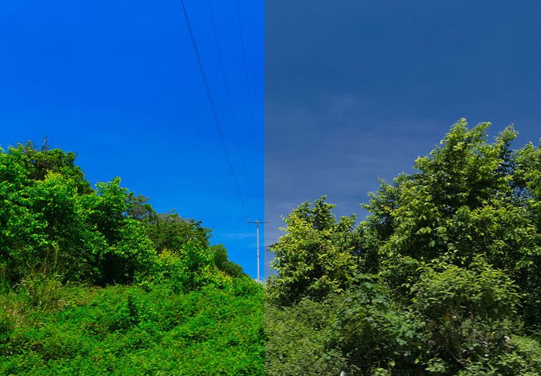
Color consistency is essential in business and in terms of branding, it may cause different results. Due to the psychology of color and the nature of human eye, as well as the cheating nature of on-screen vs. real color perception, these color standards came to be an important part of every web or graphic design project.
This means that, in a nutshell, these color standards were developed in order to differentiate from print and on-screen colors which may deceive the eye and cause catastrophic events such as public shaming.
Consistency in color usage is very important in creating a visual identity of a company, so a designer needs to keep in mind that a hue of red will not be the same on the web and when printed on a memo or business card.
In order to ensure this consistency, try using standard color marks and you will be good to go (but only if you make sure that they are web-safe).
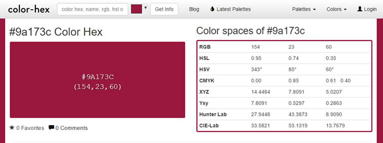
A useful tool that might be of help to you is Color Hex, a website which gives you color spaces in different color standards, such as RGB, HSL, HSV, CMYK etc. Just select or type in a code of your preferred color, and you can see it in other formats as well.
Of course, the aforementioned are not the only color models in the world. There are many others, such as HSL, HSV/HSB, XYZ, etc. However, since the making of systems comes from humans and the colors are not inherently ordered as such in nature, one cannot help but wonder how these arbitrary systems would look only if they were not created by people. Color would still be color, no matter its standardized code. Do you agree?