Undoubtedly, e-commerce websites have become a true driving force in the digital sphere. Shopping has never been more convenient – with a simple click, you can purchase the items you want while sitting on your favorite couch. And in most cases, you’ll receive your coveted items in only a few business days. It’s not fair to say that early e-commerce businesses had it easy, but one thing’s for sure
: fewer competitors also meant less hassle when it came to designing trends, website layout creation, payment options, etc.
Times have changed now, and every serious e-commerce site owner knows that very well. In today’s world, one must have a keen eye for trends to stay afloat in the roaring sea of e-commerce. Every site hopes to offer the best online shopping experience and website owners seek to keep visitors on their sites for longer and longer. No wonder the competition regarding their design is so fierce and ever-changing.
As we are wrapping up the year soon, we thought it would be a great idea to reflect on the most memorable e-commerce web design trends of the past few years to summarize the most groundbreaking changes.
The trends
While there are always major changes and tweaks, there are also quite a few features that stay on the scene for a couple of years. The reason behind this is fairly simple – they work. These features really make it easier for the user to navigate through the site and are simply just practical.
Material Design
This trend has made user-friendly browsing a reality, by the usage of micro-interactions like subtle animations. Minimal design aesthetics rule here giving way for elements that focus mainly on the user. It lets potential buyers view the item more in-depth. The material design shares quite a few features with flat design, however, the material design features more depth and shadow which enhances the overall user-experience.
Material Design can be described as a part of a continuous trend that is pretty dominant in the digital realm – removing complexity and introducing sleek and simple features.
According to professionals, by creating simple websites, users get a more reliable and more consistent shopping experience that they can connect with. For that, you need a simple website that gets the job done.
However, there is a catch. “Simple” doesn’t mean watering down your website. On the contrary. You should design a platform that is simple to use, yet it can still display the power of your brand seamlessly. You don’t want a site that erodes the power of your brand for the sake of simplicity.
Mobile Shopping – Responsiveness
As mobile internet usage overtook laptop and desktop searches, e-commerce site owners have taken notice and started tailoring their websites for this major shift. While early e-commerce sites were crowded both with content and items, today, it’s all about the user. Better internet connectivity has made it possible to respect user-experience, and shifting to mobile-friendly websites is one of the best examples for that. When your customers spend up to three or four hours browsing the web, then you know you have to join the bandwagon to stay relevant.
Card-like Layouts
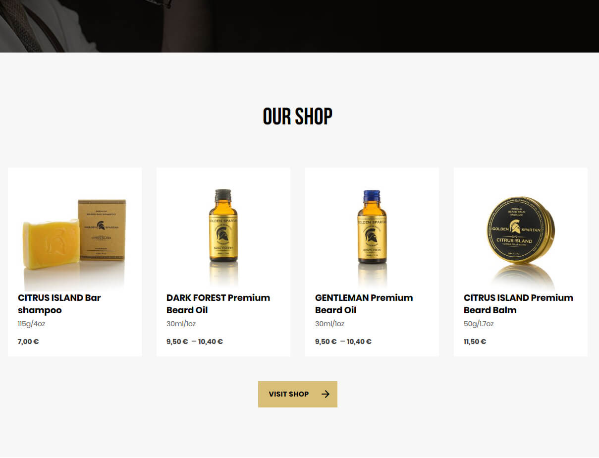
It’s safe to say, this trend is here to stay. These elements have become fairly popular even among the biggest social media gurus. This design trend is superb if you want to display short and neatly placed pieces of text, buttons, and images. It’s a great way to display everything in one tiny little space without getting too crowded.
Websites with Rich Motion Animation
Everybody knows that incorporating animations will make it more engaging. Also, when it comes to e-commerce platforms, it’s an awesome way to display their products more in-depth. It makes the shopping experience that much richer, leading to growth in conversions. No wonder why design elements like icon rotation have become so popular.
Pop-ups timing
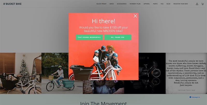
They are one of the main players when it comes to engagement with visitors on e-commerce sites. They have been around for a while now, however, they’ve become more intelligent and respond better to the visitors’ actions.
It’s true that they were mostly regarded as unwanted elements in the past, and were seen as something that ruins user-experience, but they have proven to be an effective method for getting visitors’ attention. A pop-up popping up at the right time, paired with a brilliant marketing technique can help with keeping visitors longer on the website and may even help boost lead generation.
Templates
A prominent trend way back from yesteryear, including templates generated a few misconceptions at first. Some thought that using them would mean not being creative enough and as an act of plain negligence, however, they’ve proven to be really handy when there’s simply not enough time to create a website from scratch.
It may be true that there are quite a few sites sharing the awfully similar design and layout (with a few changes of course), but the majority of these sites have appealed to users and they kept going back.
And in most cases, templates will offer you a wide array of custom features so you don’t have to be concerned about ending up with a copycat website.
Call To Action (CTA Buttons)
These buttons are critical to every serious e-commerce website. They are there to draw potential buyers to make the desired actions (buying an item or reading content). In order to make these buttons “stick out” is by displaying in contrast with the site’s background color. Adding enticing texts like “Free Download”, “Click Here”, “Add to Cart” or “Buy Now” is also a great idea.
Hover Effects
These effects provide immediate information for visitors. By hovering the mouse over a specific image of a product, the site displays the content related to it. This is becoming a more and more prominent and important feature for e-commerce sites since they give basic info to the visitor without actually having to click on anything. It makes it incredibly easy for users to get the info they need immediately and saves them time.
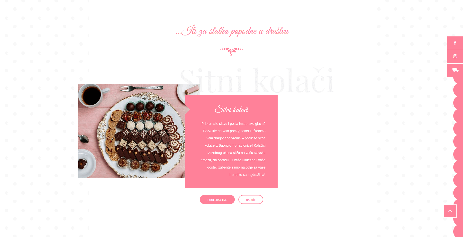
Imagery instead of copy
Using big images to tell your story. You may have seen a couple of websites doing this: revamping what they have by shedding copy and adding more images.
According to professionals, the presence of images actually makes the buyer feel closer to owning the product itself.
To wrap it all up
Trends come and go, but one thing is constant: the ongoing mission to increase your website’s traffic and sales.
– In order to get that going for you, making constant changes in your website design and joining the bandwagon when a new trend pops up might not be the best thing to do. It is important to have a more realistic approach. Your goal here is to get most of the things right.
– Focus on design trends that really do matter. Make sure that your image layouts, color schemes, and available info are all intact, connected. Treat each of them with equal importance. Your aim is to create a website that’s easy to use, engaging and draws customers toward making a purchase.
– Focus on the trends that make the most sense business-wise. From this aspect, having a highly responsive website is a must.
– The bottom line is to have a site that works. The latest design trends are important, yes, but they aren’t the only thing you should rely on to keep your business on its feet. Don’t forget, design trends are here to serve your brand, not the other way around. You should focus on the trends that best help tell the story of your brand and encourage visitors to stay on your site.
At the end of the day, user-experience is pivotal along with the sales you make. If you have a website that allows your customers to purchase their preferred items with ease, that’s a good thing. However, having a fast and reputable delivery system and great customer support will also play a huge role in the number of visits you get and sales you make on a weekly/monthly/yearly basis.