The world of web design gives space for collaboration between both web and graphic designers. Web design can be considered both practical work and the expression of one’s individuality. Only creative minds with eye for detail can succeed in building truly great websites.
What makes websites so great is the ability to combine fantastic code which is presented visually to the viewers/visitors as a true masterpiece that holds them on the website without the wish to leave it.
In 2006, Oliver Richtenstein said that written language (i.e. typography) takes up 95% of content on the web. Search engines read code, whereas people – for whom websites exist and serve the purpose – read (or at least, should read) good, well-shaped content. If their visual criteria are not met, they will leave your website in a matter of seconds. When meditating on typography and it speaking louder than words, C. Knight and J. Glaser said that
in communicating a message, a balance has to be achieved between the visual and the verbal aspects of a design.
This does not, however mean that you have done the job right if you have simply selected a font for your website. There is much more in typography than mere font selection.
The Secret of Great Web Design
It was scientifically proven in 1999 that different typefaces will influence readability and legibility differently on paper and in digital form. This means that fonts selected for paper print will be perceived differently when in digital form (either in a document or on a website or blog).
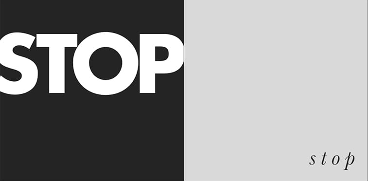
- The message you want to communicate should be your starting point. Similarly to drawing up a sketch of a project, before you start with any work, determine what you want to achieve with your website and what type of message you wish to send to your visitor. Ferdinand de Saussure and Roland Barthes gave their contribution to this topic with the addition of context to the text which gives “secondary signification” to the text. This means that the same words or texts will be understood differently in different circumstances. For example, the following two images write the same word, but their message differs greatly. In the first one, we see that the writer wants us to stop urgently, whereas the second one gives emphasis to teasing and wanting the reader to carry on.
- The reason to this may be that spacing is one of the factors that can influence readability of fonts, which can in return contribute to visual language of a website. Other factors may include serifs, height, length, sharpness of edges, and other elements of a typeface which make some fonts more desirable than other.

- Subtlety is important in the era of responsive design now more than ever. Those subtle details that make one font different from another will contribute to the choice of the right one for your website. In other words, if you choose a typeface that reads well on all screens, your website will have a much higher user experience. For example, we are using the Roboto font for our website, and it reads impeccably on all devices.
- Typography is what enables collaboration between graphic designers and copywriters. It can make even boring texts appear more visually attractive than the best piece of writing in a dull surrounding.
Do not underestimate the power of typography
Subtle typographic choices, indeed, make a difference. They are what your design needs the most if you want it to be impactful and get your message through. Even though the meaning of the content you are presenting is the essence, it will break through much easier if you accompany it with visual flavor and memorable semiotics. Do not hesitate and order your website in the best web design studio and get a 20% discount before New Year’s Eve!
Further reading: