The story of PopArt Studio follows a similar pattern in all of its aspects: ideas that started small and gradually grew into something much bigger. When it comes to illustration, that story comes down to nearly a decade of monthly calendar design. What started as submissions to Smashing Magazine gradually grew into a recurring illustration practice alongside our branding, web, and graphic design work.
Over the years, these projects became a space for experimenting with storytelling, seasonal themes, folklore references, character design, and different illustration styles. Some pieces started from a holiday or mythological concept, while others came from a single sketch, color palette, or atmosphere we wanted to build around a specific month.
This collection brings together 13 designs across three categories: those featured in Smashing Magazine, studio calendar designs, and themed illustrations/seasonal art. Each one carries its own story behind it and reflects a different approach to composition, mood, and visual narrative.
This is not a traditional tutorial or a roundup of generic calendar design. Think of it more as part portfolio, part illustrated calendar design inspiration scroll.
Featured in Smashing Magazine
We don’t like to leave the best for last, but to start with what we’re most proud of.
Two of these pieces were selected for Smashing Magazine’s monthly wallpaper calendar series, which gave the work a much wider audience within the design community. These projects pushed us to think beyond functional layouts and treat each wallpaper calendar design as a small illustrated story tied to a season, tradition, or cultural reference.
We keep experimenting with narrative, atmosphere, symbolism, and composition while still designing something functional that people would actually use on their desktops every day.
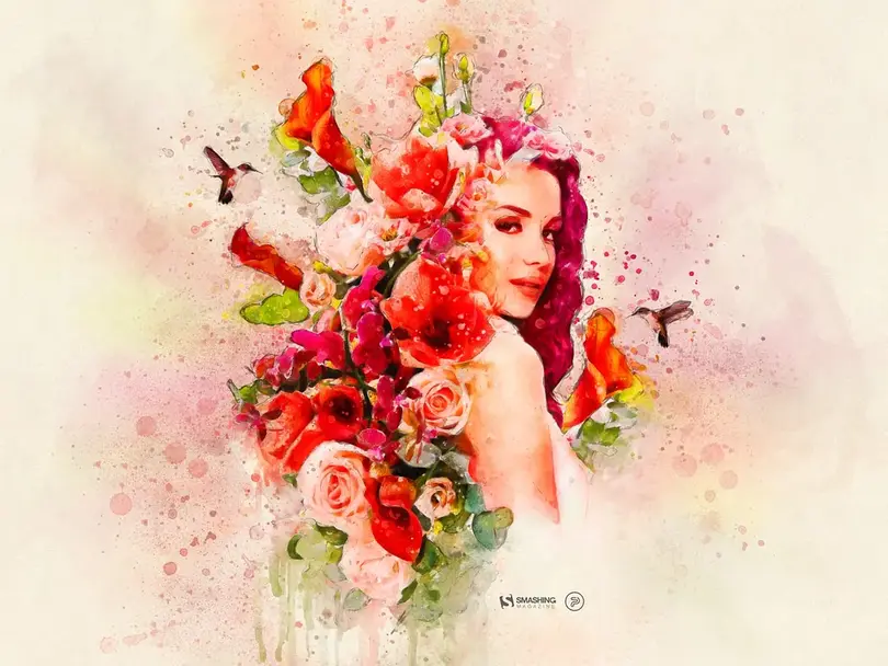
Goddess Makosh

This illustrated calendar design started with Slavic mythology and the atmosphere that comes with late October and the harvest season. We focused on Makosh, a goddess connected to fields, crops, fate, and women’s work in Slavic folklore, and built the composition around harvest symbolism, traditional ornament, and folk-inspired details.
The idea wasn’t to create a historically accurate depiction, but a modern interpretation of Slavic folk motifs through creative calendar design. The goal was to make the illustration feel rich and symbolic without leaning into typical Halloween visuals.
Because this was created as a wallpaper calendar design, we also had to think carefully about balance and readability. The illustration carries most of the visual weight, while the calendar section stays clear enough to function across different desktop formats. That mix of storytelling and usability is an important part of many calendar projects we created.
You can see this piece on Dribbble and in Smashing Magazine’s October 2021 wallpaper collection.
No-Shave November

Once our folklore inspiration ceased, this calendar design came from a modern awareness campaign. The idea was built around No-Shave November, a global movement that encourages people to grow out their hair and donate the money they would normally spend on grooming to cancer awareness and support initiatives.
We approached this one through character illustration and humor rather than a serious or overly dramatic tone. The goal was to create something playful and memorable while still keeping the message recognizable. Because the campaign itself is visually tied to beard growth, the illustration leaned into exaggerated work.
This piece also gave us room to experiment with proportions and simplified composition. Instead of filling the wallpaper calendar design with a lot of smaller seasonal details, we focused on building one central character strong enough to carry the entire visual identity. That approach made the calendar area easier to integrate without competing with the illustration itself.
The project was included on Dribbble and in Smashing Magazine’s November 2021 wallpaper calendar collection, which was especially meaningful because of the awareness message behind it.
Studio Calendar Designs
Not every illustration came from a larger, meaningful concept, but each is substantial to us. Some were built entirely around color, seasonal energy, or a visual mood we wanted to capture for a specific month. All of these projects gave us space to experiment freely with composition, character work, texture, and atmosphere.
Smashing Calendar
This illustrated calendar design from 2021 was built around the feeling of June arriving in full intensity. Instead of treating the month through typical summer clichés, we focused on feminine energy, color, and organic shapes that feel lively and almost overflowing across the composition.
The central character’s hair blends into large floral forms, creating a piece that feels somewhere between portrait illustration and seasonal calendar art. Bright pinks, reds, vivid tones, and small nature details helped us push the energetic atmosphere. Projects like this show how much emotion and seasonality can be communicated through color and composition alone.
Stay Cozy — Winter Calendar

This wallpaper calendar design inspiration came from the contrast between the warmth indoors and the cold, quiet atmosphere outside during winter. Instead of focusing on holidays directly, we wanted to capture that familiar December feeling of looking at a lit window from the outside while everything else feels still, snowy, and dark.
The illustration was built almost like a small storybook scene, with a single glowing house surrounded by winter landscape elements, pine trees, snow, and muted nighttime colors. The idea was to make the warmth inside feel even stronger by keeping the outside environment calm and isolated. During that period, especially, the concept of home starts carrying a very different emotional weight, which naturally found its way into the illustration.
Compared to some of the more detailed or symbolic designer wallpapers, this one relied more on atmosphere and contrast. It’s a reminder that a strong graphic design does not always need a complex narrative; sometimes, a simple mood is enough to carry the entire composition.
Ready for New Adventures

After the uncertainty and exhaustion we all dealt with during 2020, this illustrated calendar design was created as a much lighter and more optimistic way to enter the new year. The idea centered around movement, momentum, and that feeling of finally pushing forward again instead of standing still.
We approached the January wallpaper calendar design through a playful winter character speeding through a snowy landscape, treating the beginning of 2021 like the start of a new downhill run. The composition intentionally feels energetic and fast, with bright accents and movement carrying most of the visual storytelling. Even the color palette leaned into that balance between winter atmosphere and hopeful holiday energy.
The Off-Hours Guardian
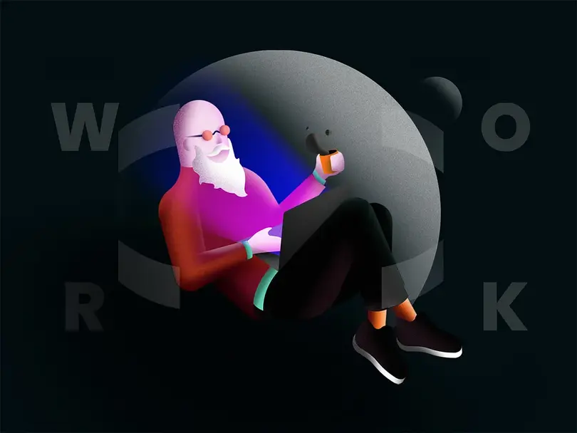
This calendar design took a more grounded and introspective direction than most of the seasonal pieces in the collection. Created around International Workers’ Day, it was inspired by the reality of overtime culture, creative burnout, unstable freelance work, and the feeling that the workday often no longer really has a clear ending.
The visual language became darker and more restrained on purpose. We focused on isolation and atmosphere: a lone figure behind a screen, “WORK” typography fading into the background, and a palette that feels closer to late-night office light than celebration.
What we like about this piece is its simplicity. It did not rely on symbolism or elaborate storytelling to communicate the idea. The screen light alone carried most of the message.
International Women’s Day Calendar
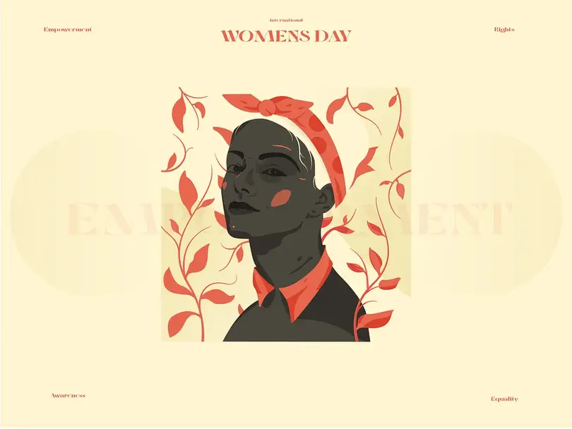
This March calendar design inspiration was built around International Women’s Day and the idea of collective effort toward a more equal and inclusive world. The 2021 theme “Choose to Challenge” guided the direction, not as a slogan, but as a prompt to think about quiet persistence, everyday resistance, and small actions that add up over time.
Visually, we approached it through a strong central figure and layered composition that feels both grounded and forward-moving. The contrast and structure were used to reflect tension and resolution, while the surrounding elements helped create a sense of scale, like one moment inside a much larger movement.
This piece leans on message; the goal wasn’t to illustrate a story, but to capture a shared direction, the idea of challenging what exists and slowly reshaping it through consistent effort.
Against The Current
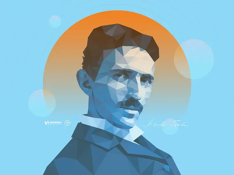
This July Smashing Magazine calendar design was created as a 2021 tribute to Nikola Tesla, marking 165 years since his birth. The concept reflects his legacy as an inventor and futurist whose ideas moved ahead of their time.
Instead of adding extra narrative elements, the design relies on portrait presence and atmosphere to carry the idea. This piece is a direct visual nod to one of the most influential minds in modern engineering and science.
Ivory Tower
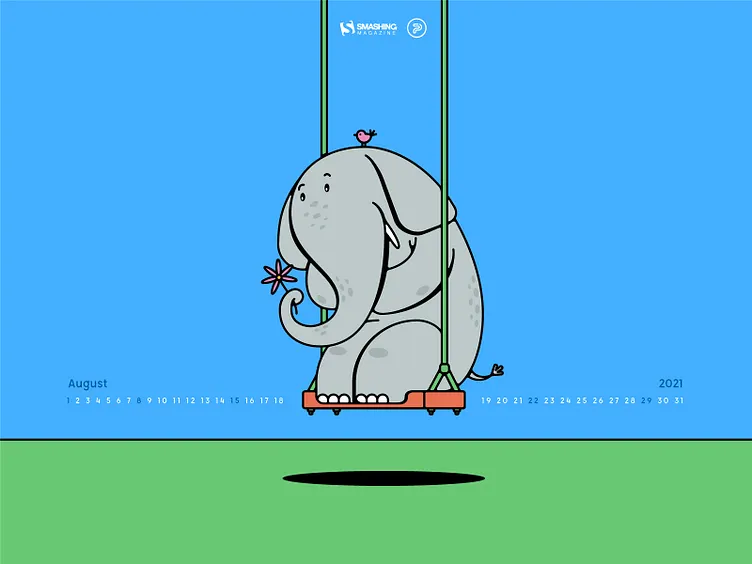
This August calendar design was created for World Elephant Day, a date focused on raising awareness about elephant conservation and the ongoing threats these animals face, from poaching to habitat loss and human-wildlife conflict.
We approached the illustration through a softer, character-driven direction. Instead of a heavy or documentary-style visual, the design centers on a stylized elephant in a calm, almost playful moment. The contrast between the lightness of the scene and the seriousness of the topic was intentional; it helps make the message more approachable without losing its meaning.
Rather than building a complex environment, the goal was to let the character carry the emotion of the piece. This approach fits well within calendar design, where the choice of illustration software often plays a part in helping the designer communicate quickly while still leaving a lasting impression.
Designers Totem Pole
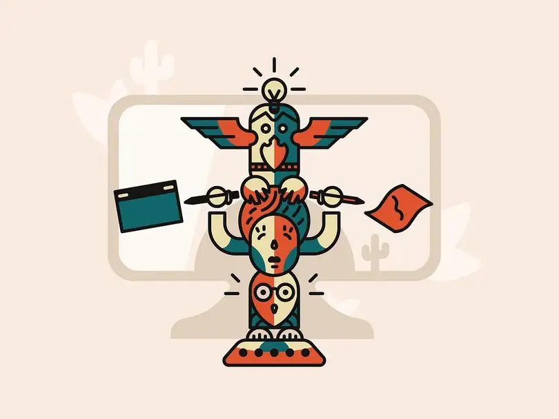
Smashing Magazine calendar design inspired this time by the idea of a totem as a symbolic structure that represents shared values within a group. In this case, the focus was on designers and the everyday tools and habits that shape creative work.
The illustration stacks familiar design-related objects into a single vertical composition, forming a visual totem that reflects the different layers of a designer’s workflow, from thinking and sketching to execution and production. Each element plays a small role in building a collective identity rather than standing on its own. The palette and shapes stay simple and readable, so the structure remains the central focus.
Themed Illustrations & Seasonal Art
Alongside the monthly calendar designs, we also explored standalone illustrations that weren’t tied to a full calendar system but still lived in the same creative space. These focused on a single idea and season, giving us more freedom to push mood, composition, and visual storytelling without the constraints of a full desktop layout.
They work as companions to the calendar work and are part of the same ongoing exploration of illustration, atmosphere, and narrative-driven design.
Hello May
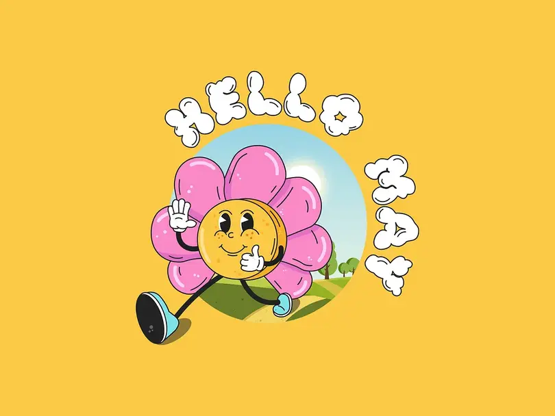
A standalone seasonal illustration celebrating the arrival of May and everything that comes with it: warmer days, blooming nature, and a general shift into a lighter, more energetic lifestyle.
The composition is built around a cheerful, playful atmosphere, with a central floral character, soft shapes, and lively color accents. Pink, orange, and light blue tones set the mood, while the typography is integrated into the scene in a cloud-like form.
Unlike the more structured calendar pieces, this illustration is purely expressive. It focuses on mood and seasonal optimism, turning the idea of “Hello May” into a small visual moment rather than a functional layout.
Chinese New Year
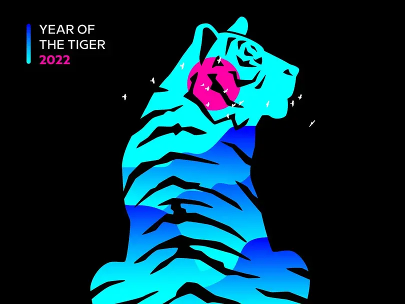
A seasonal illustration created to mark the Spring Festival and the transition into the Chinese zodiac year of the tiger. The concept focuses on renewal and forward movement, using the symbolism traditionally associated with the tiger, bravery, strength, and resilience, as a way to frame the start of a new cycle.
The composition explores contrast and balance, with the tiger as a central thematic anchor supported by a restrained, atmospheric color approach. The goal was to keep the illustration symbolic rather than literal, allowing the theme of new beginnings to come through in a more abstract way.
Compared to some of the more playful seasonal pieces in this section, this work leans into a calmer, more composed visual language, reflecting the idea of stepping into a new year with intention rather than celebration alone.
Journey Through November (National Hiking Day)

Inspired by National Hiking Day, this illustration focuses on the slower rhythm of late autumn and the experience of moving through nature with appreciation for it. It reflects that quiet shift in November when outdoor spaces feel more open and reflective.
Instead of building a character-led narrative, the focus shifts to landscape and movement through nature. The scale of the mountains, the openness of the path, and the seasonal color palette work together to highlight the quiet experience of being outdoors in late autumn, where life feels steady and unhurried.
FAQ
What makes a good calendar design?
A good calendar design balances functionality and visual storytelling. At its core, it still needs to be readable: dates, hierarchy, and structure should never get lost in the illustration. At the same time, the visual layer should add meaning, whether through seasonal cues or a stronger narrative concept. The best calendar designs feel like both: something you can use every day and something you want to keep on your screen because of how it makes you feel.
How do designers create monthly wallpaper calendars?
Most monthly wallpaper calendars start with a concept tied to the time of year, be it some cultural moments or emotional themes. Designers usually begin with rough sketches or moodboards, then build a composition that leaves space for the calendar grid or typography. The challenge is always to balance: the illustration has to carry atmosphere while still allowing the functional elements to remain clear across different screen sizes and resolutions.
What’s the difference between a calendar and a wallpaper calendar?
A traditional calendar is primarily functional, focused on organizing dates, weeks, and months in a clear, structured way. A wallpaper calendar combines that structure with illustration or design, turning it into a visual piece meant for desktop or mobile backgrounds. In wallpaper calendars, the aesthetic layer is just as important as usability, often making them feel closer to illustrated posters than standard planning tools.
Where can designers find calendar design inspiration?
Designers often look to seasonal changes, cultural traditions, folklore, and everyday observations for calendar inspiration. Platforms like Dribbble and Behance are common starting points, but many ideas come from outside design itself, nature, literature, travel, or even personal routines. Smashing Magazine’s monthly wallpaper series has also been a strong reference point for illustrated calendar design and creative experimentation within the community.
What software is used for calendar illustration?
Most calendar illustrations are created using standard design and illustration tools. Adobe Illustrator is commonly used for vector-based work, while Photoshop is often used for more painterly or textured styles. Some designers also use Procreate for sketching and concept development on tablets. The final output is usually assembled in layout tools like Adobe InDesign or Figma when combining illustration with calendar structure and typography.
Final Thoughts
After nearly a decade of creating monthly calendar art, one thing became obvious: inspiration is everywhere once you start paying attention to the character of a specific month. A holiday, a social movement, a weather shift, a folk tradition, a quiet seasonal feeling, any of it can become the starting point for an illustration.
That recurring monthly cadence also forced us to keep ideas moving. There was always another concept to develop, another atmosphere to explore, another story to tell within a fixed format and deadline. Over time, those small monthly exercises became one of the most consistent parts of our illustration practice.
If you’re looking for graphic design services or brand identity work built around strong concepts and original illustration, that’s exactly the kind of work our design team loves creating.