In this day and age, you know that a business card is more than just something you hand out to people. It's a fine source of brand recognition, advertising, CTA, and also doubles as a good old offline “contact us” page.
In order to make all that happen with one package, proper business card design preparations are paramount. You want to make a positive first impression with these small, pocket-sized billboards that has all the necessary info about your business (or yourself).
Simply put, a great business card is a crucial part of the branding and a must for every serious business or entrepreneur who wants to keep sailing afloat in this sea of marketing with stiff competition.
As such, this guide will focus on every vital aspect of how to design a business card so if you need to come up with an idea, you will exactly know where to start and how to pitch your vision to your designer.
So, let’s kick things off, shall we?
Wait a Second
Before we jump right into it, there are a couple of things we actually need to touch bases on. No matter whether you’re running an established business, a startup, a part of a large company, or just getting started as a freelancer, you need to get one huge task out of the way before even thinking about designing your business card:
Designing your logo. It’s needless to say that having a finished logo beforehand is paramount to getting started, and also, having an already established brand color scheme is a must too. They will be the foundation for your card design and may serve as a great resource of inspiration for your designer as well. A good logo along with powerful color schemes can greatly influence card layout and other important aspects, so it’s important for you to understand that you need to take your time with your logo and jump into the process of designing your business card after you’re satisfied with your brand’s “coat of arm”.
Lastly, before we start, you should also assess one more thing. What do you want to communicate with your business card?
In order to address this question properly, you must have a clear brand message and vision already. When it comes to designing your business card, this message and vision should be before you at all times as they will greatly influence the entire design process. Is your business more on the posh side? Is it something exquisite or something more laid back and easy-going? Your business card should reflect that brand personality.
How to Design a Business Card Step by Step
Once you’ve managed to come up with a brand personality you can easily assimilate with, along with creating a logo and establishing a color scheme, you can now venture on to the next step, which is getting started with your business card design.
Below, we will highlight several steps that will anchor you along the way, pointing out different possibilities and routes you can take.
1. Choosing Your Preferred Card Shape
Chances are, you will go with the old tried-and-tested rectangular shape, and that’s great. If it’s not broken, don’t fix it. We get your approach.
However, if you want to spice things up a bit, you might want to look into other options as well. As every brand is competing with each other to become more and more memorable in the eyes of the beholder, some of them look at different printing techniques, sport alternative shapes.
You literally have tons of options sporting everything from your own unique shape design to animal mascots, and even the silhouette of your products.
As a matter of fact, you can even have a card theme going on with different shapes that can empower playfulness, approachability, and gives a friendlier tone to your brand overall.
However, playing around with different ideas only works when they are in tune with your brand’s general message. If you’re a part of a formal industry or running an already established, high-profile luxury brand, going with animal mascots might not be the best idea.
2. Getting The Size Right
After you’ve managed to find the best shape, it’s time to decide on the size. Normally, each country or region will have a standardized size format which can be a great way to get started.
Here are the size charts for some of the regions:
- North American Standard: 3.5 × 2 in. (88.9 × 50.8 mm)
- European Standard: 3.346 × 2.165 in. (85 × 55 mm)
- Oceania Standard: 3.54 × 2.165 in. (90 × 55 mm)
Also, apart from the size, there are a few more important factors that you should consider at this point:
Trim line: The target line for cutting, in most cases 0.125 in or 3 mm.
Safety line: An established line where you can make cutting mistakes (which are prone to happen). This is also set to around 3 mm or 0.125 in from the bleed line.
Bleed area: The outermost part that will be most likely removed. The trim and the safety line together, or a total of 0.250 in or 6 mm.
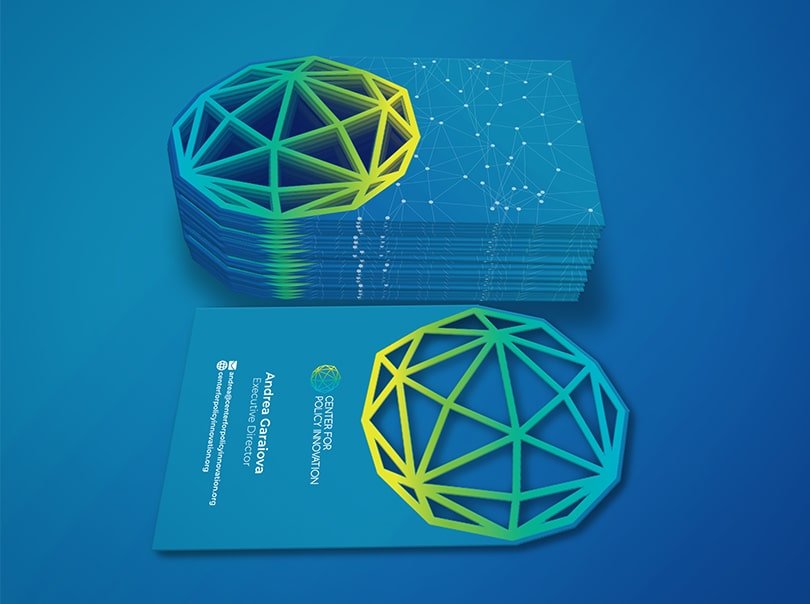
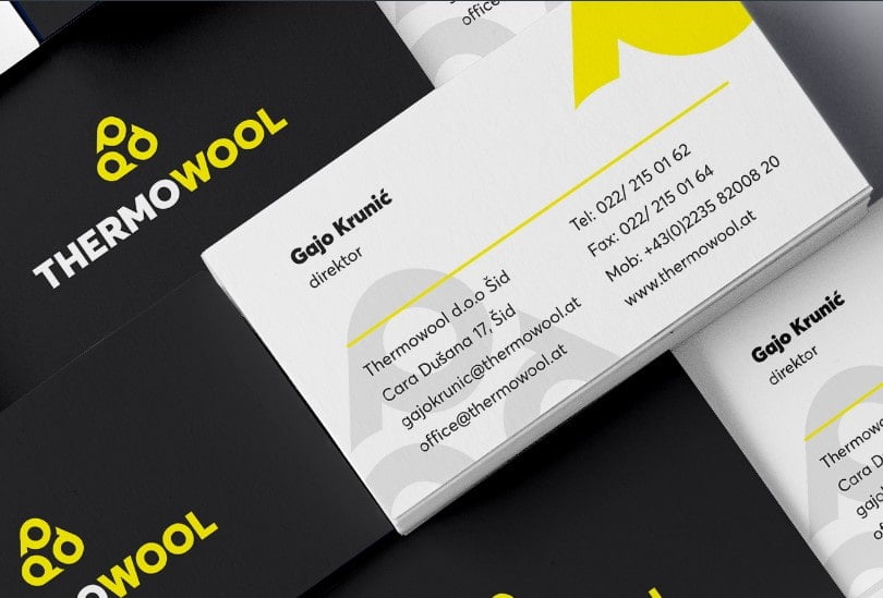
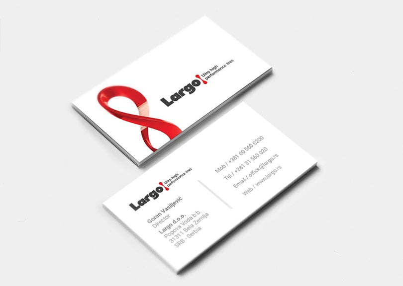
3. Logo and Graphics
So, this is where it starts to get interesting. Whenever you start with the visual elements, you have to start with the logo, as it should take center stage on the card’s design and on the card itself.
When designing your card, you should never forget that you actually have two different sides that you can use. Oftentimes, you will see brands that dedicate one side entirely to showcase their logo while the other side holds all the necessities such as contact info.
Sometimes, you will see the logo on both sides but a bit smaller and out-of-the-way in another design approach along with the contact info.
Basically, the choice is yours, experiment a little to find the right placement and approach.

Also, you’ve probably seen that most businesses go with a minimalistic approach when it comes to designs. However, that doesn’t mean you should follow the same trends. If you feel that you need to add more graphics, go ahead, see what you end up with. This even makes sense in particular niches. For example, if you are in the business of children’s clothing, you can fill out the entire card, just talk with your designer to avoid clutter.
You don’t have to be a kids’ brand to experiment with additional graphics. Bright color schemes, smaller mascots can be a great way to communicate the right brand message, especially if you want to come off as casual and approachable.
You can also go with just the logo and leave a simple URL. This will prompt people to search for you and your brand.
4. Adding the Text
This will mostly depend on you. If you’re a freelancer, chances are, you might not have to give your postal address, but if you give face-to-face consultations, you might need to do that as well. You can add your social URLs as well, especially if you want to draw attention to your following.
Generally, when it comes to text, there are quite a few common choices so feel free to experiment with what to exclude or include.
- Name: This one is quite self-explanatory.
- Job title: Usually found on traditional cards, it helps the people remind who you are.
- Company: Also a given.
- Phone number: A means of contact.
- Email address: The best form of non-urgent communications that allows your clients to attach documents and other files.
- URL: Why not market your website and boost your visits a bit?
- Social URLs: A must for influencers, it helps showcase your personality and following.
- Address: A must for brick-and-mortar offices and stores.
- Slogan: Entirely up to you, but a good slogan always helps with brand recognition.
5. Typography
Once you figured out the necessary info you want to give, you will inevitably have to choose the way how it will look.
Typography is pretty important in marketing, but it takes a pivotal role in business card design because it has to be legible and you only have a small space to pull everything off.
This is why you need to consider such factors as:
- Font size: Aim for at least 8 pts to keep the info readable, however, some important elements (like your name) should be larger as they need to stand out. Also, keep away from cluttering the design so playing around with space and adding breathing room is also important.
- Font type: You probably already know about the influence fonts can have on the way people perceive your brand. Without going into details, always remember to aim for a font type that’s in tune with the personality of your brand.
- Color: The same rule applies here as well. While it’s always a good idea to experiment, font colors should also match the general feel and personality of your brand to keep your message consistent.
All in all, the main goal here is legibility. Try and keep the text readable at all times, no matter how artistic you want to get. If you go overboard, people will simply be unable to read your contacts.
6. Add Special Touches
Now, that we’re nearing the end of the design journey, it’s time to see what printers have to offer to you to make your design stand out even more. If you choose, you can work with printers that offer certain finishes that can create a lasting impression.
Here are some of these special effects:
- Embossing: Creating 3D reliefs makes certain areas (like the text) pop out. It’s great to draw attention to specific words or areas.
- Foil stamping: If shiny is your thing, you can use this feature to make parts (or the entire card) stand out. It can also help to accent text if you have a typeface that’s bold enough.
- Letterpress printing: Instead of raising the paper ( when embossing it), this technique pushes it down. It’s more like an engravement and it can draw attention with used with special ink. It’s a to-go design option when you want to highlight words.
- Spot UV coating: This is like a sleek varnish to create smooth textures, except it’s only applied to specific areas. You can add gloss only to your logo, words, slogan, or graphics. It’s a great way to accent certain areas, however, you want to be careful not to ruin the overall picture with one portion of the card being overly shiny.
7. Choose Your Designer
This could also have been the first and the last tip on the list. If you’re struggling to come up with a design or not sure how to get started with the process, hiring a graphic designer with experience can take a lot of the weight off your shoulders.
As a matter of fact, development companies and digital agencies usually have stellar designers who tackle similar problems on a daily basis. By reaching out to a company, they can hook you up with the people with the necessary knowledge and tools. Chances are, you will just pitch them an idea and they will pull up several ideas within a few days or weeks.
8. Finalizing the Process
After you’ve completed every step above, it’s a good idea to give everything one more thorough look and get started with printing.
Don’t rush the review process. You want to examine everything: the entire visual flow, how the card looks, the things you notice right away, etc.
When the visual flow is right, then the logo should be apparent first, then the name, and the secondary info with the additional images if there are any.
If you feel that the flow is off, you can always go back a few steps and change up element sizes and their location.
Also, look for signs of clutter and try to eliminate them. The fewer elements you have on the card the better impact each of them makes.
Double-check your typography and reread everything to make sure there are no typos and similar banal issues.
Pro Tip: Standing Out
Last but not least, here are a few advanced techniques you might want to consider. If you want to go that extra mile to stand out (and especially when your industry allows it) there are quite a few additional tricks you can pull to put yourself on the map.
That being said, you can always try stuff like:
- Scented ink
- Using different materials like rubber or metal
- Transparent and/or folded cards
- Tripling or doubling the card’s with
Here are two more things that you should take into consideration:
The issue of borders: Borders work, in theory, and double as a smart aesthetic design choice to give the content a frame. However, when you’re cutting cards in bulk, mistakes and mishaps are inevitable, making cutting every card perfectly to follow the same frame is pretty much impossible. This is why most professionals advise using safety and bleed areas. When you go with borders, you are running the risk of exaggerating cutting mistakes and slightly decrease the power of the entire design.
Colors: If you have to work with a tighter budget, instead of skimping on quantity or material quality, you might be better off working with fewer colors to cut costs. As a matter of fact, working with only one or two colors can be a great way not just to save a bit of money, in the hands of the right designer, it can also be a way to create a subtle yet sophisticated design.
Finishing Thoughts
By now, you certainly get the point that a business card isn’t only a piece of paper with your info in it. It’s a miniature billboard with your brand on it which should reflect the power, mission, and vision of said brand perfectly.
That being said, take your time with designing your business card. Ask professionals for help, hire a designer who understands your brand and ideas, who can capture the essence of what needs to be conveyed to the masses right off the bat.