“I don’t know about you, but I feel a bit lost lately. Front-end, huh? Responsiveness? Flexibility? Custom properties? It is hard to keep track of all that. Yet again, there is so much generic design and lookalikes out there. We have forgotten how to stand out.”
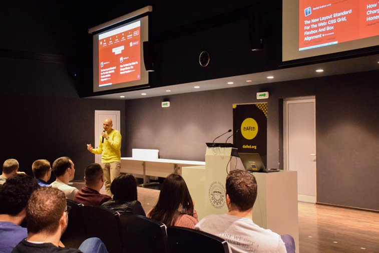
This is how Vitaly Friedman, co-founder and editor of Smashing Magazine, started his lecture in Novi Sad, Serbia, as part of the DaFED Tour organized by DaFED, a non-profit organization dedicated to empowering local IT community through educational events.
We had a chance to attend Vitaly Friedman’s talk at the DaFED #53 meet-up, along with the lecture of Mario Šestak, head of design at Bornfight from Zagreb, Croatia, who talked about the importance of design research and various discovery methods.
In a presentation jam-packed with wise advice and tons of real-life examples, Vitaly Friedman had shown us the new frontiers of the responsive web design.
“If we take a look at the web in the last two years, we see too many predictable interfaces. We need to ask ourselves how to be a lot more authentic, and a lot less generic on the web. It doesn’t have to require enormous amount of resources, it is possible to make something memorable without going into debt. At the end of the day, we should let our brands reflect the personality of people in the company, and appear as clever, fun, empathetic, and engaging.” – Vitaly Friedman
After listening to his inspiring talk, we sat together with Vitaly and talked about the current state of front-end design. So, make yourself comfortable and read all about the ideas that rule the web today. You will learn how to make a good design strategy, what is the unexplored area of web development, who are the real design critics, and what could be the key takeaways from a large-scale project for the European Parliament.
Interview with Vitaly Friedman for Popart Studio
What we saw during your DaFED lecture was a compilation of the good, the bad, and the ugly in web design today. Have you ever thought about making some kind of an online archive of such examples?
I prefer writing about it and making it available in a printed book. So, I wrote about many of those examples in the chapter called Bring the personality back to the web for the Smashing Book 6: The new frontiers of web design. I always try to create something that is tangible. I like print because of its permanence (not because I want to waste paper). Some things can also live online for a long time, but websites are constantly changing. I simply do not trust websites. They disappear. That’s why I record videos to capture the moment, although it does take a lot of time.
You often write about your work and your experience. Do you think writing about design is important for the community as a way of educating both fellow designers/developers and users/clients?
From a personal perspective, writing is very important to me. It helps me to group issues, to really understand everything, and make sense of a certain problem. On the other side, of course, various examples on the internet are something I often write about. There is a very good work out there that is worth sharing with the community. It may be coming from a remote area of the world or from a very small team working on a very small project, but I always try to amplify those valuable voices.
I am compiling thoughts, ideas, and projects, and broadcasting them to the world, mostly through social media channels. I truly believe that it is very important to mention people by names when referencing. That often gets forgotten, but I usually tend to focus on names and the practical value. I try to dedicate every Friday to research and have 3-4 hours of reading and looking at what people are doing. That way, I make some sort of personal bookmarks or my personal point of reference.
When you start a new project, what part does the research and strategizing usually make, and what part goes on strategy execution?
The scope of my work has changed a lot over the last two years. I don’t push pixels anymore, in order to design a perfect button, for instance. There is rather a lot of planning involved in my everyday tasks while trying to solve a problem in terms of clarity, transparency, and making sure that not too many people misunderstand things. My job is mostly managing expectations and dealing with wrong expectations. So, one part of my job is to make sure that whenever people come to the site with a different expectation of what would happen, they could be able to recover from it quickly.
That is a very important part of the design process, and that’s where the core of my work lies. Another part is about structuring elements in a clear way and writing meaningful copy. Of course, typography is important as well, but I hardly feel that the shape of a button matters that much. I have seen companies do a lot of A/B testing for 50 shades of green, for example, but that’s not necessarily the right way. Different colors might create different emotions and there might be a rule that red buttons work worse than green buttons, but let’s just take the Smashing Magazine for example here. We have an entire website dressed in red and I wouldn’t say that it’s hurting our conversions.
Besides color, what else do we need if we want to stand out on the web?
I often go against the mainstream just to study what people do. I try to understand why and learn how they deal with certain issues, how do they solve problems, and how could I find an interesting angle to all of that. To stand out on the web you do not need a lot of time and resources. You just need something unique that will actually stand out. So, the first thing that I do when working on a new project is asking what if we removed all rectangles, triangles, and circles. What would that leave us with? Well, it can leave us with a good concept, that’s for sure. If you have a wonderful core idea, you can build whatever you want with it.
You often debate on social media that we shouldn’t keep on doing the same thing over and over again just because ’it has always been done like that’. What would you say is the reason for this kind of uniformity?
It is easier that way. It is difficult to come up with something new all the time. But my point is that it does not require a lot of effort to stand out. I see so many websites desperately trying to break usability and accessibility for the sake of being different. Instead of that, we should always try to build in the personality on top of the usability and accessibility. It means that everything should be accessible, readable, and usable, but also there should be some sort of a signature that underlines the personality. That is very important to me. I am just really tired of sameness on the web.
What would be the opportunities that designers can take in order to make better websites in the future?
Many designers haven’t even started exploring how machine learning and artificial intelligence can help them. There are incredible opportunities for us to design systems that are somehow connected to machine learning and improve the customization of the experience. The same goes for really changing the experience altogether given on the specifics of a device. Privacy issues are very important as well, so one should find a perfect zone within the notion of customized design. The more you customize, the more you know about users, so there is always a privacy tension.
But at the same time, we need to think about how design could adjust to different networks, conditions, connection types, device memory, etc. We are pretty good at layouts and different design tasks. We know how to manage them. But there are new challenges coming our way within the personalization area that we haven’t even explored yet. So the real question is what is beyond, because there may be things that we cannot see, but we could use machine learning to acknowledge their existence. There is also a responsibility in a social state of things because we don’t want to end up with some sort of interface that is similar to the black mirror, right?
We could say that you act like a design critic in a way, as you point out to good and maybe not-so-good examples out there. How important is it to have more critical thinking within the design community, more objective reviews and more thoughtful feedback, instead of self-promotion and designing for designers?
It is not necessarily a bad thing to design for other designers. You always have to put an effort into your work, even if you want to show off. You can do something crazy and experimental for your portfolio, but you would also want to make something usable for clients. In the end, the design has to solve a business case. We are not creating websites to hang them out in museums. We create them for a purpose, but designers might forget about that sometimes and concentrate solely on the aesthetics.
We can do what we want with our personal projects, and it can help us attract new clients, but we will be judged by people who click or do not click when they enter the web page. So, users are the real critics here. On the other hand, there is our good old friend Googlebot who gets to crawl our websites and decide which one is more relevant. If a website is not accessible to a bot, it most likely won’t be accessible to users as well.
Accessibility has always been an important value in web design. The recent analysis from the WebAIM has shown that 97.8% of top 1,000,000 websites’ home pages have detectable WCAG 2 failures and some kinds of accessibility issues, whether it is a low contrast, empty links, missing form labels, or something else. What do you say about that?
Let us look back for a moment and remember that for many years the web had been driven by crazy experiments with Flash, but then we had come to the point where everything became more predictable, which was good for a while. Then we had started working on features and had a lot of feature-driven development, which is still happening on many projects. Finally, we came to the point when designers got the seat at the table. The visual component and aesthetics had become very important. We are in a similar situation today. It is really interesting to see that designers understand the importance of accessibility, so they have brought it back to the table. There is no big consortium saying everything has to be accessible.
Of course it does. If the web wasn’t accessible, people wouldn’t use it in such a diverse way. But today, there is more unpredictability in term of devices, screen sizes, dark/light modes, etc. In a way, technology pushed for accessibility because that is the only way to make a website or the web app usable. Something might be beautiful, but if it is not usable, people won’t use it. For that reason, accessibility has become a business consideration, because no one wants to miss out on the opportunities. And now it is becoming a mainstream thing.
Which part of working with clients do you consider to be the most challenging?
For starters, I want to know what the problems are for a particular client, and I want to understand why am I there in the first place. I spend quite a lot of time on that, and then I get down to solving those problems. Sometimes it is the restructuring the team, or regrouping the way people work, or bringing some fresh ideas into the loop. Usually, we are facing an interface that doesn’t seem to be working well, so the problem is how to make things better. That is always interesting to me. Also, I love challenges. The great example of challenging work is the redesign of the European Parliament websites that I have done recently. I was involved in a series of workshops and the improvement of the websites before the upcoming elections.
It was not a complicated project itself, but some of the blocks along the way had been quite challenging, such as the monstrosity of the whole network of 15 websites, a hierarchy of decision making, or a domino effect caused by a single change. At times, I was afraid to touch anything because I didn’t know what might happen next. It was really an interesting experience. It has taught me that if you are patient enough, sometimes even stubborn enough, you can contribute to a really positive change. I am very proud to see that the website that was built with my help now appears as very accessible, very fast, and serving its purpose.
What would make the right strategy for a good responsive web design today?
I always tend to start with a pyramid. At the bottom we have Performance, then we have Accessibility, then we have Skills, and then Style. It means that we always start having a conversation about the given scope of requirements and we strive to make a website fast as an ultimate goal. This is not my notion, it is coming from Patty Toland, a senior UX designer and a partner at Filament Group in Boston. So, we start with the performance, and then go to the accessibility issues, not in terms of adding accessibility, but in terms of keeping things accessible.
Afterward, we start thinking about the layout, colors, typography, and how elements should adapt to small screens and large screens, and then, on the very top, comes thinking about animations, transitions, parallax, and everything else that is not required but it adds up to the style. It is very helpful to have conversations in that order. Of course, designers and developers should be on board from the very start of the project. Besides them, other specialists are involved depending on the requirements, whether those are legal issues, security systems, data privacy issues, or anything else. There should always be as many people as possible involved in the design process. Everyone should get on board at the very beginning and then follow through.
How do you approach a new project and how do you stay unique?
Our starting question usually refers to the core message, to the essence of the design, and then we try to emphasize it. For example, for an eCommerce project, we would never start with designing the perfect home page. We would be looking into the product page first, and then the checkout, trying to make those experiences the best possible. Along the way, we would look at typography, colors, button sizes and everything else. And then we would propagate from that decisions to decisions on the home page, categories, search, etc.
For the online magazine, on the other hand, the heart would be the article layout, so we would invest a lot in typography, image captions, style formats, comments, and think about making an absolutely incredible experience. So, I always tend to start with something that will be a critical part of the experience. Sometimes, the project can start from a little bit different point. If it is a service that competes in the area which already has so many similar solutions, then you need to find your own unique perspective, something that will make you stand out and frame your project in a unique way.
We hope you have enjoyed reading as much as we enjoyed talking to Vitaly Friedman. Are there any other questions you would like to ask or something that you want to dive deeper into the debate on? Feel free to open a discussion in the comments below or on our Facebook page.
Featured image: Courtesy of DaFED