If you’re a seasoned entrepreneur, you know that a business card isn’t just a simple card. It’s more of a mini-billboard that portably advertises your business with a simple CTA message.
As it’s an integral part of your business and brand, it’s a vital part of your overall entrepreneurial presence.
As such, improving your business card design could mean improving your overall brand.
And as we’ve started 2022, we can already see daring brands experiment with outstanding design ideas to challenge business card design at its core, introducing new standards to these portable, pocket advertisements.
So, let’s not chit-chat any further. Learn about the latest business card designs that aim to redefine 2022 with cutting-edge solutions and professional looks.
Chatty Cards
Remember the time when business cards strictly meant business? Well, if you’ve been looking at the latest design trends, you can tell that some of the newest designs have become pretty “chatty.”
It looks like an obvious move since a lot of different brands are gearing towards more personalized interactions, steering the conversation into more casual waters.
This is something even formal industries can benefit from, as the design principle can help showcase the human side of any business. The basic idea behind the trend is to look friendlier and more approachable.
With this trend, entrepreneurs only have to be careful and make sure they don’t take the chit-chat overboard. Too much fluff can challenge brand perception and credibility.
Also, don’t forget to use the typography and color scheme that best matches your tone.
Anti-Card Cards
It’s not uncommon in the world of design to go ahead and challenge every long-standing principle, design standard, and tradition.
The anti-card is one of those movements, and we have to hand it to it; it’s looking awesome and creative.
Simply put, these are cards that aren’t. They make a statement by not really making a statement. On the one hand, they are created out of irony, and on the other, to be recognizable.
Even then, the result is sheer creativity.
They generally involve a design pun relating to the industry you’re in or involve a self-referential joke.
The acknowledgment of the absurdity of anti-cards is a great way to connect with people who also “get the joke,” and you can embed yourself in the mind of forward-thinking clients.
It’s also a good way to introduce a pinch of humor to the otherwise rigid business world.
Reading Between The Lines
Blend design elements with various text elements if anti-cards are simply too much for you. With this awesome design trend for 2022, you can still make a statement and look more professional than with self-referential jokes.
This trend is awesome if you want to create a memorable and outstanding design but still maintain a professional feel and look. It’s a great way of showcasing your artistic side and still retaining the legibility of all your contact info.
It works great, no matter how you look at it.
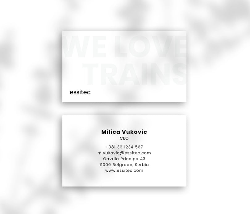
The Wrap-around Approach
This isn’t something brand new since business card designers have been experimenting with these ideas. However, they’ve become more and more straightforward and popular lately.
Essentially, the design principle entails wrapping an image around both the front and back of the card, creating a design that “pours” over to both sides.
This simple yet genius trend makes the entire card more interactive and engaging.
This card design also pairs relatively nicely will the other design trends we’ve mentioned so far. Wrap-around cards also challenge the traditions a bit but still retain a great deal of professionalism and add a modern look to the overall design at the same time. It’s a win-win trend since it works great both with brands that like to be playful and serious businesses.
Modernism
The modernist approaches of the mid-1900s are making a comeback in the business card design world, and if you’re into these solutions, you should definitely check some out modernist card design ideas.
The attention-grabbing elements, memorable design, and easily compacted designs work outstandingly well with business cards.
On the other hand, form follows function in the modernist approach. This means that the visuals will prioritize the purpose of the card over the creative expression.
Modernism in 2022, in the case of business cards, revolves around primary colors, bold fonts, basic shapes, strict grids, and more that make pocket-sized designs easily readable and understandable.
Pattern Extensions
Repeated patterns have always worked well in design and might be considered pretty much evergreen.
Even then, 2022 takes pattern expressions in card design to an entirely new level, experimenting with new and daring ideas.
Even though patterns have always been a huge favorite in business card designs, 2022 introduces a few new twists in this approach, challenging tradition and custom.
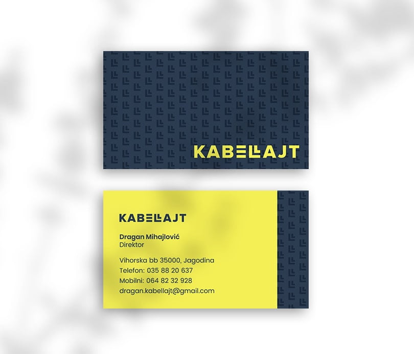
These small but noticeable deviations create a unique look that’s nostalgic yet modern at the same time, with a touch of edginess to it, especially in the case of high-contrast (black and white) designs.
Traditional and serious businesses can take advantage of these principles, as the edgy designs exude confidence and professionalism.
Soft and Gentle
Bubble letters used to be a huge thing in the seventies. Softie styles are embracing a comeback this year, and with a tad of modern touches, these ultra-bright colored design ideas can help your playfulness come to life on any business card.
The first thing you may notice on these cards is that the letters aren’t “so soft” as they were in the seventies. Also, there are more sharp corners and straight lines, which are probably inspired by the minimalist approaches of the last decade.
Still, the softie influence is here, highlighting the basic message, adding legibility to your card. This is a great retro-nostalgic idea that combines old and new in the best possible way.
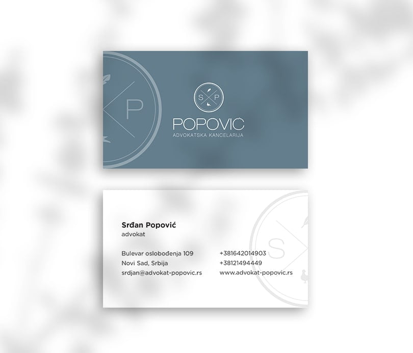
Add More Contrast
This has to be one of the most popular business card designs for 2022 and probably, beyond. High-contrast solutions in typography and contrast can work well in every design area if done right.
That being said, you’ve already come across a myriad of these trends, probably in the case of websites, landing pages, and more.
Truth be told, the high-contrast principle is more or less underpinned in the other trends we’ve mentioned above.
As a matter of fact, it can serve as a great “base trend,” and your designer may choose to combine it with other approaches that can accentuate its strong point while mitigating its drawbacks.
A lot of high-contrast solutions will use a black background and add a bright-colored font to stick out. However, this is only the beginning. You can also play around with other elements as well. Your designer can achieve a more dynamic effect by playing around with the typography itself by playing with how your readers interpret the info and the brand on the card.
Above All, Represent Your Brand
In essence, a solid business card should make contacting you a straightforward process. However, an outstanding card design will do a lot more than that. It’s an effective and portable branding tool that can influence your target audience and can have a lasting impact on the people who see your card.
It can also make an outstanding first impression which might blossom into a conversion or a lasting partnership.
Lastly, when looking at these trends, it’s essential to keep your brand’s visual identity in mind. You want to avoid throwing together a few colors and fonts, print it on a card, and end the process right there.
In order to make a standout business card, you need to choose the colors and the design trends that blend with your brand’s message and identity seamlessly.
Serious businesses may want to stay away with too playful and bubbly ideas, as they might come across as less credible. Also, more easy-going and friendly businesses may come off as too serious if they choose a design tactic that just doesn’t complement their identity.
To get the best out of your efforts, consider teaming up with a design agency.