As you know, when it comes to classic ways to make sure that different elements work well together, most web designers use contrast. At first, you might think that it’s something that’s not “that much of a big deal”, however, once you learn about the subtle art of creating contrast and how to use it to your benefit, you will be surprised just how profoundly it can enhance your overall design.
Contrast and Brand Identity
When you want to hire the best people to design your website, the best experts in the business will most probably ask about your brand first. What’s your brand identity? Generally, what style suits your brand message and online content best? Does your brand have a persona where a minimalistic, black and white color scheme could evoke the feelings you want to wake up in your audiences? Or, does a natural color palette with different shades is the way to go to enhance your message? Do you need a uniform or varied sizing?
As you can see, there are a lot of different things you need to tick off before you get the final product and most of these processes are more or less intertwined or relate to one another.

Contrast, in essence, is considered as one of the five essential visual design principles in the world of web design and all five of these elements work together to create an independent visual identity online that captures the essence of your brand and interacts with your audiences.
The Importance of Contrast in Web Design
Let’s see what actually makes contrast so important.
What is Contrast in Web Design?
Simply put, contrast represents the relationship between two (or potentially more) design elements whose different visual characteristics are emphasized when both of them are shown together. Generally, the degree of contrast between these two bodies is disproportionate to the level of their similarity. This means that the fewer similarities the two bodies share, the greater the contrast between them.
For example, light blue wouldn’t have much of an effect on a pastel interface. However, if you change the light blue to a dark color (like deep eggplant) the differences would be more pronounced and would grab the attention of the visitor.
Why Should You Be Using Contrast?
Contrast can be achieved through shape, color, sizing, and so on. Generally, they can help create a sense of visual hierarchy. By emphasizing the differences between elements, people can instantly tell what are parts of the web page they need to focus on and helps them to differentiate different parts of the site and pages more efficiently.
The best way to understand the importance of contrast is by learning about the different types there are and then you can use them to your advantage.
Contrast Types
Color
Easily, these are the most famous and probably, among the most obvious contrast types in design. It’s probably the simplest way to make screen content more distinguishable and accessible. The most basic reason behind this is the fact that text readability mostly relies on the significant contrast with the background.
There are a few ways designers can create color contrast in their designs.
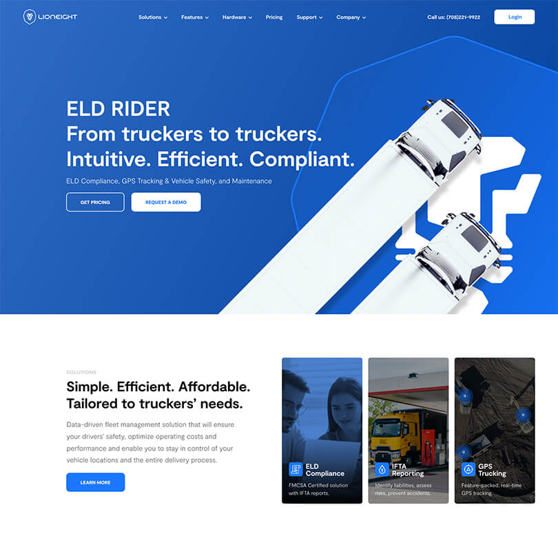
For starters, there’s color contrast with using image overlays which can create a clear contrast between a heading and a background. This method is a rather popular way for the hero section or to dramatize the main content or text.
On the other hand, you can also create contrast schemes with filter effects. For instance, there are pieces of website builder software that have their own set of filter effects that let you apply different graphic effects from blur, color shifting, and even images. All of these enable awesome ways to highlight a design element.
When you’re doing this, one important thing to remember is to make sure that the filter effect you end up using matches the color palette of the overall website. It should be a natural part of your brand’s color scheme and imagery.
Size
Sizing contrast will apply mostly to all design elements on the page. Think of buttons, images, texts… You name it. The implications of the size you end up choosing for each of your page elements can pretty much break it or make it. As such, you need to be careful with the sizing, as the relationship between your components should be distinguishable and clear. If your design logic is hard to follow.
For starters, if you’re looking to add sizing contrast, you should know that text sizing can be one of the most basic things you can get right. Or mess up. Typography schemes and visual content like headings, buttons, body paragraphs, menu elements, vector graphics, image collections, and such, all have their own information architecture.
When a visitor lands on your website they are most likely to start reading the bigger letters (in the case of texts) assuming it’s the title. Only after that will they go over subheadings and body texts. It’s a simple way to introduce informational hierarchy (most important to less important) while helping the reader navigate through the content at the same time.
Another thing you can do with sizing is creating different columns according to visual hierarchy. What this means is you can also design your columns based on the information hierarchy between main and secondary content. For example, if you’re running a media website, the main story can be the widest column on center stage, while the secondary articles can be on the sides of a basic three-column grid.
Space
To create contrast with spacing, most web designers will usually use negative space between or around elements. The emptiness around said element highlights the contrast between the design details surrounding it and the overall background.
As such, you can use spacing to highlight detail, which is rather self-explanatory, and you can also use padding margins to increase spacing and add contrast at the same time.
When using space to add contrast, designers must be mindful of responsive design as each screen size will be affected differently by the units of space you are using, so you should always consider and test every scenario to make sure that your design won’t lose its effect on a different screen.
Background and Foreground
When it comes to web design, background and foreground contrast offer you vast options to tinker with. You have a myriad of background types to start with, and the same background can change significantly as the site visitor interacts with it. The foreground is pretty similar too: whether you choose static or interactive elements, users will have a dramatically different experience with the overall design and the website.
To create contrast between these two elements, you can use Parallax.
On the other hand, you can always use a background with lively and vivid imagery. For example, if you are creating a page for a cookbook, you can always choose to put a background that represents some of the recipes inside the book.
What’s most important here is to always keep in mind how the different background types will affect such other important factors as loading speed and site performance. Awesome video images might have a huge impact on the overall design, but if they take too long to load, they may defeat the sole purpose of engaging the user.
Element Types
When looking at different media types that you can embed or upload to your site, it’s easy to see that there’s a myriad of different options. The tricky part is deciding which type(s) fit(s) best with your website and content goals. This can often be more challenging than it sounds.
For instance, sometimes photographs will be your best option, other times, you might be better off with simpler illustrations or even hand-drawn sketches.
However, you can also choose to mix these different element types with one area or page. Voila, you’ve managed to create contrast!
To pull this off, you still need to do it in style and have a purpose for it. For instance, you can combine photographs with different graphics to dramatize storytelling. Also, you can use different element types to visualize the complexity that’s happening on the page. That can be as simple as highlighting a word with different typography, color, and animation to create contrast.
All in all, experimenting with different element types can be a great way to show off your creativity, however, keep your target audience in mind when starting to design. Ask yourself, will they “get” the message? Will they be engaged with the elements you want to use, or should you stick to a more traditional approach?
Shapes
Using different shapes and visual variety is fundamental in web designs as it can drastically help to improve engagement, and shapes also give you the opportunity to play around with visual hierarchy which is a contrast type we’ve already discussed above.
So, to get started, you can simply differentiate between various story elements. Using different shapes to distinguish different sections on the homepage. Using a segmentation method like this may actually help you achieve two goals: elongating the browsing section as they discover the overall design and engaging with it, and helping them identify the different content sections.
Also, you can choose to add variety to your environments, even the simplest ones on the page.
For instance, take your background and create changing animations on it which change as the user scrolls. This is just like parallax scrolling or scrollytelling, however, it’s also a great way to fill out an otherwise dull background and make use of the simplest elements.
Your background shapes/animations can also enhance the foreground design details, creating an engaging and cohesive overall online presence.
When experimenting with environments and shapes, you can tinker around with outlined shapes, 3D effects, shadow effects, hand-drawn sketches, and more.
Using Contrast in Web Design to Stand Out
At the end of the day, every web creator is working toward one main goal: to create websites that stand out and that grab the attention of their target audiences and thus, overtower the competition.
Creating such websites can be achieved with contrast. When you use elements that are contrasting with each other, you are basically showing your capabilities as a professional designer and you are also proving that you can create websites that stand out, as they feature different design entities and elements that, even though sometimes totally different, work together in harmonious ways.


