Upon a user has landed on one of your pages, you’ve got around 8 seconds to persuade them to stay on your website. We know – it’s not nearly enough time to demonstrate all the benefits of your products or showcase your entire business offer. That’s why creating a landing page that converts visitors into customers is deemed art, and we’re here to share our secrets of what makes a landing page successful and a converting one.
Landing pages are a huge deal in digital marketing. For the most part, they’ll be a visitor’s first contact with your brand. Unfortunately, potentially their last as well. So, if you’re already investing lots into Google Ads, Facebook marketing, or some other online advertising channel, would you let your effort fail and the opportunity pass you by because of a poorly executed landing page? Of course not. Therefore, find out what you should do to make your landing page a winner.
What is a Landing Page?
Before we set out to discuss the essentials of a quality landing page that brings conversions, let’s make out what a landing page is and how it differs from the rest of the pages on your website.
The landing page represents a standalone web page created specifically for an advertising campaign. It is the page where people will “land” upon clicking on your ad anywhere on the Internet – from search engine page results, email marketing campaigns, to social media.
Although it isn’t uncommon that a homepage or some other website page do the ‘job’ of a landing page, this practice is not something that a marketing expert would suggest you do. This is because landing pages are designed with a specific goal or focus in mind. They’re aimed at converting – whether it be setting the ground for a sale, subscription, or generating leads for remarketing.
As such, it’s crucial for a landing page to meet the expectation of people who click your ad on Google, Facebook, Instagram, etc. Clicking equals putting faith in you holding the key to their problem but if your welcome is a let-down, rest assured you won’t see them converting any time soon.
What Makes a Great Landing Page?
If we would be to define what a great landing page is, it is the one that turns a wandering visitor into a satisfied customer. Generally, landing pages consist of the following elements:
- short and to-the-point copy
- compelling graphics
- client testimonials
- straightforward offer
- an enticing and clear call-to-action
Of course, these are the basics, but also pretty much everything you need for a successful landing page – if executed properly. Simply patching together these elements for the sake of having a landing page won’t make your visitors fall in love at first sight. But what makes the difference between a win and a flop?
Design Vs Marketing? Both!
Your first stop towards creating a landing page will probably be at the designer’s office. Designers base their page-creating process on general UX guidelines and various research on what makes a great user experience for website visitors. UX design is tremendously important in building websites, however, marketing experts wouldn’t always agree with UX principles.
The disparity lies in the difference between design and marketing personas. Both personas, i.e. prototypes of users who’d visit your website, are incorporated during the web design process. However, marketers often have a thing or two to say when seeing the landing page’s final design. It’s also not unheard of that the landing page leaves the marketing team’s hands quite altered.
This is because UX design primarily aims to achieve functionality, responsiveness, and fulfill user expectations when on the website. On the other hand, marketing targets hitting right in the feels, speaking the buyer’s language, and ultimately, convincing the visitor to click that glaring button.
Obviously, one won’t do without the other. A confusing landing page will dishearten visitors from doing business with you, whereas a depersonalized one won’t convince them you’re the one who’s got the solution.
That’s why our advice is to always work together with both the design and marketing experts to get the best of both worlds. You don’t want to waste your time with mediating between a disagreeing designer and marketer, so instead of hiring unacquainted professionals, go for a strong, well-organized team that’ll save you the hassle and provide you with a great final result.
Provide social proof
A research conducted by BrightLocal showed that an astounding 85% of consumers trust online reviews as equally as a personal recommendation. Customer testimonials offer social proof, and give that final nudge to the interested visitor to become your client. As they have such a huge impact on users putting faith into a company, service, or a product, leverage those positive reviews your business is getting.
Include quoted positive feedback from your customers where they’ve highlighted how exactly your business helped them. Testimonials should be specific, concise, persuasive, but primarily – authentic.
However, some business niches and models wouldn’t benefit much from an individual customer review. That’s why there are other options as well, such as listing your most-relevant clients, offering usage statistics, or referring to a media or industry acknowledgment. All these provide social proof of the quality your business offers.
Clear call-to-action
Shop Now. Learn More. Sign Up. Contact Us.
An effective call-to-action is short, simple, and to-the-point. Your visitors are already curious about what you’ve got to give, and a great call-to-action will encourage them to go further in the sales funnel.
CTAs are a great opportunity for testing. Have a go with different shapes, sizes, colors, positions of the call-to-action button, and even the text itself. According to Salesforce, a Netherland-based mobile phone eCommerce saw a 5% increase in conversions after changing the CTA button color from green to red. Besides, try out text variations – a meeker against a bolder call-to-action text to see which strategy your visitors prefer.
We strongly suggest against going with more than one CTA button per page because you risk distracting the users from your main CTA, and ultimately, your main goal. However, if there’s simply no other option, make sure your primary button is visually more prominent, as compared to others.
CTAs need to be glaringly obvious, so don’t let your visitors wonder what they should do and where they should click. Provide visual cues, such as arrows or images of people looking directly at the button, and of course, make the CTA look like an actual button.
The body of the copy that discusses your products or services should all be placed before, i.e. above the call-to-action button. In case you continue with the text after the CTA, place the button again at the end of the page as a reminder for the user why they came to you in the first place.
Copy that sells
That ‘content is king’ knows pretty much everyone. The popular marketing phrase applies to landing pages as well. Your copy has to be persuasive and compelling, and speak the language of your target users. Put yourself in their shoes, or even better, use your client experience to draw up a plan of what your landing page should say.
If you don’t feel that much silver-tongued, it’s a good idea to hire a professional copywriter who’ll do the word magic for you. When choosing a content writer for your business, it’s for the best to ensure they’ve already had experience writing for your industry, meaning they’re acquainted with the target audience, their jargon, and problems they want solved.
Copy consists of three elements – headline, body, and footer. The headline should be compelling, short, and enticing so that it maximally draws your audience’s attention. As for the body, don’t pad. Write only what’s necessary, be informative and to-the-point. Explain what you offer – if it’s a discount, highlight the conditions under which users are eligible to receive it, and add the sense of urgency to the text. In the end, the footer should provide contact info so that customers can easily reach out.
Visual appeal
Users are casually browsing the web, clicking here and there, and then – wow. A show-stopping page that’s so irresistible that a user simply clicks right through. A new email subscriber, a completed purchase, or a service requested. This could be you if you carefully think through the visual message of your landing page.
It’s important to keep in mind that no matter what the users search for, they always look for answers to their problems. Your landing page should, therefore, aim for instilling the mental image of users who solved the problem thanks to you.
The human approach is always better, so our suggestion is to go with images of people. If your budget doesn’t cover a dedicated photo session, not a problem. There are plenty of websites that offer stock photography download, either free or paid, though at very reasonable prices.
Images should be optimistic, quality, bright, and relevant. So, if you offer a retirement planning program, it would be pointless using images of students. Analyze and understand who your customers are and who you wish to appeal to with your landing page. Construct the message your landing page should carry and reinforce it with great visuals.
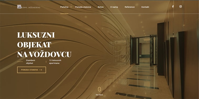
Of course, you can use photos of anything related to your business, such as images of apartments in the real estate industry. In that case, however, it is necessary that you use real-life photographs of the accommodations you’re selling. Otherwise, you’re just misleading your visitors.
Instead of photography, you can opt for good old web design. Hire an experienced designer to ensure your landing page design follows suit with the latest trends and best practices.
Optimize for SEO and mobiles
What’s the point of making a landing page if no one will be able to see it? None. Therefore, invest time and resources into ensuring your landing page is fully optimized for search engines and mobiles.
Today, mobile traffic takes up near 70% of all Internet traffic, with responsive design, i.e. the one suited to mobile screen sizes, being one of the main Google ranking factors.
Therefore, SEO and mobile optimization are a logical step in the process towards a high-converting landing page with SEO. If your business aims high, your best choice is consulting with an SEO specialists, who can help optimize your page specifically for the purpose and the industry you’re in.
Keep focus
Last but not least – may your landing page have a single, clearly-defined focus. As we’ve mentioned earlier, the landing page is a standalone page specifically designed for the purpose of advertising. Unlike the homepage, where you can include various information, such as services, about, contact, and other sections – landing page requires precision.
Thus, if you’re offering a discount on certain products or a service, there shouldn’t be mention of anything else that you do. Keep it simple, decluttered, and clearly visible. Everything important should go above the fold, i.e. be visible even without scrolling the page.
The Takeaway
Next time you click on an ad, stop for a moment, and try to analyze its strengths and weaknesses. See how the psychology works on you, and note it down for your own landing page.
There isn’t a single, definitive guide to creating a landing page that boosts conversions. Nor there’s a landing page layout, color scheme or content placement that will do the trick for all industries, across demographics, and a variety of business aims.
However, there are quite a few helpful tricks that actually work and bring impressive and lasting marketing campaign results.
As landing page exists separately from your main website, it offers a great opportunity to play around with diverse fonts, colors, layouts, text, etc. See what strikes the chord with your target audience and go with it.
As a landing page has to speak volumes in a relatively tight space, it’s a good idea to partner up with someone experienced who can help you make the best of your investment. A professionally and thoughtfully designed landing page, together with great advertising efforts will ensure your business gets the traction it deserves.