Story old as time: Color is one of the basic elements in design. No matter if the design is meant for promotion, branding, marketing, or simply to fill a gap – choosing the right color is key in reaching the right audience.
Color understanding depends on many things and is differently interpreted in basically every country in the world because people from different cultures associate different emotions with colors.
However, when it comes to web and graphic design, what you should first start from is your audience: to whom you are delivering the design, i.e. who is going to receive it (and, preferably, evoke emotion in them). After that, you need to see what you have at your disposal – which colors run with each other, which should not be combined, etc. This is all explained in color theory.
Color Theory: Primary, Secondary, Tertiary Colors – What’s the Difference?
Color theory is the practice of combining and mixing colors in art, aestetics, and design. It is considered that one of the forerunners of this theory was Leonardo Da Vinci.
Nevertheless, color wheel has been around for centuries, even before the development of contemporary graphic design as we know it, so much that it is now considered traditional in art. It is considered that back in 1704, Sir Isaac Newton had created the first color wheel in his Opticks, and since then the scientists and artists have been studying it and designed different variations of this concept. Colors belonging to the color wheel can be divided into the following three groups:
- Primary colors – these are red, yellow, and blue. In the traditional color theory, primary colors cannot be derived from the combination of any other color and, in return, these colors constitute all other colors.
- Secondary colors – are green, orange, and purple. They are created as a result of mixing primary colors, e.g. yellow + blue = green, yellow + red = orange, red + blue = purple.
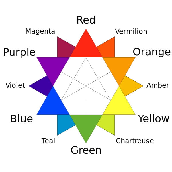
- Tertiary colors – come as a result of mixing a color with one or two secondary colors, which results in RYB (red-yellow-blue, traditional) or RGB (red-green-blue) or CMYK (cyan-magenta-yellow-key, modern) colors. For example, if you combine blue + cyan = azure, or red + magenta = rose.
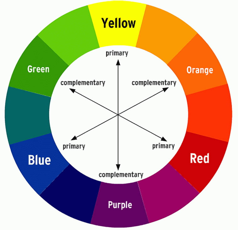
Analogous and complementary colors
There is also the distinction between analogous and complementary colors.
Analogous are groups of three colors standing next to each other on the color wheel. Usually, they are primary, secondary and tertiary colors, e.g. red, orange, and red-orange. These colors can be seen in nature, for example in fall or spring, when the plants progressively move through the color wheel and create a natural gradient.
On the other hand, complementary colors can be defined as “pairs of colors which, when combined, cancel each other out” (source: Wikipedia). In other words, these colors are opposite to one another, and this is why often these colors are called opposite since this term is more appropriate. A color complementary to red is green, orange to blue, purple to yellow, etc.
Color Psychology
The experts say that there is some kind of science behind colors and how they affect people. In fact, there are different studies and research dealing with the psychology of color which indicate that there is more to color that meets the eye. People are sensual beings which relate their emotions to the things they feel with their senses, including sight. For example, blue is said to reduce blood pressure and slow heartbeat down, whereas yellow makes people happier; similarly, if you use a combination of the two – you will get green – the color which is pleasant to the eye and makes the majority of people happy.
Tone is also important in color psychology. They say that pastel tones can help people calm down, which is why they are usually used in mental health institutions where they make their residents feel relaxed and happy. On the other hand, intense colors such as bright red, yellow and green are usually used in educational institutions because children like them.
How To Choose the Right Color for Your Design
First off, colors are subjective, especially in design. What the designer feels is appropriate for a design can be a complete failure in the eyes of a client, et vice versa. It has already been said that colors depend on culture, as the example of which we can use sadness. In the western civilizations, the color connected with grief is usually black, whereas, in the East (Asia, etc.), white evokes this emotion.
The best piece of advice would be to choose carefully: you should sit down with your client first and discuss in advance what color they would prefer and, based on color psychology, your subjective feeling (and maybe ask another designer for an opinion) – decide on what the best solution would be for your project. There is a number of great online tools you can use to try out different colors, such as Coolors and Color Scheme Designer, or Paletton.
If you are a web designer, you need to be familiarized with Web-safe Colors, specified with a # and a number/letters for the corresponding color (e.g. #008000 is green).
Like this? Read more:
- How to become an art director?
- Photoshop shortcuts every designer should know
- A short history of flat design
- The magnificent world of illustrator Ryan Putnam
- How much is the art of typography important in web design