You have decided to create a website for your business or you make your own blog for months, you were looking for a certain template that you like and you're sure that you have selected the right one.
One of the most important aspects when it comes to web sites is to create and provide a better web design. Good web design can bring the popularity of your site, while the poor can make a counter effect, you certainly would not want that.
Read what would be best to avoid as you create and design a web site templates.
“Under construction” page
When the site is finished, you’re ready! You wouldn’t expect a shop to put the “Open” sign on the door unless it has something to sell? So don’t make the same mistake with your website. Make sure your design and materials of all pages is ready and it doesn’t post links on the site that do not lead anywhere.
Compatibility with browsers
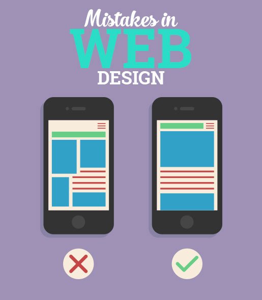
Website templates should function equally well regardless of which browser the user is attempting to enter the website from. Make sure your website is compatible with all browsers. This also applies to mobile applications too.
Don’t fall into disorganization
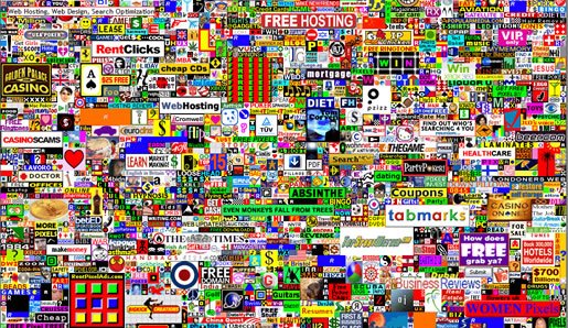
Disorganization is chaos, and a chaotic website equals a frustrated user who will go elsewhere. Your website traffic depends on repeat visitors, and no one will bookmark a website if it gives them a headache! It’s important to have a nice homepage but don’t neglect the rest of the website too. Make sure that your other pages have plenty to keep people interested. This could include witty catch phrases, informative video content, or simply a pretty design which is pleasing to look at. Keep everything simple to read in easy to swallow paragraphs and try not to make it look so busy.

Pages ought to present a unified and consistent look. But novice site builders entranced by having thousands of fonts at their fingertips, plus dozens of colors, sites often become overcrowded. Use two or three fonts and colors per page, maximum. The idea is to reassure viewers of your solidity and stability, not to convince them with your artistic abilities. Also remember to make sure that your font and colors look good on all possible devices from desktops, tablets, mobile phones, etc.
Remember: Every page in your site needs a link back to the home page. Why? Sometimes users will forward a URL to friends, who may visit and may want more information. But if the page they get is a dead end, then it’s a bad solution. Always put a link to “Home” on every page, and make your site logo link back to your home page.
Synchronize with social networks
Most businesses have their own Facebook pages, others who have a lot of pictures use Printerest, while some broadcast their latest activities on Twitter. Business has a lot of benefits of social networks that are present and are constantly growing. Therefore, make sure that your website is linked with social networks and users should easily switch from one to another. Using social networks for your business will keep users on your website and will work only if you allow them to easily without much effort go to the site or social network.

Advertising in web design
The fact is that advertising is very important in modern times, and it’s very rare to find a website without advertising, especially because they are provided free of charge in an age of information and social media.
However, some adverts sit nicely on the page, and can be glanced at or ignored by the user, while others blind us with garish music or annoying pop ups, making us eager to get as far away from the website as we can. Ads contribute to essential income, and this can’t be denied, especially if you’re using free web hosting but try to make the ad not look like an ad, and create a uniform design requirement for all ads on your site.
Confusing, jargon written or insufficient information
The users enter your website because they want to learn something interesting and valuable, but what they’re getting is useless, poorly written information that’s not even relevant. Users won’t read everything but their eyes will skim the pages for relevant and useful information. If it isn’t there, or if it’s hidden under meaningless jargon, they won’t find it.
They should be able to find the information they are looking for with ease. If you’re selling, you need to offer viewers multiple ways to contact you. The best way is to create the pages “About Us” and “Contact Us”, where will be the basic information, email, phone, address, etc. This pages should be visible on all pages on your website.
Even if nobody ever calls, the very presence of this information adds real-world legitimacy and transparency to your site and comforts some viewers.
Unplanned navigation
The internet promises speed. If visitor can’t figure out where to go next quickly and get there easily, they’ll simply surf on to the next website – your competitor’s! Most users will hang around on a home page for seconds before moving on. In those initial moments, they are scanning the page to see if they are interested in giving you more time.
You wouldn’t start any other work project without a plan, and a website is no different. There should be a navigation bar on every page that guides visitors to other areas of the site. Position the bar along the top of the page or along the left side so it will always be visible regardless of screen resolution. It’s very frustrating to be forced to go back two or three pages so you can get to the other areas of a site. It’s also a waste of time. Add a site map in your main navigation bar and/or footer to provide visitors with an at-a-glance view of every page on your site.
Disabled back button
Some authors are long ago figured out how to break a browser’s back button so that when a user pushes it. One of several undesired things happen:
“There’s an immediate redirect to an unwanted location, the browser stays put because the “back” button has been deactivated, or a new window pops up and overtakes the screen.
Our advice: Never do it. All that’s accomplished is that viewers get annoyed and do not return to your site.
Search doesn’t work properly
Nothing more frustrating than not being able to find what you’re looking for because of bad website design, especially when you know it’s there! As well as good links to various sections of your website, make sure the search tool is operating correctly, as well as offering some suggestions for the bad spellers amongst us!
Bad links
Bad hyperlinks that do nothing when clicked or lead to “404” error pages–are the bane of any web surfer. Test your site, and do it weekly or monthly, to ensure that all links work as promised. Include a “Contact the Webmaster” link in your site’s footer so users can quickly let you know if they find a broken link or other mistake on your site, and fix those errors immediately.
Slow load time
Slow load times are inexcusable with professional sites – it’s an invitation to the visitor to click away. What’s slow? Research showed that online shoppers, on average, will wait only four seconds for a site to load before clicking away. If your site is loading significantly slower than this, put it on a diet, images may be too large or special add-ons, like a Flash introduction, may be slowing things down.

Old information
For this there’s no excuse, but it’s amazing how many sites include old, dated content. Make sure to keep your site fresh and updated daily for best results. You can’t afford the loss of credibility that can come from having dated content. Also, make sure your content is accurate, and if you find a single error, fix it immediately.


